Posts Tagged ‘graphs’
“Any chart, no matter how well designed, will mislead us if we don’t pay attention to it. The world cannot be understood without numbers. And it cannot be understood with numbers alone.”*…
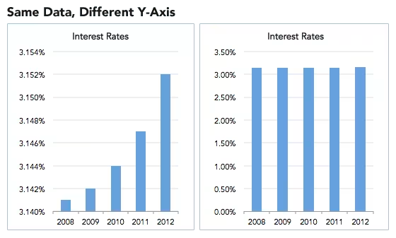
Spencer Greenberg on the critical importance of thinking critically about the charts and graphs that we constantly consume…
In 1994, the U.S. Congress passed the largest crime bill in U.S. history, called the Violent Crime Control and Law Enforcement Act. The bill allocated billions of dollars to build more prisons and hire 100,000 new police officers, among other things. In the years following the bill’s passage, violent crime rates in the U.S. dropped drastically, from around 750 offenses per 100,000 people in 1990 to under 400 in 2018.
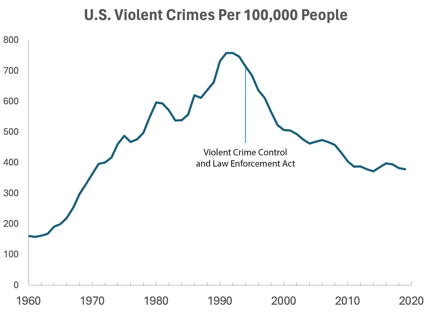
But can we infer, as this chart seems to ask us to, that the bill caused the drop in crime?
As it turns out, this chart wasn’t put together by sociologists or political scientists who’ve studied violent crime. Rather, we—a mathematician and a writer—devised it to make a point: Although charts seem to reflect reality, they often convey narratives that are misleading or entirely false.
Upon seeing that violent crime dipped after 1990, we looked up major events that happened right around that time—selecting one, the 1994 Crime Bill, and slapping it on the graph. There are other events we could have stuck on the graph just as easily that would likely have invited you to construct a completely different causal story. In other words, the bill and the data in the graph are real, but the story is manufactured.
Perhaps the 1994 Crime Bill really did cause the drop in violent crime, or perhaps the causality goes the other way: the spike in violent crime motivated politicians to pass the act in the first place. (Note that the act was passed slightly after the violent crime rate peaked!)
Charts are a concise way not only to show data but also to tell a story. Such stories, however, reflect the interpretations of a chart’s creators and are often accepted by the viewer without skepticism. As Noah Smith and many others have argued, charts contain hidden assumptions that can drastically change the story they tell.
This has important consequences for science, which, in its ideal form, attempts to report findings as objectively as possible. When a single chart can be the explanatory linchpin for years of scientific effort, unveiling a data visualization’s hidden assumptions becomes an essential skill for determining what’s really true. As physicist Richard Feynman once said: In science, “the first principle is that you must not fool yourself, and you are the easiest person to fool.”What we mean to say is—don’t be fooled by charts…
[Greenberg unpacks a couple of powerful examples…]
… to avoid producing a chart that misleads scientists, which misleads journalists, which misleads the public, and which then contributes to widespread confusion, you must think carefully about what you actually aim to measure. Which representation of the data best reflects the question being asked and relies on the sturdiest assumptions?
After all, scientific charts are a means to read data rather than an explanation of how that data is collected. The explanation comes from a careful reading of methods, parameters, definitions, and good epistemic practices like interrogating where data comes from and what could be motivating the researchers who produced it.
In the end, the story a chart tells is still just that—a story—and to be a discerning reader, you must reveal and interrogate the assumptions that steer those narratives…
Eminently worth reading in full: “How charts can inadvertently manipulate reality,” from @spencrgreenberg.bsky.social.
* Alberto Cairo, How Charts Lie: Getting Smarter about Visual Information
###
As we ferret out the facts, we might recall that it was on this date in 1874 that Florence Nightingale became the first female President of the Royal Statistical Society.
Famed for her work as a nurse in the Crimean War, she went on to found training facilities and nursing homes– pioneering both medical training for women and what is now known as Social Entrepreneuring. Less well-known are Nightingale’s contributions to epidemiology, statistics, and the visual communication of data in the field of public health. Always good at math, she pioneered the use of the polar area chart (the equivalent to a modern circular histogram or rose diagram) and popularized the pie chart (which had been developed in 1801 by William Playfair). Nightingale later became an honorary member of the American Statistical Association.

“Diagram of the causes of mortality in the army in the East” by Florence Nightingale, an example of the the polar area diagram (AKA, the Nightingale rose diagram) source

“Nothing can better cure the anthropocentrism that is the author of all our ills than to cast ourselves into the physics of the infinitely large (or the infinitely small)”*…

And very eye-opening it can be. Jason Kottke reports on an article in the most recent issue of the American Journal of Physics with the understated title of “All objects and some questions.”
You just have to admire a chart that casually purports to show every single thing in the Universe in one simple 2D plot. [As the article’s author explain:]
In Fig. 2 [above], we plot all the composite objects in the Universe: protons, atoms, life forms, asteroids, moons, planets, stars, galaxies, galaxy clusters, giant voids, and the Universe itself. Humans are represented by a mass of 70 kg and a radius of 50 cm (we assume sphericity), while whales are represented by a mass of 10^5 kg and a radius of 7 m.
The “sub-Planckian unknown” and “forbidden by gravity” sections of the chart makes the “quantum uncertainty” section seem downright normal — the paper collectively calls these “unphysical regions.” Lovely turns of phrase all.
But what does it all mean? My physics is too rusty to say, but I thought one of the authors’ conjectures was particularly intriguing: “Our plot of all objects also seems to suggest that the Universe is a black hole.”…
Is the universe a black hole? (and other provocative propositions): @kottke on a recent scientific paper: “The Plot of All Objects in the Universe.”
* Julio Cortázar, Around the Day in Eighty Worlds
###
As we size up scale, we might recall that it was on this date in 451 that a different kind of attempt to reconcile the finite and the infinite began: the first session of the Council of Chalcedon (in modern-day Turkey) was opened. The fourth ecumenical council of the Christian church, it was attended by over 520 bishops or their representatives (making it the largest and best documented of the first seven ecumenical councils). It was convened by the Roman emperor Marcian to re-assert the teachings of the ecumenical Council of Ephesus against the heresies of Eutyches and Nestorius— whose teachings attempted to dismantle and separate Christ’s divine nature from his humanity (Nestorianism) and further, to limit Christ as solely divine in nature (Monophysitism).
The Council succeeded in that task. As Jaroslav Pelikan characterized their findings:
We all teach harmoniously [that he is] the same perfect in godhead, the same perfect in manhood, truly God and truly man, the same of a reasonable soul and body; homoousios with the Father in godhead, and the same homoousios with us in manhood … acknowledged in two natures without confusion, without change, without division, without separation.
… which marked a turning point in the Christological debates. But it also generated heated disagreements between the council and the Oriental Orthodox Church, which saw things differently– a contention that informed the separation of the Oriental Orthodox Churches from the rest of Christianity… and led to the Council being remembered as “Chalcedon, the Ominous.”

“History is not the past but a map of the past, drawn from a particular point of view, to be useful to the modern traveler”*…

Timelines are now a commonplace. But as Emily Thomas explains, Joseph Priestley’s “A New Chart of History” revolutionized how we view history…
… Priestley (1733-1804) is best known for his scientific work, especially the co-discovery of oxygen. Yet he was also a teacher and a philosopher. As a teacher, Priestley sought to better communicate history to his students. He was fascinated by chronologies, texts ordering events. Since ancient Greece and Rome, chronologers used ‘time tables’ or grids to depict the order of events in time. An obvious problem with these chronologies, though, is that only so many events can fit on each page.
The mid-18th century saw many experiments in representing history, including Thomas Jefferys’ 1753 A Chart of Universal History. Jefferys was a mapmaker and his chart depicts empires almost as though they are countries on a map, allowing you to scan them all at once. Impressed, Priestley determined to create a chart of his own that readers could scan ‘at one view’. He made several innovations but one proved key: lines, inspired by his philosophy of time.
For this, Priestley drew on a seemingly unconnected topic: John Locke’s 1690 account of abstract ideas. For Locke, abstract ideas include ‘redness’, ‘triangle’, or ‘animal’. They are general ideas, produced when our minds consider particular things. Take a pint of milk, a stick of chalk and a lump of snow. I can consider these things while leaving out their particular features, ‘abstracting’ what is common to them: their whiteness. Many philosophers accepted some version of Locke’s account of abstraction, but puzzled over how to mentally visualise them. Locke writes that our abstract idea of a triangle ‘must be neither Oblique, nor Rectangle, neither Equilateral, Equicrural, nor Scalenon; but all and none of these at once’. Clearly we cannot picture such a thing. Priestley makes an alternative suggestion: represent abstract ideas using a variable particular. A child, he writes, has an idea of ‘what a triangle in general is’, even though all the ideas of triangles he ‘contemplates’ are ‘particular’. In other words, our picture of the abstract idea of a triangle can change: from equilateral to, say, scalene. In the same essay, Priestley argued that time is an abstract idea. And this view feeds into his timeline…
How Joesph Priestley’s “A New Chart of History” used the ideas of John Locke to revolutionize our undertstanding of history: “The Invention of Time,” from @emilytwrites in @HistoryToday.
Pair with “Putting Time in Perspective,” from @waitbutwhy.
###
As we ponder the past, we might send evocative birthday greetings to Jules Michelet; he was born on this date in 1798. Considered one of the founders of modern historiography, he is best known for his multivolume work Histoire de France (History of France).
Influenced by Giambattista Vico, Michelet emphasized on the role of people and their customs in shaping history, a major departure from the then-current emphasis on political and military leaders. He coined the term “Renaissance” (meaning “rebirth” in French) as a period in Europe’s cultural history that represented a break from the Middle Ages, creating a modern understanding of humanity and its place in the world. (The term “rebirth” and its association with the Renaissance can be traced to a work published in 1550 by the Italian art historian Giorgio Vasari. Vasari used the term to describe the advent of a new manner of painting that began with the work of Giotto, as the “rebirth (rinascita) of the arts.”)

“When the graphs were finished, the relations were obvious at once”*…

We can only understand what we can “see”…
… this long-forgotten, hand-drawn infographic from the 1840s… known as a “life table,” was created by William Farr, a doctor and statistician who, for most of the Victorian era, oversaw the collection of public health statistics in England and Wales… it’s a triptych documenting the death rates by age in three key population groups: metropolitan London, industrial Liverpool, and rural Surrey.
With these visualizations, Farr was making a definitive contribution to an urgent debate from the period: were these new industrial cities causing people to die at a higher rate? In some ways, with hindsight, you can think of this as one of the most crucial questions for the entire world at that moment. The Victorians didn’t realize it at the time, but the globe was about to go from less than five percent of its population living in cities to more than fifty percent in just about a century and a half. If these new cities were going to be killing machines, we probably needed to figure that out.
It’s hard to imagine just how confusing it was to live through the transition to industrial urbanism as it was happening for the first time. Nobody really had a full handle on the magnitude of the shift and its vast unintended consequences. This was particularly true of public health. There was an intuitive feeling that people were dying at higher rates than they had in the countryside, but it was very hard even for the experts to determine the magnitude of the threat. Everyone was living under the spell of anecdote and availability bias. Seeing the situation from the birds-eye view of public health data was almost impossible…
The images Farr created told a terrifying and unequivocal story: density kills. In Surrey, the increase of mortality after birth is a gentle slope upward, a dune rising out of the waterline. The spike in Liverpool, by comparison, looks more like the cliffs of Dover. That steep ascent condensed thousands of individual tragedies into one vivid and scandalous image: in industrial Liverpool, more than half of all children born were dead before their fifteenth birthday.
The mean age of death was just as shocking: the countryfolk were enjoying life expectancies close to fifty, likely making them some of the longest-lived people on the planet in 1840. The national average was forty-one. London was thirty-five. But Liverpool—a city that had undergone staggering explosions in population density, thanks to industrialization—was the true shocker. The average Liverpudlian died at the age of twenty-five, one of the lowest life expectancies ever recorded in that large a human population.
There’s a natural inclination to think about innovation in human health as a procession of material objects: vaccines, antibiotics, pacemakers. But Farr’s life tables are a reminder that new ways of perceiving the problems we face, new ways of seeing the underlying data, are the foundations on which we build those other, more tangible interventions. Today cities reliably see life expectancies higher than rural areas—a development that would have seemed miraculous to William Farr, tabulating the data in the early 1840s. In a real sense, Farr laid the groundwork for that historic reversal: you couldn’t start to tackle the problem of how to make industrial cities safer until you had first determined that the threat was real.
Why the most important health innovations sometimes come from new ways of seeing: “The Obscure Hand-Drawn Infographic That Changed The Way We Think About Cities,” from Steven Johnson (@stevenbjohnson). More in his book, Extra Life, and in episode 3 of the PBS series based on it.
###
As we investigate infographics, we might send carefully calculated birthday greetings to Lewis Fry Richardson; he was born on this date in 1881. A mathematician, physicist, and psychologist, he is best remembered for pioneering the modern mathematical techniques of weather forecasting. Richardson’s interest in weather led him to propose a scheme for forecasting using differential equations, the method used today, though when he published Weather Prediction by Numerical Process in 1922, suitably fast computing was unavailable. Indeed, his proof-of-concept– a retrospective “forecast” of the weather on May 20, 1910– took three months to complete by hand. (in fairness, Richardson did the analysis in his free time while serving as an ambulance driver in World War I.) With the advent of modern computing in the 1950’s, his ideas took hold. Still the ENIAC (the first real modern computer) took 24 hours to compute a daily forecast. But as computing got speedier, forecasting became more practical.
Richardson also yoked his forecasting techniques to his pacifist principles, developing a method of “predicting” war. He is considered (with folks like Quincy Wright and Kenneth Boulding) a father of the scientific analysis of conflict.
And Richardson helped lay the foundations for other fields and innovations: his work on coastlines and borders was influential on Mandelbrot’s development of fractal geometry; and his method for the detection of icebergs anticipated the development of sonar.

“Above all else show the data”*…

Three of the many exhibits at Xenographics…
… a collection of unusual charts and maps, managed by Maarten Lambrechts. Its objective is to create a repository of novel, innovative and experimental visualizations to inspire you, to fight xenographphobia and popularize new chart types…
* Edward Tufte
###
As we put the info into infographics, we might ponder the terminally-tarnished legacy of James Dunwoody Brownson De Bow; he was born on this date in 1820. While he was an accomplished statistician who served as as head of the U.S. Census from 1853 to 1857, he was also the founder and first editor of DeBow’s Review, a widely-circulated magazine of “agricultural, commercial, and industrial progress and resource” in the American South from 1846 until 1884. Before the Civil War, the magazine “recommended the best practices for wringing profits from slaves.”

You must be logged in to post a comment.