Posts Tagged ‘data visualization’
“Science explains how things work, it doesn’t always answer why they exist”*…

Still, it’s cool to know how things work. In a continuing series of “tear-downs,” Bryan Macomber obliges in the most elegant of ways…
Are you curious why a clicky Pen… clicks? How a Zippo Lighter flips open? Or what lives inside a Pez Dispenser?
I’ve illustrated tear-downs and break-downs of everyday products that you may have taken for granted. Let’s take a look inside and understand how they work. Click around, have fun and maybe learn something new!…
An illustrated celebration of the engineering around us: “Mechanical Pencil.”
* (Paraphrase of) Isaac Newton
###
As we muse on the mechanical, we might recall that it was on this date (according to most sources, though a few cite the 12th or the 19th of June) in 1902 that Philadelphia restauranteurs Frank Hardart and Joe Horn opened the first Automat in the U.S. A cavernous, waiterless establishment that was a combination of fast (but fresh) food, vending, and a cafeteria. Customers put nickels into slots beside small glass-doored compartments in the Automats and turned a knob. In the compartment next to the slot, food revolved into place for the customer to receive through the glass door.
Horn & Hardart Automats expanded into a chain reaching Manhattan in 1912. With their uniform recipes and centralized commissary system of supplying their restaurants, the Automats were America’s first major fast-food chain.
For more on how they worked, see “Meet Me at the Automat” and the charming documentary “The Automat.”


“A simile is just a metaphor with the scaffolding still up”*…
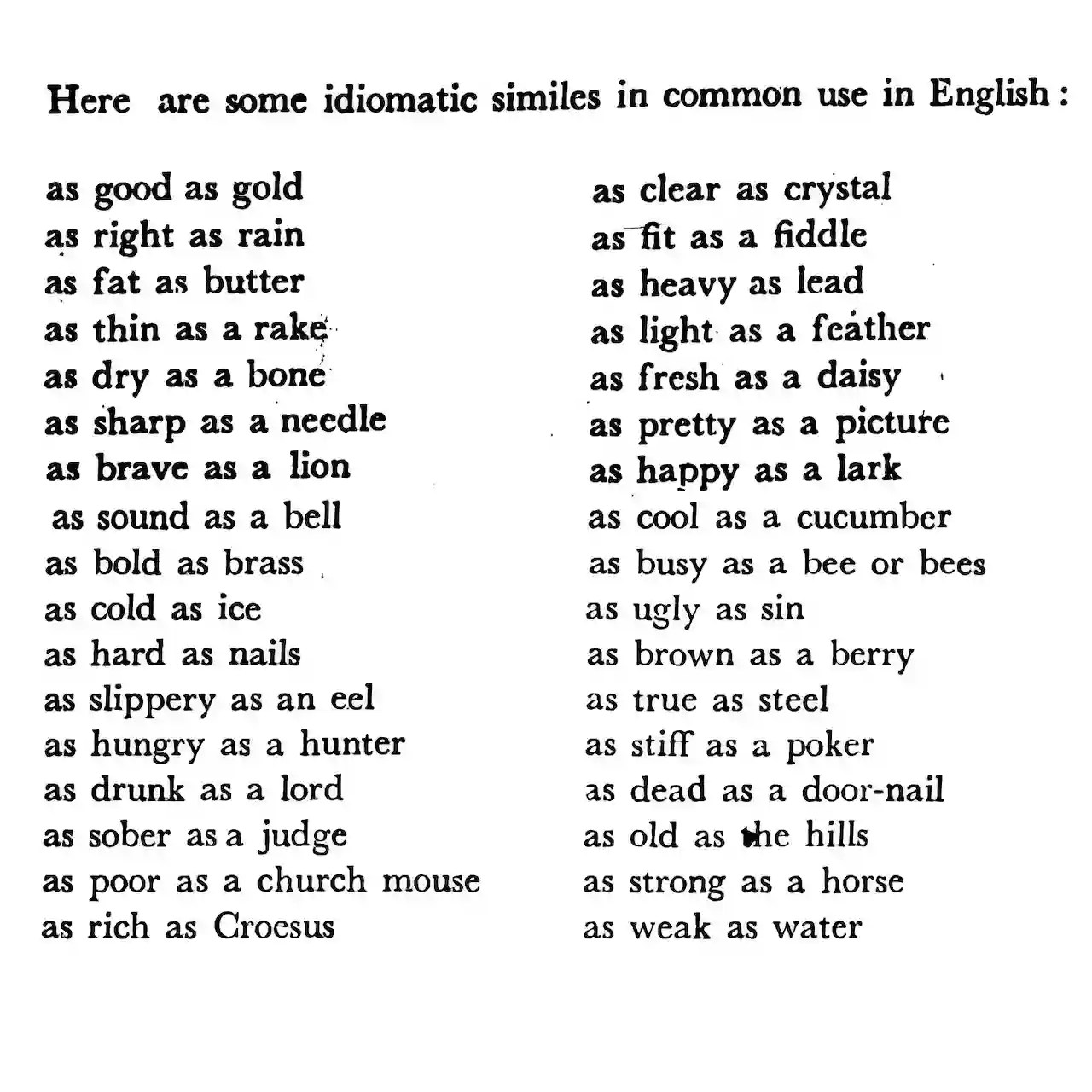
Russell Samora has been fooling around with figures of speech; with his colleagues at The Pudding, he’s fielded a fascinating analysis of of that comparative workhorse, the simile…
Similes are all around us. But, if you haven’t considered this figure of speech since grade school, here’s a refresher: similes compare a shared quality of two things, often using “like” or “as.”
I pulled every simile in the form “as ___ as ___” from tens of thousands of fiction books for the top 500 most common adjectives… I thought it would be a trivial exercise, but the more I poked around, the more questions I had…
Samora explains how similes are structured and how they are used (and with what relative frequency) in literature. He examines some of the most common– and several special cases (“The Ironic Ones”). And he explains his methodology and sources… all in the context of a lovely interactive data visualization.
It’s as cool as hell: “Comparisons as Predictable as the Sunrise,” from @pudding.cool.
###
As we agree with Steve Martin that “a day without sunshine is like, you know, night,” we might recall that it was on this date in 1789 that Richard Kirwan published his essay in support of the phlogiston theory (the belief, that dates to alchemical times, in the existence of a fire-like element (dubbed “phlogiston”) contained within combustible bodies and released during burning. Kirwan was among the last of its advocates.
A well-regarded scientist in the late 18th and early 19th centuries, Kirwan met and corresponded with Black, Lavoisier, Priestley, and Cavendish. Indeed, while scientific history remembers him as a defender of an incorrect theory, his work probably spurred Priestley and Lavoisier, who respectively discovered and named the actual elemental agent of combustion, oxygen.
But Kirwan is also remembered for a personal eccentricity (one of many) that led to some referring to him (all too poignantly) as “crazy as a bed bug”: he hated bugs (especially flies). Kirwan paid his servants a bounty for each one they killed.

“Without data, you’re just another person with an opinion”*…

… and that data can be even more useful if we can visualize it. Andrew Zolli introduces a new opportunity…
Whether we’re contending with food shocks, responding to disasters, preventing the next pandemic, helping communities adapt to a changing climate, or just delivering basic governmental services, one constant runs through it all: people. Where we live, how we move, when we gather or flee – these human patterns shape the arc of every modern challenge. Without a deep and dynamic understanding of those patterns, meaningful action becomes not just harder, it becomes guesswork.
That’s why I’m so excited about our ongoing collaboration with colleagues at the Microsoft AI for Good Lab and the Institute for Health Metrics and Evaluation to develop the world’s most up-to-date, highly accurate, high resolution #population density maps. Harnessing the power of Planet’s high-frequency, high-resolution satellite imagery, the AI for Good team’s artificial intelligence expertise, and IHME’s deep demographic modeling capabilities, these population maps allow us to estimate how many people we’re likely to find in every 40 sq meter patch of Earth, in every country of the world. And because the underlying data is updated quarterly, they also allow us to see change over time.
This week, we announced the completion of the first phase of this work at the United Nations AI For Good Global Summit, held in Geneva. We’ve been piloting the use of these population maps as part of the UN’s Early Warnings For All Initiative, which seeks to ensure that everyone on Earth is protected from hazardous weather, water, and climate events. In an early use-case, by overlaying population data with maps of mobile connectivity, we’ve been able to identify unconnected populations that might not be reachable in a crisis.
And that’s just one of what are likely hundreds – even thousands – of ways this kind of population data can be put to work. Knowing where people are settling, and how those patterns are changing, is foundational to everything from public health campaigns to the design of infrastructure and services. If we want to reduce wildfire risk, for example, we need to understand where human communities are pressing into forested frontiers. If we want to evacuate people ahead of an oncoming storm, we need to know how many lives are in harm’s way. And if we want to ensure people aren’t displaced by unlivable heat, we have to overlay human presence with climate exposure.
You can learn more and sign up to explore a coarser (but compelling!) (40km/pixel) visualization of the population data. At the AI for Good Summit, we also announced an Early Access Program for a carefully selected number of trusted organizations who will explore applications of the data and give feedback. If that sounds like it might be of interest, please contact services@healthdata.org…
A new tool for visualizing the world in which we live: “Everyone, Everywhere: Mapping Humanity’s Changing Footprint in Unprecedented Detail,” from @andrewzolli.bsky.social and his collegues at Planet.
###
As we get down with data, we might spare a thought for a spiritual ancestor of Planet’s, Denis Diderot; he died on this date in 1784. A philosopher, art critic, and writer, he is best known for serving as co-founder, chief editor, and contributor to the Encyclopédie along with Jean le Rond d’Alembert.
The Encyclopédie is most famous for representing the thought of the Enlightenment. According to Denis Diderot in the article “Encyclopédie”, the Encyclopédie‘s aim was “to change the way people think” and for people to be able to inform themselves and to know things. He and the other contributors advocated for the secularization of learning away from the Jesuits. Diderot wanted to incorporate all of the world’s knowledge into the Encyclopédie and hoped that the text could disseminate all this information to the public and future generations. Thus, it is an example of democratization of knowledge.
It was also the first encyclopedia to include contributions from many named contributors, and it was the first general encyclopedia to describe the mechanical arts. In the first publication, seventeen folio volumes were accompanied by detailed engravings. Later volumes were published without the engravings, in order to better reach a wide audience within Europe…
– source

“Read the best books first, or you may not have a chance to read them at all”*…

Ah, but “good”?… Past a certain level of quality, our definitions of “good”– that’s to say, the books that entertain and enlighten– vary for each of us. How to choose? Literature-Map is here to help…
The Literature-Map is part of Gnod, the Global Network of Discovery.
It is based on Gnooks, Gnod’s literature recommendation system. The more people like an author and another author, the closer together these two authors will move on the Literature-Map.
If you found a typo or a duplicate, please report it here.
Is an author missing on the map? Please vote for them here.
Want to jump to a random place on the map? Click here
Help in finding your next book: “The Literature-Map.”
* Henry David Thoreau, A Week on the Concord and Merrimack Rivers
###
As we turn the page, we might recall that this date in 1935 was a big one for the book business:
Allen Lane, Chairman of the London publisher The Bodley Head, was returning home after traveling with author Agatha Christie and her husband. At the train station, he browsed the kiosks looking for something to read on his way home. All he could find were magazines or low-quality paperback stories that he had no interest in reading. Then the thought occurred to him that people, like himself, might be more inclined to read good quality books [literature in paperback was then mainly poor quality lurid fiction] if they were more affordable. And since he was in the position to help build up lagging sales for his company, he ventured into printing previously hard-back books into a paperback format. The first was released on this day in 1935…
– source
Penguin Books featured no photos and were priced about a fifteenth the price of a hardcover book. The traditional book trade initially resisted; but the purchase of 63,000 books by Woolworths paid for the project outright, confirmed its worth, and allowed Lane to establish Penguin as a separate business in 1936. Indeed, by March 1936, ten months after the company’s launch, one million Penguin books had been printed.
[More here]
“Any chart, no matter how well designed, will mislead us if we don’t pay attention to it. The world cannot be understood without numbers. And it cannot be understood with numbers alone.”*…
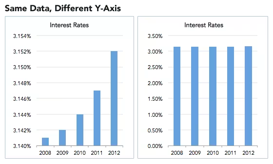
Spencer Greenberg on the critical importance of thinking critically about the charts and graphs that we constantly consume…
In 1994, the U.S. Congress passed the largest crime bill in U.S. history, called the Violent Crime Control and Law Enforcement Act. The bill allocated billions of dollars to build more prisons and hire 100,000 new police officers, among other things. In the years following the bill’s passage, violent crime rates in the U.S. dropped drastically, from around 750 offenses per 100,000 people in 1990 to under 400 in 2018.
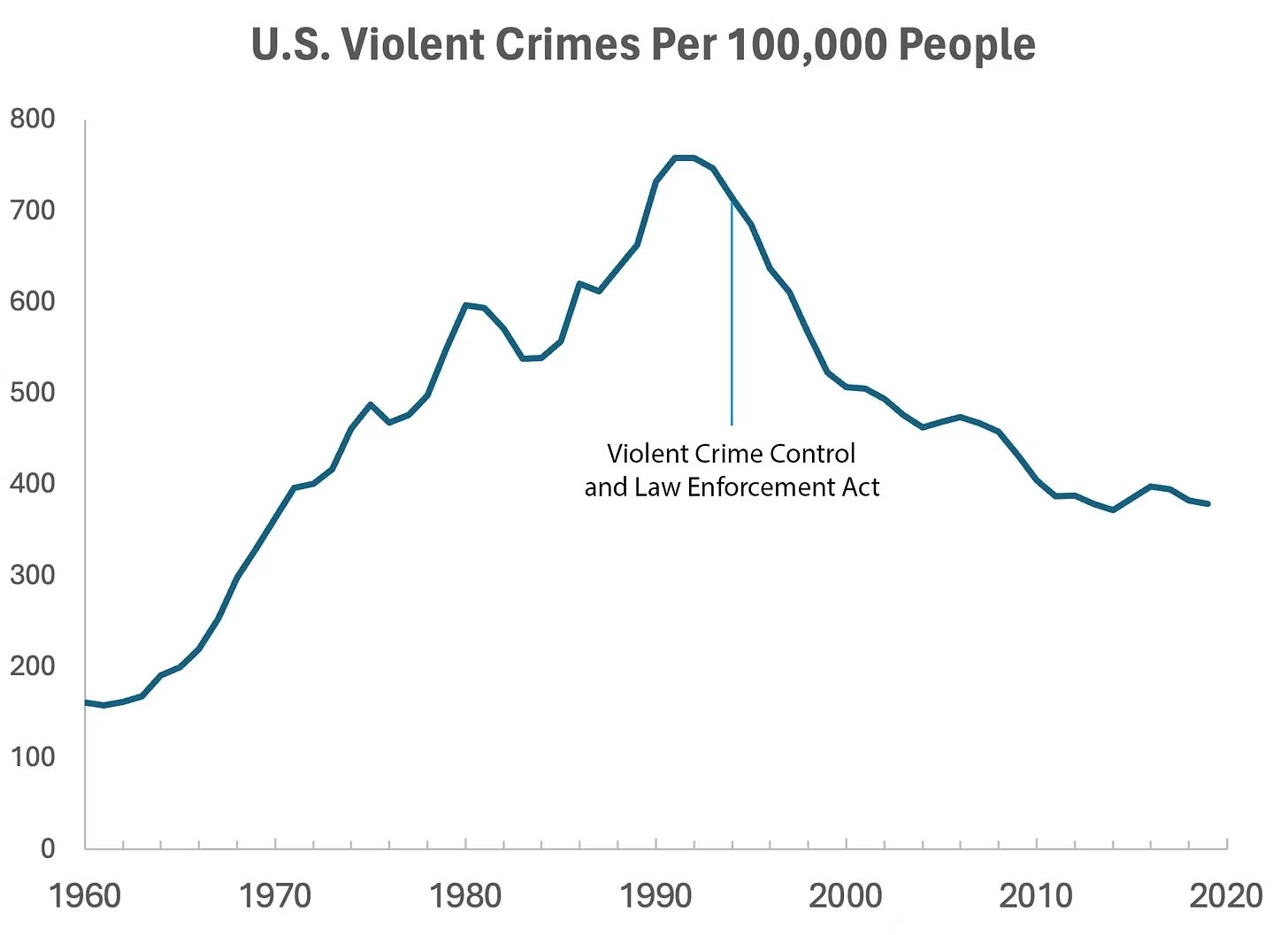
But can we infer, as this chart seems to ask us to, that the bill caused the drop in crime?
As it turns out, this chart wasn’t put together by sociologists or political scientists who’ve studied violent crime. Rather, we—a mathematician and a writer—devised it to make a point: Although charts seem to reflect reality, they often convey narratives that are misleading or entirely false.
Upon seeing that violent crime dipped after 1990, we looked up major events that happened right around that time—selecting one, the 1994 Crime Bill, and slapping it on the graph. There are other events we could have stuck on the graph just as easily that would likely have invited you to construct a completely different causal story. In other words, the bill and the data in the graph are real, but the story is manufactured.
Perhaps the 1994 Crime Bill really did cause the drop in violent crime, or perhaps the causality goes the other way: the spike in violent crime motivated politicians to pass the act in the first place. (Note that the act was passed slightly after the violent crime rate peaked!)
Charts are a concise way not only to show data but also to tell a story. Such stories, however, reflect the interpretations of a chart’s creators and are often accepted by the viewer without skepticism. As Noah Smith and many others have argued, charts contain hidden assumptions that can drastically change the story they tell.
This has important consequences for science, which, in its ideal form, attempts to report findings as objectively as possible. When a single chart can be the explanatory linchpin for years of scientific effort, unveiling a data visualization’s hidden assumptions becomes an essential skill for determining what’s really true. As physicist Richard Feynman once said: In science, “the first principle is that you must not fool yourself, and you are the easiest person to fool.”What we mean to say is—don’t be fooled by charts…
[Greenberg unpacks a couple of powerful examples…]
… to avoid producing a chart that misleads scientists, which misleads journalists, which misleads the public, and which then contributes to widespread confusion, you must think carefully about what you actually aim to measure. Which representation of the data best reflects the question being asked and relies on the sturdiest assumptions?
After all, scientific charts are a means to read data rather than an explanation of how that data is collected. The explanation comes from a careful reading of methods, parameters, definitions, and good epistemic practices like interrogating where data comes from and what could be motivating the researchers who produced it.
In the end, the story a chart tells is still just that—a story—and to be a discerning reader, you must reveal and interrogate the assumptions that steer those narratives…
Eminently worth reading in full: “How charts can inadvertently manipulate reality,” from @spencrgreenberg.bsky.social.
* Alberto Cairo, How Charts Lie: Getting Smarter about Visual Information
###
As we ferret out the facts, we might recall that it was on this date in 1874 that Florence Nightingale became the first female President of the Royal Statistical Society.
Famed for her work as a nurse in the Crimean War, she went on to found training facilities and nursing homes– pioneering both medical training for women and what is now known as Social Entrepreneuring. Less well-known are Nightingale’s contributions to epidemiology, statistics, and the visual communication of data in the field of public health. Always good at math, she pioneered the use of the polar area chart (the equivalent to a modern circular histogram or rose diagram) and popularized the pie chart (which had been developed in 1801 by William Playfair). Nightingale later became an honorary member of the American Statistical Association.

“Diagram of the causes of mortality in the army in the East” by Florence Nightingale, an example of the the polar area diagram (AKA, the Nightingale rose diagram) source

You must be logged in to post a comment.