“Any chart, no matter how well designed, will mislead us if we don’t pay attention to it. The world cannot be understood without numbers. And it cannot be understood with numbers alone.”*…
Spencer Greenberg on the critical importance of thinking critically about the charts and graphs that we constantly consume…
In 1994, the U.S. Congress passed the largest crime bill in U.S. history, called the Violent Crime Control and Law Enforcement Act. The bill allocated billions of dollars to build more prisons and hire 100,000 new police officers, among other things. In the years following the bill’s passage, violent crime rates in the U.S. dropped drastically, from around 750 offenses per 100,000 people in 1990 to under 400 in 2018.
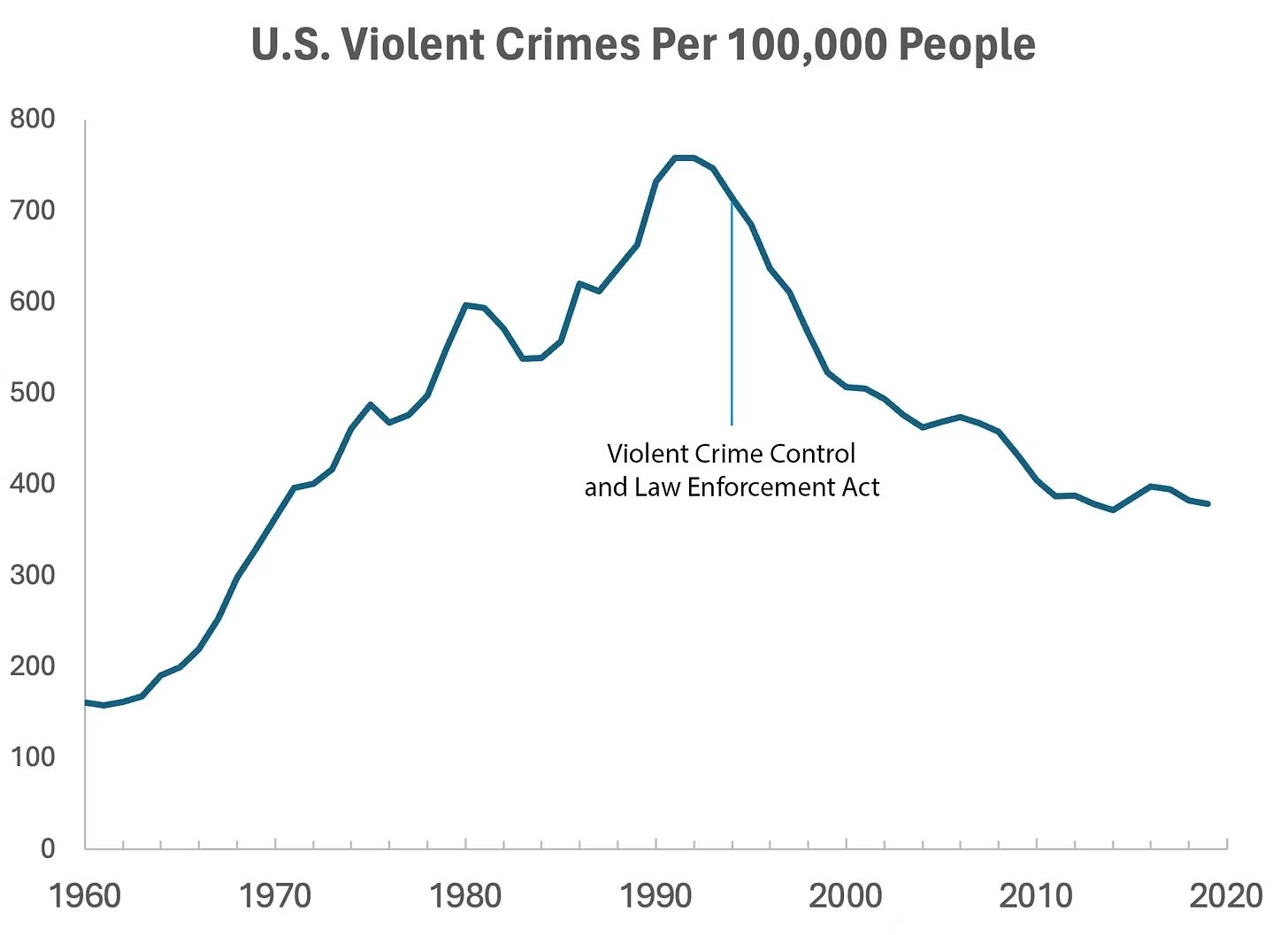
But can we infer, as this chart seems to ask us to, that the bill caused the drop in crime?
As it turns out, this chart wasn’t put together by sociologists or political scientists who’ve studied violent crime. Rather, we—a mathematician and a writer—devised it to make a point: Although charts seem to reflect reality, they often convey narratives that are misleading or entirely false.
Upon seeing that violent crime dipped after 1990, we looked up major events that happened right around that time—selecting one, the 1994 Crime Bill, and slapping it on the graph. There are other events we could have stuck on the graph just as easily that would likely have invited you to construct a completely different causal story. In other words, the bill and the data in the graph are real, but the story is manufactured.
Perhaps the 1994 Crime Bill really did cause the drop in violent crime, or perhaps the causality goes the other way: the spike in violent crime motivated politicians to pass the act in the first place. (Note that the act was passed slightly after the violent crime rate peaked!)
Charts are a concise way not only to show data but also to tell a story. Such stories, however, reflect the interpretations of a chart’s creators and are often accepted by the viewer without skepticism. As Noah Smith and many others have argued, charts contain hidden assumptions that can drastically change the story they tell.
This has important consequences for science, which, in its ideal form, attempts to report findings as objectively as possible. When a single chart can be the explanatory linchpin for years of scientific effort, unveiling a data visualization’s hidden assumptions becomes an essential skill for determining what’s really true. As physicist Richard Feynman once said: In science, “the first principle is that you must not fool yourself, and you are the easiest person to fool.”What we mean to say is—don’t be fooled by charts…
[Greenberg unpacks a couple of powerful examples…]
… to avoid producing a chart that misleads scientists, which misleads journalists, which misleads the public, and which then contributes to widespread confusion, you must think carefully about what you actually aim to measure. Which representation of the data best reflects the question being asked and relies on the sturdiest assumptions?
After all, scientific charts are a means to read data rather than an explanation of how that data is collected. The explanation comes from a careful reading of methods, parameters, definitions, and good epistemic practices like interrogating where data comes from and what could be motivating the researchers who produced it.
In the end, the story a chart tells is still just that—a story—and to be a discerning reader, you must reveal and interrogate the assumptions that steer those narratives…
Eminently worth reading in full: “How charts can inadvertently manipulate reality,” from @spencrgreenberg.bsky.social.
* Alberto Cairo, How Charts Lie: Getting Smarter about Visual Information
###
As we ferret out the facts, we might recall that it was on this date in 1874 that Florence Nightingale became the first female President of the Royal Statistical Society.
Famed for her work as a nurse in the Crimean War, she went on to found training facilities and nursing homes– pioneering both medical training for women and what is now known as Social Entrepreneuring. Less well-known are Nightingale’s contributions to epidemiology, statistics, and the visual communication of data in the field of public health. Always good at math, she pioneered the use of the polar area chart (the equivalent to a modern circular histogram or rose diagram) and popularized the pie chart (which had been developed in 1801 by William Playfair). Nightingale later became an honorary member of the American Statistical Association.

“Diagram of the causes of mortality in the army in the East” by Florence Nightingale, an example of the the polar area diagram (AKA, the Nightingale rose diagram) source

You must be logged in to post a comment.