Posts Tagged ‘charts’
“Any chart, no matter how well designed, will mislead us if we don’t pay attention to it. The world cannot be understood without numbers. And it cannot be understood with numbers alone.”*…
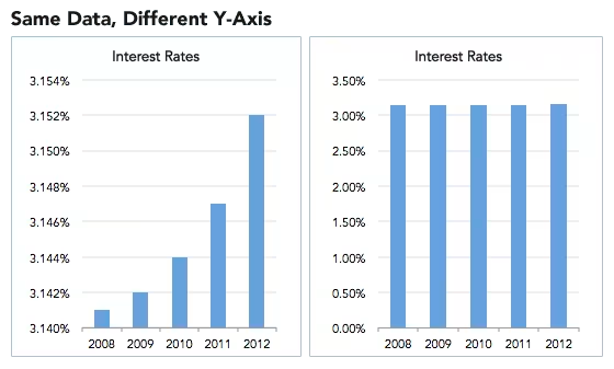
Spencer Greenberg on the critical importance of thinking critically about the charts and graphs that we constantly consume…
In 1994, the U.S. Congress passed the largest crime bill in U.S. history, called the Violent Crime Control and Law Enforcement Act. The bill allocated billions of dollars to build more prisons and hire 100,000 new police officers, among other things. In the years following the bill’s passage, violent crime rates in the U.S. dropped drastically, from around 750 offenses per 100,000 people in 1990 to under 400 in 2018.
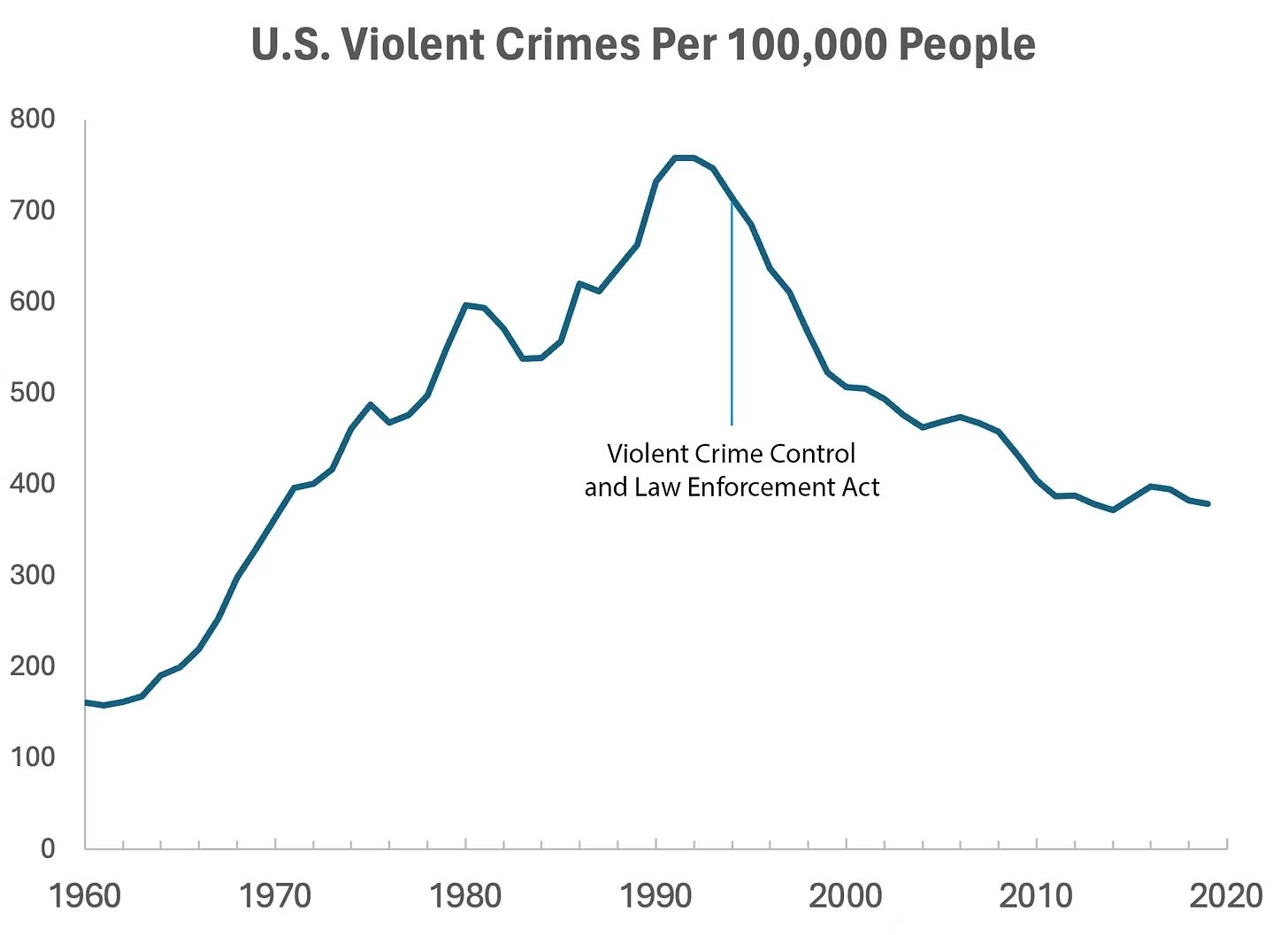
But can we infer, as this chart seems to ask us to, that the bill caused the drop in crime?
As it turns out, this chart wasn’t put together by sociologists or political scientists who’ve studied violent crime. Rather, we—a mathematician and a writer—devised it to make a point: Although charts seem to reflect reality, they often convey narratives that are misleading or entirely false.
Upon seeing that violent crime dipped after 1990, we looked up major events that happened right around that time—selecting one, the 1994 Crime Bill, and slapping it on the graph. There are other events we could have stuck on the graph just as easily that would likely have invited you to construct a completely different causal story. In other words, the bill and the data in the graph are real, but the story is manufactured.
Perhaps the 1994 Crime Bill really did cause the drop in violent crime, or perhaps the causality goes the other way: the spike in violent crime motivated politicians to pass the act in the first place. (Note that the act was passed slightly after the violent crime rate peaked!)
Charts are a concise way not only to show data but also to tell a story. Such stories, however, reflect the interpretations of a chart’s creators and are often accepted by the viewer without skepticism. As Noah Smith and many others have argued, charts contain hidden assumptions that can drastically change the story they tell.
This has important consequences for science, which, in its ideal form, attempts to report findings as objectively as possible. When a single chart can be the explanatory linchpin for years of scientific effort, unveiling a data visualization’s hidden assumptions becomes an essential skill for determining what’s really true. As physicist Richard Feynman once said: In science, “the first principle is that you must not fool yourself, and you are the easiest person to fool.”What we mean to say is—don’t be fooled by charts…
[Greenberg unpacks a couple of powerful examples…]
… to avoid producing a chart that misleads scientists, which misleads journalists, which misleads the public, and which then contributes to widespread confusion, you must think carefully about what you actually aim to measure. Which representation of the data best reflects the question being asked and relies on the sturdiest assumptions?
After all, scientific charts are a means to read data rather than an explanation of how that data is collected. The explanation comes from a careful reading of methods, parameters, definitions, and good epistemic practices like interrogating where data comes from and what could be motivating the researchers who produced it.
In the end, the story a chart tells is still just that—a story—and to be a discerning reader, you must reveal and interrogate the assumptions that steer those narratives…
Eminently worth reading in full: “How charts can inadvertently manipulate reality,” from @spencrgreenberg.bsky.social.
* Alberto Cairo, How Charts Lie: Getting Smarter about Visual Information
###
As we ferret out the facts, we might recall that it was on this date in 1874 that Florence Nightingale became the first female President of the Royal Statistical Society.
Famed for her work as a nurse in the Crimean War, she went on to found training facilities and nursing homes– pioneering both medical training for women and what is now known as Social Entrepreneuring. Less well-known are Nightingale’s contributions to epidemiology, statistics, and the visual communication of data in the field of public health. Always good at math, she pioneered the use of the polar area chart (the equivalent to a modern circular histogram or rose diagram) and popularized the pie chart (which had been developed in 1801 by William Playfair). Nightingale later became an honorary member of the American Statistical Association.

“Diagram of the causes of mortality in the army in the East” by Florence Nightingale, an example of the the polar area diagram (AKA, the Nightingale rose diagram) source

“The path to paradise begins in hell”*…

It’s been over 700 years since Dante Aligheri found himself, midway along the journey of his life, within a dark forest. His terza rima epic, The Divine Comedy, rivets us still…. and as Hunter Dukes recounts, raises questions…
Ever since the publication of Dante’s Divine Comedy, scholars and artists have tried to map the Inferno’s architecture, survey Purgatory, and measure their way across the spheres of Paradise. The first cosmographer of Dante’s universe was the Florentine polymath Antonio Manetti, whose unpublished research — which mathematically concluded that hell was 3246 miles wide and 408 miles deep — inspired the woodcuts used for a landmark 1506 edition of the poem. In 1588, a young Galileo weighed in, deriving Lucifer’s height and armlength (1200 and 340 meters respectively) and suggesting that the Inferno’s vaulted ceiling was supported by the same physical principles as Brunellesci’s dome. The scholarly tradition continued for centuries, culminating with the works of Michelangelo Caetani, who designed a series of maps and charts. These were published as The Divine Comedy of Dante Alighieri Described in Six Plates and appeared in two editions, an 1855 edition featuring hand-colored lithographs and an 1872 edition printed using an early form of chromolithography, deployed by an order of monks at Monte Cassino near Rome…
Learn more about Caetani and his approach, and see more of his work: “Diagramming Dante: Michelangelo Caetani’s Maps of the Divina Commedia,” from @hunterdukes in @PublicDomainRev.
* Dante Alighieri
###
As we chart cosmology, we might recall that it was on this date in 1971 that Michael Hart launched the source of the link to The Divine Comedy embedded above, Project Gutenberg, and effectively invented ebooks. It debuted on ARPANET.
An online library of free ebooks, it currently has over 70,000 items available (in plain text as well as other formats, such as HTML, PDF, EPUB, MOBI, and Plucker wherever possible).

“Only in our dreams are we free. The rest of the time we need wages.”*…

The Economist is repurposing one of its famous indices…
Since 1986 The Economist has produced the Big Mac index as a light-hearted gauge of whether currencies are at their “correct” level. The famous burger is a good test of currency valuations because of its global uniformity and ubiquity. The same properties make it a useful way of comparing international salaries: how many Big Macs, in principle, can a typical worker afford with their wages?
The more conventional way of comparing incomes is to convert wages in different countries into a common currency. But that is misleading because exchange rates are volatile. Moreover, one American dollar goes a lot farther in, say, the Philippines than it does in America itself. The Big Mac helps to solve this problem as a ready-made illustration of purchasing power: it represents a bundle of goods (or, rather, a bun of goods) that is identical everywhere, and so it serves as a yardstick of the real cost of things from country to country.
For the Big Mac wage analysis (the MacWage, for short), we started with full-time, pre-tax earnings in 2023 as reported by the OECD, a club of 38 mostly rich countries. We then made a simple adjustment, dividing wages by the price of a Big Mac—all in local currencies. That gave us the number of burgers that the average full-time worker can buy annually.
The results? Americans can perhaps be forgiven for having somewhat expansive waistlines. Although fast-food prices have rocketed since the pandemic, Americans still earn more greasy calories than any others in our analysis [chart below]. The average American worker takes home the equivalent of 14,000 Big Macs in wages for a year of full-time work. At 590 calories a pop, they could buy enough burgers to keep ten adults fed for a year. The Swiss and Danes come, respectively, second and third in MacWages. At the bottom are Mexican workers, who can afford to buy about 2,500 Big Macs with their average annual wages.

A standard objection to any measure of higher incomes in America is that its workers generally get less time off. To factor this in, we looked at average hours worked, based on data from the OECD and the Conference Board, a business-research group. This yields slightly different results (see chart 2). Americans still get more than enough Big Macs—pulling in the equivalent of about 7.4 per hour on the job—but they drop to third in the ranking. The burger champions are the Danes, who earn 8.1 per hour, followed by the Swiss. Looked at another way, the average Dane works for just seven minutes to make enough money to buy a Big Mac. In Mexico—still at the bottom of the rankings after this hourly adjustment—workers must toil for about 57 minutes.

The MacWage is, of course, far from perfect. Danes may celebrate their top performance, but our measure misses how income taxes (which can surpass 50% in Denmark) eat into their burger budgets. Much else of what goes into the cost of living, from housing to transportation, is also barely reflected in the price of burgers. In a developing country like Mexico, where housing is relatively cheap and American fast-food indulgences relatively expensive, a burger-based wage calculation understates how much stuff an average worker can actually afford. Still, as a quick method for comparing incomes around the world, the MacWage is easily digestible…
The purchasing power of average earners across the OECD: “An alternative use for The Economist’s Big Mac index” from @ECONdailycharts in @TheEconomist.
* Terry Pratchett
###
As we supersize that, we might recall that it was on this date in 1979 that the U.S. government agreed to a bailout of the Chrysler Corporation. The smallest of the “Big Three” automakers, but still the 10th largest company in America, Chrysler suffering from a combination a bad management decisions and increased competition from Japanese and German automakers. Facing a $500 million loss for the year (and probably bankruptcy), newly-installed CEO Lee Iacocca asked the government for a guarantee on a $1.5 Billion loan package. In return for detailed plans from Chrysler detailing both how the company would right its ship and how other constituents (employees, suppliers, lenders) would make concessions, the Carter Administration (which feared that a Chrysler failure could lead to a “depression”– and depression-level unemployment– in the auto industry) agreed. In return for its guarantee, the government received stock warrants in the company.
Chrysler did turn itself around: it proceeded to introduce the “K-Car” line, then mini-vans, then the earliest generation of SUVs. The company repaid the government-guaranteed debt ahead of schedule; the Treasury made about $500 million on its warrants.
But of course, nearly thirty years later, in 2008, Chrysler received billions in a new bailout from the U.S. government in the aftermath of the financial crisis that decimated automotive sales over the following few years. Chrysler filed for Chapter 11 bankruptcy in April 2009, before being acquired in total by Fiat in 2014.

“You see much more of your children after they leave home”*…

… And so, American parents are seeing less of their 18-24 year-old kids. From David Crowther, a graphic reminder that a historic rite of passage for young people and their parents has changed…
As we enter the peak summer months, many students and newly-minted college graduates are taking their first steps into the big bad world of work. In decades gone by, a wave of weddings often followed and young newlyweds shacked up to leave a huge cohort of “empty nesters” behind. That is no longer the case.
In the late 1960s, nearly 40% of 18-24 year-olds lived with their spouse. Last year, just 6% did.
Indeed, data plotted from the Census Bureau (and inspired by reddit user u/theimpossiblesalad) reveals how dramatically the living arrangements of America’s youngest adults have changed in the last 50+ years…

More on how we now live: “Who do Gen Z and Millennials live with in America?” from @ChiefChartmaker in @chartrdaily.
* Lucille Ball
###
As we ruminate on residence, we might recall that it was on this date in 1910 that those epic enactors of the human condition Krazy Kat (and Ignatz Mouse) first appeared in print, in New York Journal (as the “downstairs” strip in George Herriman’s predecessor comic, The Dingbat Family (later, The Family Upstairs). Krazy, Ignatz, and Offisa Pup stepped out on their own in 1913 and ran until 1944– but never actually succeeded financially. It was only the admiration (and support) of publisher William Randolph Hearst that kept those bricks aloft.

“The greatest value of a picture is when it forces us to notice what we never expected to see”*…

The breath-takingly broadly talented Joesph Preistley left us much– not least, Alyson Foster explains, a then-new way of understanding history…
It’s a testament to the wide-ranging and unconventional nature of Joseph Priestley’s mind that no one has settled on a term to sum up exactly what he was. The eighteenth-century British polymath has been described as, among other things, a historian, a chemist, an educator, a philosopher, a theologian, and a political radical who became, for a period of time, the most despised person in England. Priestley’s many contradictions—as a rationalist Unitarian millenarian, as a mild-mannered controversialist, as a thinker who was both ahead of his time and behind it—have provided endless fodder for the historians who have debated the precise nature of his legacy and his place among his fellow Enlightenment intellectuals. But his contributions—however they are categorized—have continued to live on in subtle and surprisingly enduring ways, more than two hundred years after his death, at the age of seventy, in rural Pennsylvania.
Take, for example, A Chart of Biography, which is considered to be the first modern timeline. This unusual, and unusually beautiful, pedagogical tool, which was published by Priestley in 1765, while he was in his thirties and working as a tutor at an academy in Warrington, England, tends to get lost in the shuffle of Priestley’s more notable achievements—his seminal 1761 textbook on language, The Rudiments of English Grammar, say, or his discovery of nine gases, including oxygen, 13 years later. But the chart, along with its companion, A New Chart of History, which Priestley published four years later, has become a curious subject of interest among data visualization aficionados who have analyzed its revolutionary design in academic papers and added it to Internet lists of notable infographics. Recently, both charts have become the focus of an NEH-supported digital humanities project, Chronographics: The Time Charts of Joseph Priestley, produced by scholars at the University of Oregon.
Even those of us ignorant of (or uninterested in) infographics can look at the painstakingly detailed Chart of Biography for a moment or two and appreciate how it has become a source of fascination. The two-foot-by-three-foot, pastel-striped paper scroll—which contains the meticulously inscribed names of approximately 2,000 poets, artists, statesmen, and other famous historical figures dating back three millennia—is visually striking, combining a formal, somewhat ornate eighteenth-century aesthetic with the precise organization of a schematic. Every single one of the chart’s subjects is grouped vertically into one of six occupational categories, then plotted out chronologically along a horizonal line divided into ten-year increments. Despite the huge quantity of information it contains, it is extremely user-friendly. Any one of Priestley’s history students could run his eye across the chart and immediately gain a sense of the temporal lay of the land. Who came first: Copernicus or Newton? How many centuries separate Genghis Khan from Joan of Arc? Which artists were working during the reign of Henry VIII? The chart was a masterful blend of form and function…
The most significant design feature of Priestley’s chart—as historians point out—was the way in which he linked units of time to units of distance on the page, similar to the way a cartographer uses scale when creating a map. (The artist Pietro Lorenzetti lived two hundred years before Titian and thus is situated twice as far from Titian as Jan van Eyck, who predated Titian by about a century.) If this innovation is hard for contemporary viewers to fully appreciate, it’s probably because Priestley’s representation of time has become a convention that’s used everywhere in visual design and seems so obvious it’s now taken for granted.
To Priestley’s contemporaries, though, who were accustomed to cumbersome Eusebian-style [see here] chronological tables or the visually striking but often obscure “stream charts” created by the era’s chronographers, Priestley’s method of capturing time on the page revealed something revelatory and new—a way of seeing historical patterns and connections that would have otherwise remained hidden. “To many readers,” wrote Daniel Rosenberg and Anthony Grafton in their book, Cartographies of Time, Priestley’s Chart of Biography offered a never-before-seen “picture of time itself.”
It was no wonder, then, that eighteenth-century readers found themselves drawn to it. A Chart of Biography sold well in both England and the United States, accruing many fans along the way. Along with the New Chart of History, it would go on to be printed in at least 19 editions and spawn numerous imitations, including one by Priestley’s future friend Thomas Jefferson, who developed his own “time chart” of market seasons in Washington, and the historian David Ramsay, who acknowledged Priestley’s influence in his Historical and Biographical Chart of the United States. The time charts marked Priestley’s first major commercial success and played a key role in establishing his reputation as a serious intellectual, earning him an honorary degree from the University of Edinburgh, and helping him secure a fellowship nomination to the Royal Society of London.
As much as anything he published, and he published a staggering amount—somewhere between 150 and 200 books, articles, papers, and pamphlets—Priestley’s time charts encapsulate his uniqueness as a thinker. Of his many intellectual gifts, his gift for synthesis—for knitting together the seemingly disparate things that caught his attention—might have been his greatest…
Read on for how Priestley went on to become the most controversial man in England: “Joseph Priestley Created Revolutionary ‘Maps’ of Time,” by @alysonafoster in @humanitiesmag from @NEHgov.
More info on the Chart– and magnified views– here.
###
As we celebrate constructive charts, we might spare a thought for Edward Lorenz, a mathematician and meteorologist, best remembered as a pioneer of Chaos Theory; he died on this date in 2008. Having noticed that his computer weather simulation gave wildly different results from even tiny changes in the input data, he began investigating a phenomenon that he famously outlined in a 1963 paper— and that came to be known as the “butterfly effect,” that the flap of a butterfly’s wings could ultimately determine the weather thousands of miles away and days later… generalized in Chaos Theory to state that “slightly differing initial states can evolve into considerably different [later] states.”

You must be logged in to post a comment.