Posts Tagged ‘infographics’
“A simile is just a metaphor with the scaffolding still up”*…
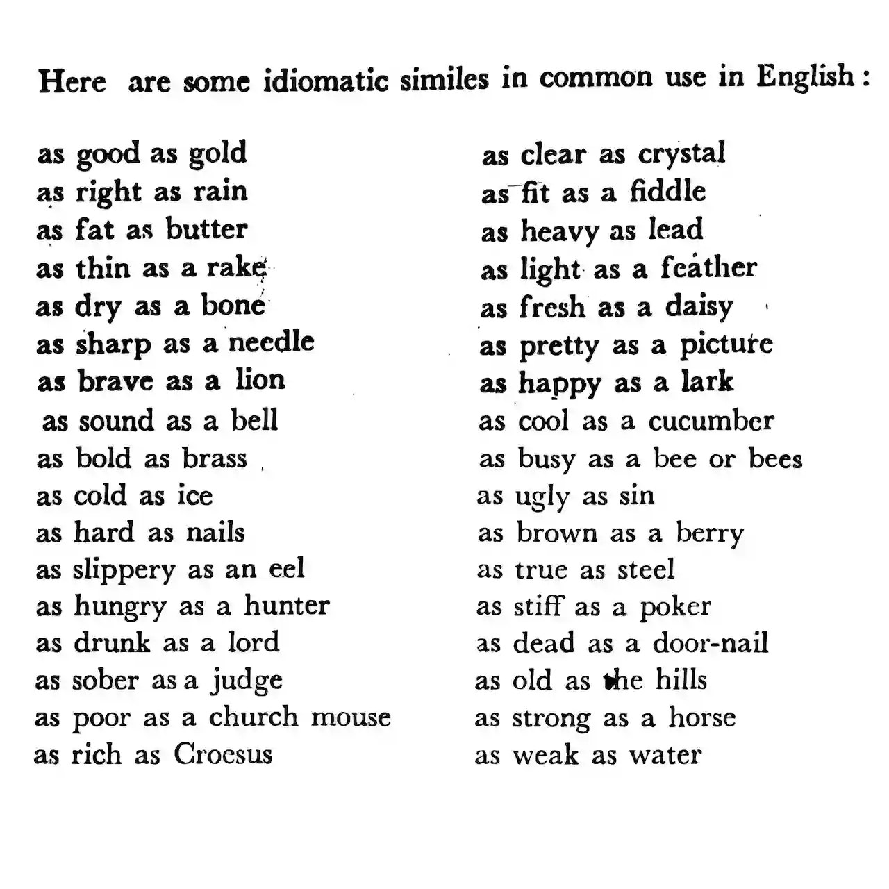
Russell Samora has been fooling around with figures of speech; with his colleagues at The Pudding, he’s fielded a fascinating analysis of of that comparative workhorse, the simile…
Similes are all around us. But, if you haven’t considered this figure of speech since grade school, here’s a refresher: similes compare a shared quality of two things, often using “like” or “as.”
I pulled every simile in the form “as ___ as ___” from tens of thousands of fiction books for the top 500 most common adjectives… I thought it would be a trivial exercise, but the more I poked around, the more questions I had…
Samora explains how similes are structured and how they are used (and with what relative frequency) in literature. He examines some of the most common– and several special cases (“The Ironic Ones”). And he explains his methodology and sources… all in the context of a lovely interactive data visualization.
It’s as cool as hell: “Comparisons as Predictable as the Sunrise,” from @pudding.cool.
###
As we agree with Steve Martin that “a day without sunshine is like, you know, night,” we might recall that it was on this date in 1789 that Richard Kirwan published his essay in support of the phlogiston theory (the belief, that dates to alchemical times, in the existence of a fire-like element (dubbed “phlogiston”) contained within combustible bodies and released during burning. Kirwan was among the last of its advocates.
A well-regarded scientist in the late 18th and early 19th centuries, Kirwan met and corresponded with Black, Lavoisier, Priestley, and Cavendish. Indeed, while scientific history remembers him as a defender of an incorrect theory, his work probably spurred Priestley and Lavoisier, who respectively discovered and named the actual elemental agent of combustion, oxygen.
But Kirwan is also remembered for a personal eccentricity (one of many) that led to some referring to him (all too poignantly) as “crazy as a bed bug”: he hated bugs (especially flies). Kirwan paid his servants a bounty for each one they killed.

“Where liberty dwells, there is my country”*…

Ah, but where might that be? Amos Miller (using tools from the good folks at Mapbox) shares a handy site with the answers…
The Civic Atlas is a project which marries leading civic data sets with information on governance types and physical capitals.
This project is an exploration of physical governance. As international relations enter another era of rocky uncertainty, it’s important to have the opportunity to look at a world which is not flat or equal. Many countries are on the march away from freedom and democracy towards autocracy. Many are already there.
Explore this project by selecting various freedom and democracy indices in the dropdown menu. Click a state to see where its legislative authority is housed, more information about the country, its governance system, and its governance scores. To learn more about each index, click on its link in the nav bar while selected.This is our globe.
We all live here.
A visualization of governance around the globe: “The Civic Atlas.”
* Latin phrase of unknown origin; the motto of Algernon Sydney and James Otis
###
As we compare and contrast, we might spare a thought for Alexis de Tocqueville; he died on this date in 1859. A French diplomat, political philosopher, and historian, he is best known for his works Democracy in America (appearing in two volumes, 1835 and 1840) and The Old Regime and the Revolution (1856). In both, he analyzed the living standards and social conditions of individuals as well as their relationship to the market and state in Western societies. Democracy in America was published after Tocqueville’s travels in the United States (on a mission to examine prisons and penitentiaries here) and is today considered an immensely important early work of sociology and political science.
“The surface of American society is covered with a layer of democracy, from beneath which the old aristocratic colors sometimes peep” – from Democracy in America

“A billion here, a billion there, and pretty soon you’re talking real money”

See how the amount donated by Americans to charity per year compares to the size of outstanding student debt. Or how Walmart’s revenue measures up against Elon Musk’s wealth. Or how the U.S. military budget stacks up against China’s… and so much more.
From the estimable David McCandless and his wonderful site Information is Beautiful, an illustration of how expenses and wealth that run to over a billion dollars compare.
Then peruse “$Trillions.”
###
As we ponder the pecuniary, we might recall that on this date in 1989, Exxon Valdez, an oil supertanker owned by Exxon Shipping Company, bound for Long Beach, California, struck Prince William Sound‘s Bligh Reef, 6 mi west of Tatitlek, Alaska. The tanker spilled more than 10 million US gallons of crude oil over the next few days.
The Exxon Valdez spill is the second largest in U.S. waters, after the 2010 Deepwater Horizon oil spill, in terms of volume of oil released. It is the costliest disaster ever with no direct human fatalities. The oil, extracted from the Prudhoe Bay Oil Field, eventually affected 1,300 miles of coastline, of which 200 miles were heavily or moderately oiled; and it wreaked havoc with the habitats salmon, sea otters, seals, and seabirds in its path.
Exxon spent an estimated $2 billion cleaning up the spill and a further $1 billion to settle related civil and criminal charges. Exxon was also assessed another $2.5 billion in punitive damages in a suit (Exxon v. Baker)… but that was reduced by the Supreme Court to roughly $500 million. Exxon remained hugely profitable– the process of payment was drawn out over decades and long term damage continues and is not funded by Exxon. Hence, the Exxon spill is often cited as shorthand in conversations about corporate responsibility as a case of accountability for societal damage inadequately enforced.

“Don’t look away. Look straight at everything. Look it all in the eye, good and bad.”*…

Frustrated by fragmented war news, Elie Habib built World Monitor, a platform that fuses global data– everything from military activity and intel hotspots to climate events and cyber threats– to track trouble as it unfolds. Lilian Wagdy reports…
Elie Habib doesn’t work in the defense or intelligence industries. Instead, he runs Anghami, one of the Middle East’s largest music streaming platforms. But as missiles began flying across the region, a side project he coded earlier this year suddenly became something bigger: an open-source dashboard people around the world were using to track the war in real time…
… The idea emerged as headlines began colliding in ways that felt impossible to follow. “The news became genuinely hard to parse,” he says. “Iran, Trump’s decisions, financial markets, critical minerals, tensions compounding from every direction simultaneously.”
Traditional media wasn’t solving the problem he had in mind. “I didn’t need a news aggregator,” he says. “I needed something that showed me how these events connect to each other in real time. The existing OSINT tools that did this cost governments and large enterprises tens of thousands of dollars annually.”…
… The platform processes a messy stream of global data, bypassing social media noise to pull facts directly from the source.
“The system ingests 100-plus data streams simultaneously,” Habib notes. The result is a constantly updating map of global tensions: conflict zones with escalation scores, military aircraft broadcasting positions through ADS-B transponders, ship movements tracked through AIS signals, nuclear installations, submarine cables, internet outages and satellite fire detections.
“Everything is normalized, geolocated and rendered on a WebGL globe capable of displaying thousands of markers without frame drops,” Habib says.
The underlying architecture wasn’t built from scratch. Much of it draws on the same principles used to process massive volumes of streaming data…
… Processing hundreds of live data streams during a military conflict raises a question: How do you verify information fast enough to keep the system moving?
Habib’s answer was to remove human editors entirely. “Zero editorializing,” he says. “No human editor makes a call.”
Instead, Habib says the platform relies on a strict source hierarchy. Wire services and official channels such as Reuters, AP, the Pentagon and the UN sit at the top tier. Major broadcasters including the BBC and Al Jazeera follow, along with specialist investigative outlets such as Bellingcat. In total, he says the system processes about 190 sources, assigning higher confidence scores to more reliable ones.
Software then scans incoming reports for major events and emerging patterns. If multiple credible sources report the same development within minutes, the system flags it as a breaking alert. But headlines alone are not enough.
Because online claims can be unreliable, the platform also looks for physical signals on the ground. It tracks disruptions such as internet blackouts, diverted military flights, halted cargo ships and satellite-detected fires. “A convergence algorithm then checks how many distinct signal types activate in the same geography simultaneously,” Habib says.
“One signal is noise. Three or four converging in the same location is the signal worth surfacing,” Habib says. If an internet outage coincides with diverted aircraft and a satellite heat signature in the same area, the map flags a potential escalation.
Habib acknowledges that removing humans from the loop carries risks. “The multi-tier source-credibility system and convergence algorithm [are a] substitute for editorial judgment,” he says. “Whether that creates blind spots in genuinely novel scenarios, an event with no historical baseline, is a real architectural question the system doesn’t fully resolve.”…
… Habib does not plan for the platform to become a business. “World Monitor started as a personal learning project,” he says. But the experiment quickly grew beyond that. Developers from around the world began contributing code and ideas, helping expand the system’s capabilities.
Now the project is shifting toward a broader goal. “The direction shifts from pure conflict tracking toward broader world signal understanding and acting on these signals,” Habib says.
Instead of simply mapping events after they happen, the platform is increasingly designed to detect patterns before they become headlines, Habib says. “The architecture is moving toward predicting where signals converge before events become news.”…
More at: “How a Music Streaming CEO Built an Open-Source Global Threat Map in His Spare Time,” from @lilianwagdy81.bsky.social and @wired.com. (JIC of paywall trouble, here is an archived link.)
Then, try out World Monitor yourself.
* Henry Miller
###
As we pay attention, we might recall that today is the anniversary of an event that would surely have made Wolrd Monitor’s map if that tool hasd been around back then: on the this date in 2011, Tōhoku earthquake (a 9.0–9.1 undersea megathrust earthquake occurred in the Pacific Ocean, 45 mi east of the Oshika Peninsula of the Tōhoku region— the most powerful earthquake ever recorded in Japan, and the fourth most powerful earthquake recorded in the world since modern seismography began in 1900.
The quake was followed by a tsunami that killed thousands and caused the devastation of whole cities. Together, they did damage estimated to have cost well into the tens of billions of US dollars. Famously, the quake and subsequent tsunami caused the shutdown of eleven nuclear reactors in power plants in the region. The Fukushima reactors were especially heavily damaged, and leaked radioactive waste water, leading to radiation levels outside the plant that were up to eight times normal levels.

“The greatest value of a picture is when it forces us to notice what we never expected to see”*…

The breath-takingly broadly talented Joesph Preistley left us much– not least, Alyson Foster explains, a then-new way of understanding history…
It’s a testament to the wide-ranging and unconventional nature of Joseph Priestley’s mind that no one has settled on a term to sum up exactly what he was. The eighteenth-century British polymath has been described as, among other things, a historian, a chemist, an educator, a philosopher, a theologian, and a political radical who became, for a period of time, the most despised person in England. Priestley’s many contradictions—as a rationalist Unitarian millenarian, as a mild-mannered controversialist, as a thinker who was both ahead of his time and behind it—have provided endless fodder for the historians who have debated the precise nature of his legacy and his place among his fellow Enlightenment intellectuals. But his contributions—however they are categorized—have continued to live on in subtle and surprisingly enduring ways, more than two hundred years after his death, at the age of seventy, in rural Pennsylvania.
Take, for example, A Chart of Biography, which is considered to be the first modern timeline. This unusual, and unusually beautiful, pedagogical tool, which was published by Priestley in 1765, while he was in his thirties and working as a tutor at an academy in Warrington, England, tends to get lost in the shuffle of Priestley’s more notable achievements—his seminal 1761 textbook on language, The Rudiments of English Grammar, say, or his discovery of nine gases, including oxygen, 13 years later. But the chart, along with its companion, A New Chart of History, which Priestley published four years later, has become a curious subject of interest among data visualization aficionados who have analyzed its revolutionary design in academic papers and added it to Internet lists of notable infographics. Recently, both charts have become the focus of an NEH-supported digital humanities project, Chronographics: The Time Charts of Joseph Priestley, produced by scholars at the University of Oregon.
Even those of us ignorant of (or uninterested in) infographics can look at the painstakingly detailed Chart of Biography for a moment or two and appreciate how it has become a source of fascination. The two-foot-by-three-foot, pastel-striped paper scroll—which contains the meticulously inscribed names of approximately 2,000 poets, artists, statesmen, and other famous historical figures dating back three millennia—is visually striking, combining a formal, somewhat ornate eighteenth-century aesthetic with the precise organization of a schematic. Every single one of the chart’s subjects is grouped vertically into one of six occupational categories, then plotted out chronologically along a horizonal line divided into ten-year increments. Despite the huge quantity of information it contains, it is extremely user-friendly. Any one of Priestley’s history students could run his eye across the chart and immediately gain a sense of the temporal lay of the land. Who came first: Copernicus or Newton? How many centuries separate Genghis Khan from Joan of Arc? Which artists were working during the reign of Henry VIII? The chart was a masterful blend of form and function…
The most significant design feature of Priestley’s chart—as historians point out—was the way in which he linked units of time to units of distance on the page, similar to the way a cartographer uses scale when creating a map. (The artist Pietro Lorenzetti lived two hundred years before Titian and thus is situated twice as far from Titian as Jan van Eyck, who predated Titian by about a century.) If this innovation is hard for contemporary viewers to fully appreciate, it’s probably because Priestley’s representation of time has become a convention that’s used everywhere in visual design and seems so obvious it’s now taken for granted.
To Priestley’s contemporaries, though, who were accustomed to cumbersome Eusebian-style [see here] chronological tables or the visually striking but often obscure “stream charts” created by the era’s chronographers, Priestley’s method of capturing time on the page revealed something revelatory and new—a way of seeing historical patterns and connections that would have otherwise remained hidden. “To many readers,” wrote Daniel Rosenberg and Anthony Grafton in their book, Cartographies of Time, Priestley’s Chart of Biography offered a never-before-seen “picture of time itself.”
It was no wonder, then, that eighteenth-century readers found themselves drawn to it. A Chart of Biography sold well in both England and the United States, accruing many fans along the way. Along with the New Chart of History, it would go on to be printed in at least 19 editions and spawn numerous imitations, including one by Priestley’s future friend Thomas Jefferson, who developed his own “time chart” of market seasons in Washington, and the historian David Ramsay, who acknowledged Priestley’s influence in his Historical and Biographical Chart of the United States. The time charts marked Priestley’s first major commercial success and played a key role in establishing his reputation as a serious intellectual, earning him an honorary degree from the University of Edinburgh, and helping him secure a fellowship nomination to the Royal Society of London.
As much as anything he published, and he published a staggering amount—somewhere between 150 and 200 books, articles, papers, and pamphlets—Priestley’s time charts encapsulate his uniqueness as a thinker. Of his many intellectual gifts, his gift for synthesis—for knitting together the seemingly disparate things that caught his attention—might have been his greatest…
Read on for how Priestley went on to become the most controversial man in England: “Joseph Priestley Created Revolutionary ‘Maps’ of Time,” by @alysonafoster in @humanitiesmag from @NEHgov.
More info on the Chart– and magnified views– here.
###
As we celebrate constructive charts, we might spare a thought for Edward Lorenz, a mathematician and meteorologist, best remembered as a pioneer of Chaos Theory; he died on this date in 2008. Having noticed that his computer weather simulation gave wildly different results from even tiny changes in the input data, he began investigating a phenomenon that he famously outlined in a 1963 paper— and that came to be known as the “butterfly effect,” that the flap of a butterfly’s wings could ultimately determine the weather thousands of miles away and days later… generalized in Chaos Theory to state that “slightly differing initial states can evolve into considerably different [later] states.”

You must be logged in to post a comment.