Posts Tagged ‘infographics’
“Tell me what you eat and I will tell you what you are”*…

Back in 2016, Nathan Yau of Flowing Data created a fascinating set of animated infographics illustrating how the American diet had changed over the prior several decades. A few years later, he used an even more comprehensive data set to update the picture…
The United States Department of Agriculture keeps track of food availability for over 200 items, which can be used to estimate food consumption at the national level. They have data for 1970 through 2019, so we can for example, see how much beef Americans consume per year on average and how that has changed over four decades.
So that’s what I did.
How long will chicken reign supreme? Who wins between lemon and lime? Is nonfat ice cream really ice cream? Does grapefruit ever make a comeback? Find out in the charts below.
The rankings are broken into six main food groups: proteins [pictured above], vegetables, fruits, dairy, grains, and added fats…
Illuminating: “Seeing How Much [and of what] We Ate Over the Years,” from @flowingdata (where one will find larger, more legible versions of the chart above and its companions).
* Jean Anthelme Brillat-Savarin
###
As we contemplate consumption, we might recall that it was on this date in 1953 that the Cabinet-level Department of Health, Education, and Welfare (HEW) was created under President Eisenhower. Its first Secretary was Oveta Culp Hobby. (In 1979, the Department of Education Organization Act was signed into law, providing for a separate Department of Education. HEW became the Department of Health and Human Services, officially arriving on May 4, 1980.)

“In the last analysis civilization is based upon the food supply”*…

From the ever-illuminating Information is Beautiful, a look at the global food supply. Click through for a larger version of the diagram above and for illustrations of what’s being over/under consumed, and how much we really need… then ponder the fact that almost one-in-ten people in the world do not get enough to eat.
* Will Durant
###
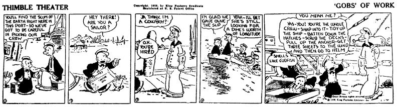
As we pick at our food, we might recall that it was on this date in 1926 that spinach-loving Popeye the Sailor, who made his first appearance in a strip (called “Thimble Theater,” along with Castor Oyle, father of Olive, who “meets” Popeye seven days later).
We might recall Popeye’s wise paraphrase of the old saw “you are what you eat”:
I yam what I yam and tha’s all what I yam.
“A map does not just chart, it unlocks and formulates meaning; it forms bridges between here and there, between disparate ideas that we did not know were previously connected”*…

Readers may recall an earlier post on John B. Sparks’ Histomap, a well-known 1931 attempt to visualize the 4,000 year history of global power. Public Domain Review takes a look at Histomap‘s ancestor/inspiration, Friedrich Strass’ Der Strom der Zeiten (published in 1803), and its influence…
In his foundational textbook Elements, the Alexandrian mathematician Euclid defined a line as “breadthless length” — a thing with only one dimension. That’s what lines can do to history when used to plot events: they condense its breadth into pure motion, featuring only those people and places that serve as forces thrusting it forwards along an infinite axis. Early in the nineteenth century, Friedrich Strass proposed a different way to visualize time’s flow. A Prussian historian and schoolteacher, he published his chronological chart in 1803, a massive diagram titled Der Strom der Zeiten oder bildliche Darstellung der Weltgeschichte von den altesten Zeiten bis zum Ende des achtzehnden Jahrhunderts (The stream of the times or an illustrated presentation of world history from the most ancient times until the eighteenth century). The linear timelines that Strass resisted, like those inspired by Joseph Priestley, “implied a uniformity in the processes of history that was simply misleading”, write Anthony Grafton and Daniel Rosenberg. Strass’ stream, by contrast, allowed historical events to “ebb and flow, fork and twist, run and roll and thunder.” It would spawn several imitations as the century drew on…
Capturing history in its organic unfolding: “The Stream of Time,” from @PublicDomainRev. See the original at the David Rumsey Map Collection.
* Reif Larsen
###
As we contemplate chronology, we might recall that it was on this date in 1800 that the Library of Congress was established. James Madison has first proposed a national library in 1783. But it wasn’t until 1800, when (on this date) President John Adams signed signed an act of Congress providing for the transfer of the seat of government from Philadelphia to the new capital city of Washington, that the deed was done. The Act appropriated $5,000 “for the purchase of such books as may be necessary for the use of Congress … and for fitting up a suitable apartment for containing them.” Books were ordered from London, creating a collection consisting of 740 books and three maps, which were housed in the new United States Capitol.
But in 1814, during the War of 1812, British forces burned the Capitol Building, and with it, the the collection (by then, around 3,000 volumes). The Library as we know it was created from those ashes. Thomas Jefferson offered to sell his personal library– 6,487 books– as a replacement, Congress accepted, and the Library of Congress grew from there.

“It is what it is”*…
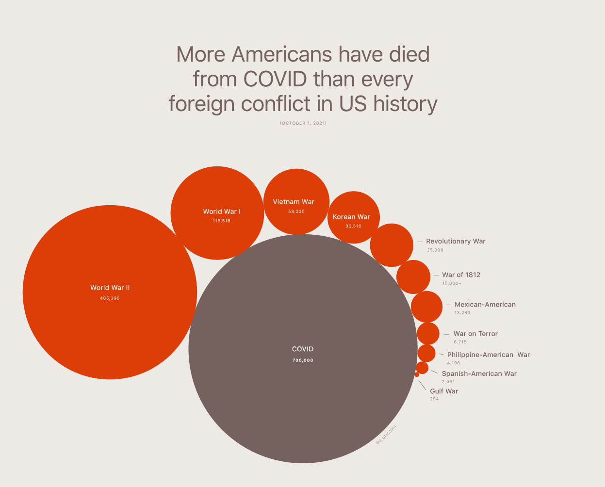
COVID-19 deaths in the U.S. have topped 700,000, which means that more Americans have died in the pandemic than died in every foreign conflict the U.S. has ever fought (combined combat deaths in all U.S foreign wars are estimated at 659,267).
This graphic is from r/dataisbeautiful.
Two things to note:
- Deaths in the American Civil War were equal or higher (they’re estimated to have been 620,000 and 750,000 soldiers dead, along with an undetermined number of civilian casualties).
- On a death-per-100,000-population basis, COVID-19 deaths are at roughly 211 per 100,000. That’s materially more than deaths in any U.S. foreign war except World War II (which had a death toll of 307 per 100,000). See here and here for the underlying data.
* then-President Donald Trump, on COVID deaths
###
As we mourn, we might recall that it was on this date in 1945 that Desmond Doss received the U.S. Medal of Honor. A conscientious objector serving as a U.S. Army medic, he saved 75 men during the Battle of Okinawa during World War II. (Prior to that, he had twice been awarded the Bronze Star for heroism in Guam and the Philippines.) He was the only conscientious objector to receive the Medal of Honor for his actions during the war; his story has been told in several books, a documentary (The Conscientious Objector), and the 2016 Oscar-winning film Hacksaw Ridge.

“When the graphs were finished, the relations were obvious at once”*…

We can only understand what we can “see”…
… this long-forgotten, hand-drawn infographic from the 1840s… known as a “life table,” was created by William Farr, a doctor and statistician who, for most of the Victorian era, oversaw the collection of public health statistics in England and Wales… it’s a triptych documenting the death rates by age in three key population groups: metropolitan London, industrial Liverpool, and rural Surrey.
With these visualizations, Farr was making a definitive contribution to an urgent debate from the period: were these new industrial cities causing people to die at a higher rate? In some ways, with hindsight, you can think of this as one of the most crucial questions for the entire world at that moment. The Victorians didn’t realize it at the time, but the globe was about to go from less than five percent of its population living in cities to more than fifty percent in just about a century and a half. If these new cities were going to be killing machines, we probably needed to figure that out.
It’s hard to imagine just how confusing it was to live through the transition to industrial urbanism as it was happening for the first time. Nobody really had a full handle on the magnitude of the shift and its vast unintended consequences. This was particularly true of public health. There was an intuitive feeling that people were dying at higher rates than they had in the countryside, but it was very hard even for the experts to determine the magnitude of the threat. Everyone was living under the spell of anecdote and availability bias. Seeing the situation from the birds-eye view of public health data was almost impossible…
The images Farr created told a terrifying and unequivocal story: density kills. In Surrey, the increase of mortality after birth is a gentle slope upward, a dune rising out of the waterline. The spike in Liverpool, by comparison, looks more like the cliffs of Dover. That steep ascent condensed thousands of individual tragedies into one vivid and scandalous image: in industrial Liverpool, more than half of all children born were dead before their fifteenth birthday.
The mean age of death was just as shocking: the countryfolk were enjoying life expectancies close to fifty, likely making them some of the longest-lived people on the planet in 1840. The national average was forty-one. London was thirty-five. But Liverpool—a city that had undergone staggering explosions in population density, thanks to industrialization—was the true shocker. The average Liverpudlian died at the age of twenty-five, one of the lowest life expectancies ever recorded in that large a human population.
There’s a natural inclination to think about innovation in human health as a procession of material objects: vaccines, antibiotics, pacemakers. But Farr’s life tables are a reminder that new ways of perceiving the problems we face, new ways of seeing the underlying data, are the foundations on which we build those other, more tangible interventions. Today cities reliably see life expectancies higher than rural areas—a development that would have seemed miraculous to William Farr, tabulating the data in the early 1840s. In a real sense, Farr laid the groundwork for that historic reversal: you couldn’t start to tackle the problem of how to make industrial cities safer until you had first determined that the threat was real.
Why the most important health innovations sometimes come from new ways of seeing: “The Obscure Hand-Drawn Infographic That Changed The Way We Think About Cities,” from Steven Johnson (@stevenbjohnson). More in his book, Extra Life, and in episode 3 of the PBS series based on it.
###
As we investigate infographics, we might send carefully calculated birthday greetings to Lewis Fry Richardson; he was born on this date in 1881. A mathematician, physicist, and psychologist, he is best remembered for pioneering the modern mathematical techniques of weather forecasting. Richardson’s interest in weather led him to propose a scheme for forecasting using differential equations, the method used today, though when he published Weather Prediction by Numerical Process in 1922, suitably fast computing was unavailable. Indeed, his proof-of-concept– a retrospective “forecast” of the weather on May 20, 1910– took three months to complete by hand. (in fairness, Richardson did the analysis in his free time while serving as an ambulance driver in World War I.) With the advent of modern computing in the 1950’s, his ideas took hold. Still the ENIAC (the first real modern computer) took 24 hours to compute a daily forecast. But as computing got speedier, forecasting became more practical.
Richardson also yoked his forecasting techniques to his pacifist principles, developing a method of “predicting” war. He is considered (with folks like Quincy Wright and Kenneth Boulding) a father of the scientific analysis of conflict.
And Richardson helped lay the foundations for other fields and innovations: his work on coastlines and borders was influential on Mandelbrot’s development of fractal geometry; and his method for the detection of icebergs anticipated the development of sonar.

You must be logged in to post a comment.