Posts Tagged ‘Florence Nightingale’
“Any chart, no matter how well designed, will mislead us if we don’t pay attention to it. The world cannot be understood without numbers. And it cannot be understood with numbers alone.”*…
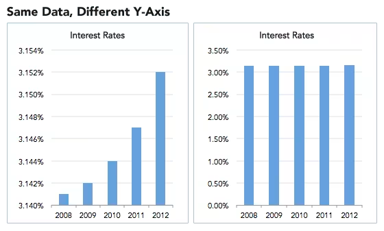
Spencer Greenberg on the critical importance of thinking critically about the charts and graphs that we constantly consume…
In 1994, the U.S. Congress passed the largest crime bill in U.S. history, called the Violent Crime Control and Law Enforcement Act. The bill allocated billions of dollars to build more prisons and hire 100,000 new police officers, among other things. In the years following the bill’s passage, violent crime rates in the U.S. dropped drastically, from around 750 offenses per 100,000 people in 1990 to under 400 in 2018.
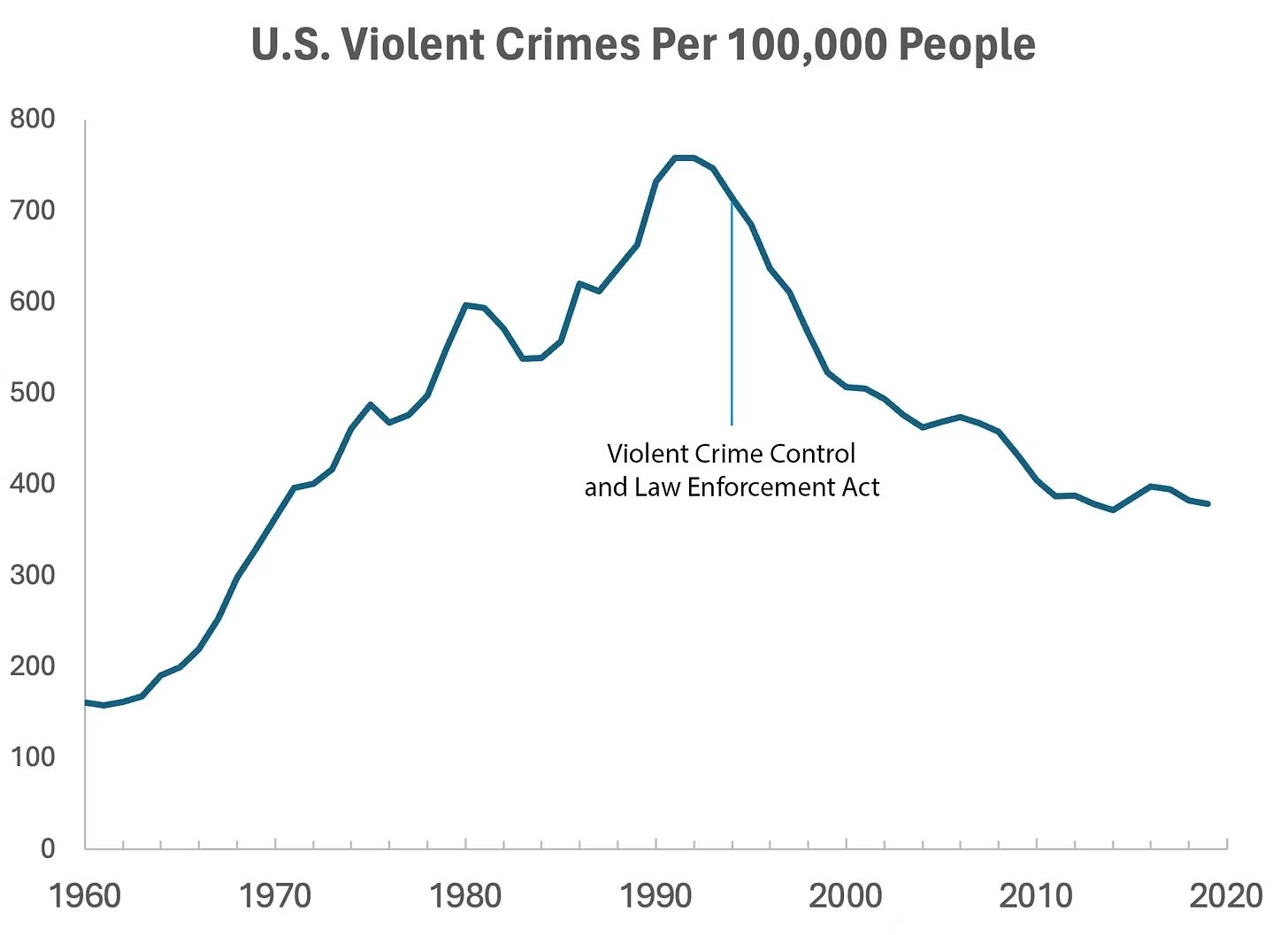
But can we infer, as this chart seems to ask us to, that the bill caused the drop in crime?
As it turns out, this chart wasn’t put together by sociologists or political scientists who’ve studied violent crime. Rather, we—a mathematician and a writer—devised it to make a point: Although charts seem to reflect reality, they often convey narratives that are misleading or entirely false.
Upon seeing that violent crime dipped after 1990, we looked up major events that happened right around that time—selecting one, the 1994 Crime Bill, and slapping it on the graph. There are other events we could have stuck on the graph just as easily that would likely have invited you to construct a completely different causal story. In other words, the bill and the data in the graph are real, but the story is manufactured.
Perhaps the 1994 Crime Bill really did cause the drop in violent crime, or perhaps the causality goes the other way: the spike in violent crime motivated politicians to pass the act in the first place. (Note that the act was passed slightly after the violent crime rate peaked!)
Charts are a concise way not only to show data but also to tell a story. Such stories, however, reflect the interpretations of a chart’s creators and are often accepted by the viewer without skepticism. As Noah Smith and many others have argued, charts contain hidden assumptions that can drastically change the story they tell.
This has important consequences for science, which, in its ideal form, attempts to report findings as objectively as possible. When a single chart can be the explanatory linchpin for years of scientific effort, unveiling a data visualization’s hidden assumptions becomes an essential skill for determining what’s really true. As physicist Richard Feynman once said: In science, “the first principle is that you must not fool yourself, and you are the easiest person to fool.”What we mean to say is—don’t be fooled by charts…
[Greenberg unpacks a couple of powerful examples…]
… to avoid producing a chart that misleads scientists, which misleads journalists, which misleads the public, and which then contributes to widespread confusion, you must think carefully about what you actually aim to measure. Which representation of the data best reflects the question being asked and relies on the sturdiest assumptions?
After all, scientific charts are a means to read data rather than an explanation of how that data is collected. The explanation comes from a careful reading of methods, parameters, definitions, and good epistemic practices like interrogating where data comes from and what could be motivating the researchers who produced it.
In the end, the story a chart tells is still just that—a story—and to be a discerning reader, you must reveal and interrogate the assumptions that steer those narratives…
Eminently worth reading in full: “How charts can inadvertently manipulate reality,” from @spencrgreenberg.bsky.social.
* Alberto Cairo, How Charts Lie: Getting Smarter about Visual Information
###
As we ferret out the facts, we might recall that it was on this date in 1874 that Florence Nightingale became the first female President of the Royal Statistical Society.
Famed for her work as a nurse in the Crimean War, she went on to found training facilities and nursing homes– pioneering both medical training for women and what is now known as Social Entrepreneuring. Less well-known are Nightingale’s contributions to epidemiology, statistics, and the visual communication of data in the field of public health. Always good at math, she pioneered the use of the polar area chart (the equivalent to a modern circular histogram or rose diagram) and popularized the pie chart (which had been developed in 1801 by William Playfair). Nightingale later became an honorary member of the American Statistical Association.

“Diagram of the causes of mortality in the army in the East” by Florence Nightingale, an example of the the polar area diagram (AKA, the Nightingale rose diagram) source

“Representation plus interpretation to develop an idea”*…

William Playfair’s trade-balance time-series chart, published in his Commercial and Political Atlas, 1786
We’ve celebrated before the formative contributions of Florence Nightingale to data visualization; as noted then, she was building on the earlier work of William Playfair. But as as Playfair was pioneering new ways to communicate complex data, he was himself building on prior efforts…
The idea of visualizing data is old: After all, that’s what a map is—a representation of geographic information—and we’ve had maps for about 8,000 years. But it was rare to graph anything other than geography. Only a few examples exist: Around the 11th century, a now-anonymous scribe created a chart of how the planets moved through the sky. By the 18th century, scientists were warming to the idea of arranging knowledge visually. The British polymath Joseph Priestley produced a “Chart of Biography,” plotting the lives of about 2,000 historical figures on a timeline. A picture, he argued, conveyed the information “with more exactness, and in much less time, than it [would take] by reading.”
Still, data visualization was rare because data was rare. That began to change rapidly in the early 19th century, because countries began to collect—and publish—reams of information about their weather, economic activity and population. “For the first time, you could deal with important social issues with hard facts, if you could find a way to analyze it,” says Michael Friendly, a professor of psychology at York University who studies the history of data visualization. “The age of data really began.”
An early innovator was the Scottish inventor and economist William Playfair. As a teenager he apprenticed to James Watt, the Scottish inventor who perfected the steam engine. Playfair was tasked with drawing up patents, which required him to develop excellent drafting and picture-drawing skills. After he left Watt’s lab, Playfair became interested in economics and convinced that he could use his facility for illustration to make data come alive.
“An average political economist would have certainly been able to produce a table for publication, but not necessarily a graph,” notes Ian Spence, a psychologist at the University of Toronto who’s writing a biography of Playfair. Playfair, who understood both data and art, was perfectly positioned to create this new discipline…
“The Surprising History of the Infographic.”
* Francesco Franchi, defining inforgraphics
###
As we make it clear, we might note that today begins National Canned Luncheon Meat Week, “celebrated” the first week of July each year.
email readers click here for video
Speak no evil…
 In danger no longer! (source)
Gawker reports [from the Hindustan Times] that Pakistan’s Telecommunications Authority has issued a list of 1,700 words [and phrases] it considers “offensive and obscene,” and has demanded that mobile providers begin filtering them from text messages as of Monday. The list, which contains hundreds of familiar swear words as well as some truly puzzling choices, is meant to curb SMS spamming, according the PTA, which it defines as “the transmission of harmful, fraudulent, misleading, illegal or unsolicited messages in bulk to any person without express permission of the recipient.”
Some of the words:
Athlete’s foot
Deposit
Black out
Drunk
Flatulence
Glazed Donut
Harem
Jesus Christ
Hostage
Murder
Penthouse
Satan
Flogging the dolphin
Monkey crotch
Idiot
Damn
Deeper
Four twenty
Go to hell
Harder
Looser
No sex
Quickie
Fairy
The full list is on Google Docs, here… after a careful consideration of which, your correspondent will be choosing his words more carefully.
As we reconsider our morning glazed donut, we might recall that it was on this date in 1839 that the American Statistical Association was formed in a meeting at the Boston home of the American Education Society by William Cogswell, teacher, fund-raiser for the ministry, and genealogist; Richard Fletcher, lawyer and U.S. Congressman; John Dix Fisher, physician and pioneer in medical reform; Oliver Peabody, lawyer, clergyman, poet, and editor; and Lemuel Shattuck, statistician, genealogist, publisher, and author of perhaps the most significant single document in the history of public health to that date.
Over the next few decades, the membership grew to over 100, including Florence Nightingale, Alexander Graham Bell, Herman Hollerith, Andrew Carnegie, and President Martin Van Buren; by 1939, the roll had expanded to 3,000. But it was after World War Two, and the explosion in the physical and social sciences, that the organization began to balloon. Today the ASA has over 17,000 members, and 23 special interest section (like Business and Economics; Biometrics, and Agricultural, Biological, and Environmental).

Pictures worth a million words…
 In his great opus De Revolutionibus Orbium Coelestium published shortly before his death in 1543, Copernicus takes 405 pages of words, numbers and equations to explain his heliocentric theory. But it is the diagram that he draws at the beginning of the book that captures in a simple image his revolutionary new idea: it is the Sun that is at the centre of the Solar System, not the Earth.
 A diagram has the power to create a whole new visual language to navigate a scientific idea. Isaac Newton’s optics diagrams [Opticks, 1704] for example transform light into geometry. By representing light as lines, Newton is able to use mathematics and geometry to predict the behaviour of light. It was a revolutionary idea.
 Mathematicians had been struggling with the idea of the square root of minus one. There seemed to be no number on the number line whose square was negative. Experts knew that if such a number existed it would transform their subject. But where was this number? It was a picture drawn independently by three mathematicians at the beginning of the 19th Century that brought these numbers to life. Called the Argand diagram after one of its creators, this picture… was a potent tool in manipulating these new numbers [Imaginary Numbers] since the geometry of the diagram reflected the underlying algebra of the numbers they depicted.
 Although better known for her contributions to nursing, Florence Nightingale’s greatest achievements were mathematical. She was the first to use the idea of a pie chart to represent data. Nightingale’s diagrams were designed to highlight deaths in the Crimea. She had discovered that the majority of deaths in the Crimea were due to poor sanitation rather than casualties in battle. She wanted to persuade government of the need for better hygiene in hospitals. She realised though that just looking at the numbers was unlikely to impress ministers. But once those numbers were translated into a picture – her “Diagram of the Causes of Mortality in the Army in the East” – the message could not be ignored.
Read more (and find links to enlarged versions of the images above) at BBC.com, in “Diagrams that Changed the World,” a teaser for new BBC TV series, Marcus du Sautoy’s six-part The Beauty of Diagrams (on air now, and available via iPlayer to readers in the U.K… and readers with VPNs that can terminate in the U.K.)
As we marvel at the power of pictures, we might recall that it was on this date in 1997 that eight planets in our Solar System lined up from West to East– beginning with Pluto, followed by Mercury, Mars, Venus, Uranus, Neptune, Saturn and Jupiter, with a crescent moon alongside– in a rare alignment visible from Earth. Mercury, Mars, Venus, Jupiter and Saturn were visible to the naked eye; the small blue dots that are Uranus and Neptune, with binoculars. Pluto was visible only by telescope (but has subsequently been demoted from “planet” anyway…). The planets also aligned in May 2000, but too close to the sun to be visible from Earth.
Readers who missed it have a long wait for the reprise: it will be at least another 100 years before so many planets will be so close and so visible.

You must be logged in to post a comment.