A few months ago I had the fleeting thought to write a post about Stephen Biesty, the DK books cross-section legend. After learning he’d passed only just last year, I was disheartened to discover his personal website and galleries had gone offline, and there were no significant retrospectives of his career that I could find.
Now, after having looked through nearly every single work he produced and having read literally everything I could find online about him, I have come to find his quiet denouement rather touching. He certainly seemed to be private by design, offering only a handful of interviews in his lifetime. The longest profile I could find is weirdly condemning of his workmanlike ethos:
The artist himself is not quite as immediately engaging. Biesty is 35, with the smooth face and straight jeans of a Microsoft programmer. He lives in a Somerset cottage of grey-gold stone between a village church and a pair of wandering geese.
Biesty’s garden glows in the late-summer sun, yet he leads the way straight up to his studio and questions about his business. The room is almost bare of artist’s clutter, more an office with fax and easel and three paintbrushes laid parallel on a tissue to dry. ‘I don’t collect stuff,’ says Biesty.
He talks about his illustrating with a stern set to his chin, as if filling out a tricky detail. He doesn’t sketch – “There isn’t time to be doing reams of doodles” – but expands his work straight from thumbnail ideas to full-scale final pieces. These he completes, eyes close to the paper and hand in rhythm, layer by repetitive layer, between 7.30am and 5.30pm every weekday. “At lunchtime I go downstairs for half an hour and a sandwich.”
Biesty makes all this sound like mass production. “You’re employed to do one thing,” he says, straight as a factory manager. “Something that’s going to sell.” There are no posters of his pictures on his studio walls.
[…] Often, he answers with “we” rather than “I”.
I have to confess a great soft spot for all this. My great grandfather was studying technical illustration at Pratt before he was drafted into the war and lost at sea. His daughter became a graphic designer, as did her daughter — my mom. I appreciate that we all sat somewhere between art and science, heart and mind. Biesty’s seeming indifference towards an artistic identity gives his work more credibility for my tastes.
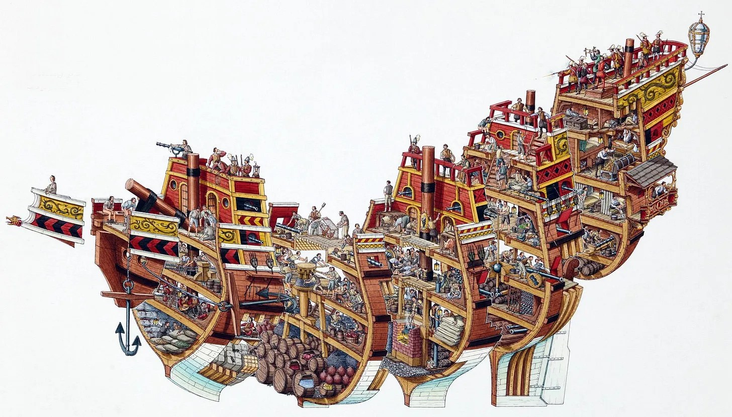
Biesty’s breakout moment came when the K of DK books asked Biesty to draw a steamboat in cross section. “I tried it lengthways and he said, ‘Fine. But try it the other way, like a loaf.’” And lo:
This became the centerpiece for his first book, Incredible Cross-Sections [here], and the seed for the rest of his career. Anyone around my age and above a certain threshold of autistic will have burned much library time on this amazing ‘90s run of DK books…
[Cole goes on to show and discuss other examples of Biesty’s work and to examine his influences…]
… Later in life, Biesty was able to admit some of the depth so evident in the work, as he accepted an award in 2011 for Into the Unknown [here]:
In a world where most information is stored and conveyed electronically, conventional non-fiction books for young people have taken a heavy hit. So is Into The Unknown a dinosaur, a final example of a Dying Breed? I believe not. In the years ahead, certainly fewer paper books will be produced. But those that are designed, written, and manufactured will be a bit like medieval manuscripts — special creations, works of art, unique, beautiful products to be collected and cherished. Into the Unknown, therefore, is not the end of a line but the beginning of a new, fresh and very beautiful one, and you have so kindly recognized that fact. Thank you all very much indeed…
* Robert J. Bezucha, The Art of the July Monarchy: France, 1830 to 1848
###
As we show (in addition to telling), we might spare a thought for an illustrator of a different ilk, William Steig; he died on this date in 2003. A cartoonist (most notably, in The New Yorker), and illustrator and writer of children’s books, he’s best known for Shrek!, which inspired the film series of the same name, as well as others that included Sylvester and the Magic Pebble (which won the Caldecott Medal), Abel’s Island, and Doctor De Soto. He was the U.S. nominee for the biennial and international Hans Christian Andersen Awards, as both a children’s book illustrator in 1982 and a writer in 1988.
When asked his opinion about the movie based on his picture book, Shrek!, William Steig responded: “It’s vulgar, it’s disgusting — and I loved it.” (With the release of Shrek 2 in 2004, Steig became the first sole-creator of an animated movie franchise that went on to generate over $1 billion from theatrical and ancillary markets after only one sequel.)
Your correspondent is headed off on the road, so (R)D will be in temporary hiatus. Regular service should resume on/around October 13. To keep you occupied until then, this tasty tidbit from Neal.fun (Neal Agarwal): “I’m not a robot.”
Diagram from S. W. Clark, A Practical Grammar (1847)
Hunter Dukes in Public Domain Review, on how scholars and pedagogues in the U.S. began to illustrate the principles of grammar, more specifically, how they began to diagram sentences…
“Once you really know how to diagram a sentence, really know it, you know practically all you have to know about English grammar”, Gertrude Stein once claimed. “I really do not know that anything has ever been more exciting than diagramming sentences. . . I like the feeling the everlasting feeling of sentences as they diagram themselves.” While one student’s lexical excitement is surely another’s slow death by gerund, Stein cuts to the heart of the grammatical pull. Is grammar prescriptive and conventional, something one learns to impose on language through trial and error? Or do sentences, in a sense, diagram themselves, revealing an innate logic and latent structure in language and the mind? More than a century before Noam Chomsky popularized the idea of a universal grammar, linguists in the United States began diagramming sentences in an attempt to visualize the complex structure — of seemingly divine origins — at their mother tongue’s core.
The history of diagramming sentences in the United States begins with James Brown’s American Grammar (1831). “Language is an emanation from God”, he writes. “As a gift, it claims our servitude; as a science, it demands our highest attention.” Accordingly, the student of grammar can lift himself up (educationally, devotionally) by knuckling down. “The mind becomes a passenger; the body his chariot; ideas his baggage; the earth his inn; hope his food; and another world his destination.” It was in American Grammar that Brown debuted construing as a method for parsing sentences using a system of square and round brackets to isolate major and minor sections. Major sections are “mechanically independent”; minor sections are “mechanically dependent”. Brown called this form of analysis close reading, but construing was only one half of the system. “As construing is a critical examination of the constructive relation between the sections of a sentence, so scanning is a critical investigation of the constructive relation between the words of a section.” Scanning involves ranking minor sections in ascending numerical order based on their relational distance from the major section. Playing a kind of grammarian god, Brown uses John 1 to demonstrate how his system can cleave sentential flesh. (In the beginning) [was the word] (and the word was) (with God) (and the word was God)…
A different Biblical example from James Brown, The American Grammar (1831)
Dukes goes on to trace, with wonderful examples, those who followed Brown into the syntactical thicket; for example…
Diagram from S. W. Clark, A Practical Grammar (1847)
Diagram from Solomon Barrett, The Principles of Grammar (1857)
As we parse, we might spare a thought for a man whose sentences were eminently diagrammable, Kenneth Grahame; he died on this date in 1932. A career officer at the Bank of England–he retired as its Secretary– he is better remembered as the author of tales he created to delight his son Alastair, The Wind in the Willows and The Reluctant Dragon (both of which were made into films by Disney: The Adventures of Ichabod and Mr. Toad and The Reluctant Dragon).
The first issueof National Geographic magazine, published in October 1888, was vastly different to the magazine we know today. It contained no photographs or illustrations. The cover was brown, with just the title and symbol of the National Geographic Society.
The following year, the magazine published a four-color foldout map, the first step towards the all-color charts and diagrams that have since become synonymous with National Geographic. “We’re in the business of using art to explain,” Kaitlin Yarnall, Deputy Creative Director, explains…
Since then, National Geographic has become renowned for the infographics it uses to break down complex information…
* … and its variants: a supposed Chinese (or Japanese) proverb, actually coined by Frank Bernard in the early 20th century
###
As we show instead of tell, we might send adventurous birthday greetings to Gerald “Gerry” Malcolm Durrell; he was born on this date in 1925. A British naturalist, zookeeper, conservationist, author, and television presenter, most of his work was rooted in his life as an animal collector and enthusiast… though he is probably most widely known for his autobiographical book My Family and Other Animals and its successors, Birds, Beasts, and Relatives and The Garden of the Gods... which have been made into television and radio mini-series many times, most recently as ITV’s/PBS’s The Durrells.
These pretty diagrams of types of high dives performed in the 1912 Olympics in Stockholm are from the official report summarizing the events of the games, published in 1913. (The book has been digitized by the University of Toronto and is available in full on the Internet Archive.)
At the time of this Olympics, diving was a young sport. Its history was rooted in 19th-century Sweden and Germany, where gymnasts experimented with tumbling routines that ended in the water. Swedish divers traveled to Great Britain in the late 1890s and made exhibition dives, which prompted British enthusiasts to found an Amateur Diving Association in 1901. In 1912, which was the first year that women’s diving was included in the Games, Swedish athletes won gold in men’s and women’s 10-meter platform diving, as well as men’s plain high diving.
The handbook summarizes the degree of difficulty for the dives depicted here, with the hardest being the flying somersault forwards and Isander’s dive. (The Isander and Mollberg dives were both named after the Swedish divers who invented them.)
As we tuck and roll, we might send mellifluous baritone birthday greetings to Christopher Eugene “Chris” Schenkel; he was born on this date in 1923. A career sportscaster perhaps best remembered as the voice (for almost 40 years) of professional bowling, he was a regular announcer on ABC’s Olympics broadcasts. Indeed, contrary to current popular belief, Schenkel, not Jim McKay, anchored ABC’s prime time coverage of the ill-fated 1972 Summer Olympics: when the terrorist attacks (otherwise known as the Munich Massacre) occurred, Schenkel was asleep after hosting the previous night’s coverage live from Munich from 2 a.m. to 5 a.m. local time. McKay, who was on his way to the Stadium for track and field coverage, was told to return to the ABC studio to report on the situation unfolding at the Olympic Village. Schenkel returned to anchor Olympic coverage after the Games resumed.
In his great opus De Revolutionibus Orbium Coelestium published shortly before his death in 1543, Copernicus takes 405 pages of words, numbers and equations to explain his heliocentric theory. But it is the diagram that he draws at the beginning of the book that captures in a simple image his revolutionary new idea: it is the Sun that is at the centre of the Solar System, not the Earth.
A diagram has the power to create a whole new visual language to navigate a scientific idea. Isaac Newton’s optics diagrams [Opticks, 1704] for example transform light into geometry. By representing light as lines, Newton is able to use mathematics and geometry to predict the behaviour of light. It was a revolutionary idea.
Mathematicians had been struggling with the idea of the square root of minus one. There seemed to be no number on the number line whose square was negative. Experts knew that if such a number existed it would transform their subject. But where was this number? It was a picture drawn independently by three mathematicians at the beginning of the 19th Century that brought these numbers to life. Called the Argand diagram after one of its creators, this picture… was a potent tool in manipulating these new numbers [Imaginary Numbers] since the geometry of the diagram reflected the underlying algebra of the numbers they depicted.
Although better known for her contributions to nursing, Florence Nightingale’s greatest achievements were mathematical. She was the first to use the idea of a pie chart to represent data. Nightingale’s diagrams were designed to highlight deaths in the Crimea. She had discovered that the majority of deaths in the Crimea were due to poor sanitation rather than casualties in battle. She wanted to persuade government of the need for better hygiene in hospitals. She realised though that just looking at the numbers was unlikely to impress ministers. But once those numbers were translated into a picture – her “Diagram of the Causes of Mortality in the Army in the East” – the message could not be ignored.
Read more (and find links to enlarged versions of the images above) at BBC.com, in “Diagrams that Changed the World,” a teaser for new BBC TV series, Marcus du Sautoy’s six-part The Beauty of Diagrams (on air now, and available via iPlayer to readers in the U.K… and readers with VPNs that can terminate in the U.K.)
As we marvel at the power of pictures, we might recall that it was on this date in 1997 that eight planets in our Solar System lined up from West to East– beginning with Pluto, followed by Mercury, Mars, Venus, Uranus, Neptune, Saturn and Jupiter, with a crescent moon alongside– in a rare alignment visible from Earth. Mercury, Mars, Venus, Jupiter and Saturn were visible to the naked eye; the small blue dots that are Uranus and Neptune, with binoculars. Pluto was visible only by telescope (but has subsequently been demoted from “planet” anyway…). The planets also aligned in May 2000, but too close to the sun to be visible from Earth.
Readers who missed it have a long wait for the reprise: it will be at least another 100 years before so many planets will be so close and so visible.


 In his great opus De Revolutionibus Orbium Coelestium published shortly before his death in 1543, Copernicus takes 405 pages of words, numbers and equations to explain his heliocentric theory. But it is the diagram that he draws at the beginning of the book that captures in a simple image his revolutionary new idea: it is the Sun that is at the centre of the Solar System, not the Earth.
 A diagram has the power to create a whole new visual language to navigate a scientific idea. Isaac Newton’s optics diagrams [Opticks, 1704] for example transform light into geometry. By representing light as lines, Newton is able to use mathematics and geometry to predict the behaviour of light. It was a revolutionary idea.
 Mathematicians had been struggling with the idea of the square root of minus one. There seemed to be no number on the number line whose square was negative. Experts knew that if such a number existed it would transform their subject. But where was this number? It was a picture drawn independently by three mathematicians at the beginning of the 19th Century that brought these numbers to life. Called the Argand diagram after one of its creators, this picture… was a potent tool in manipulating these new numbers [Imaginary Numbers] since the geometry of the diagram reflected the underlying algebra of the numbers they depicted.
 Although better known for her contributions to nursing, Florence Nightingale’s greatest achievements were mathematical. She was the first to use the idea of a pie chart to represent data. Nightingale’s diagrams were designed to highlight deaths in the Crimea. She had discovered that the majority of deaths in the Crimea were due to poor sanitation rather than casualties in battle. She wanted to persuade government of the need for better hygiene in hospitals. She realised though that just looking at the numbers was unlikely to impress ministers. But once those numbers were translated into a picture – her “Diagram of the Causes of Mortality in the Army in the East” – the message could not be ignored.
You must be logged in to post a comment.