Posts Tagged ‘knowledge’
“Curiosity is, in great and generous minds, the first passion and the last”*…

From the arcane through the mysterious to the perplexing, a glorious collecton of obscure– but fascinating– knowledge…
Freakpages is a community-curated directory of esoteric articles across the internet, primarily from Wikipedia. Here, we encourage you to learn about interesting topics you have never heard of…
… divided into categories (Society, History, Technology, Psychology, Physics, Biology, Chemistry, Finance, Philosphy), with continuously refreshed selections from both the curators and the community.
A few examples: Egregore, Operation Northwoods, Matrioshka Brain, Zeigarnik Effect, Retrocausality, Horizontal Gene Transfer, Strange Matter Seeding, Keynesian Beauty Contest, Chinese Room…
So many more at: Freakpages
[Image above: source]
###
As we explore, we might spare a thought for a man driven by an endles spirit of inquiry, William Thomson, 1st Baron Kelvin; he died on this date in 1907. A mathematician, mathematical physicist, and engineer considered by many “the Newton of his era,” Lord Kelvin was instrumental in the formulation of the first and second laws of thermodynamics, and contributed significantly to unifying physics, which was then in its infancy of development as an emerging academic discipline. He received the Royal Society’s Copley Medal in 1883 and served as its president from 1890 to 1895. In 1892 he became the first scientist to be elevated to the House of Lords. Absolute temperatures are stated in units of kelvin in his honor.

“The first principle is that you must not fool yourself – and you are the easiest person to fool”*…

We live in a time when a growing number of “authorities” in the U.S. and around the world are actively trading fact for convenient fiction. Science is under attack; there’s (all-too-grounded) concern that we may be headed into a new “Dark Age.”
C. Brandon Ogbunu pushes back, arguing that science– and more particularly, the emerging research field of metascience, a form of scientific self-examination– is essential for navigating our uncertain future…
On May 24, Vice President J.D. Vance authored a post on X that highlighted a “reproducibility crisis” in the sciences. Vance offered this amid a series of other critiques of higher education to justify the withholding of federal science funding to universities over the past several months. His post was timed to accompany a White House executive order that invoked the language of open science to introduce sweeping changes to our federal scientific infrastructure. It came just weeks after the release of plans to cut science funding in the 2026 fiscal year budget.
The playbook is standard: Fuse an aggressive political agenda to a more palatable set of criticisms. In this case, many agree that processes within professional science have, for decades, had significant flaws. In my view, politicians in power are using this as a justification to burn it down. And outside of a few higher-education legal efforts to fight back, the scientific community remains shell-shocked, unable to gather the momentum to resist effectively.
But in addition to resisting the changes, there might be other ways that we can navigate an uncertain future. In recent years, a field called “metascience” (often referred to as “the science of science”) has emerged, charged with understanding the processes of science, how it operates, and identifying themes in what is produced. I argue that this area is going to be essential moving forward in stormy times, as it can dispel the myth that science is an ideological leviathan incapable of self-reflection and can help us rebuild science into a craft that interrogates its fragilities.
As described in a 2018 review, the science of science “is based on a transdisciplinary approach that uses large data sets to study the mechanisms underlying the doing of science—from the choice of a research problem to career trajectories and progress within a field.” It asks questions about aspects of the scientific enterprise, including employment, publishing trends, economic incentives, merit, and other forces that influence science in ways that may escape our intuition…
[Ogbunu explains metascience, and explores examples of work-to-date and questions like: Who is doing science? What are their incentives (and how do they shape behavior)? How innovative is science? He reminds us that “metascientists” are following in the footsteps of humanists and social scientists (Bruno Latour, for example) have examined science practice for many decades…]
… metascience offers a lens that is especially important at this critical moment. Support for science in the face of attacks is critical and necessary. But ironically, one of the best ways to defend the craft might be for scientists to identify the fragilities before the enemy does. We can use data and models, not solely our op-ed voices and social media timelines (though all can be useful). The field is already disabusing us of the notion that science as practiced is based on defensible incentives, neutrality of any kind, or merit, however defined.
Instead, it operates on what looks more like a runaway Matthew Effect, whereby the most established scientists benefit disproportionately from the system of reward — and thus the rich get richer. And the problem isn’t that the flaws exist, but that science’s practitioners aren’t interested in a critical lens towards them.
Metascience won’t fix our problems, but it formalizes ways that we can use to reflect, which may implore us to change science for the better…
Physicians (and other scientists) healing themselves: “Metascience Is More Important Now Than Ever,” from @cbo.bsky.social in @undark.org.
###
As we commit to comprehension, we might send insightful birthday greetings to a forefather of metascience, Charles Sanders Peirce; he was born on this date in 1839. A scientist, mathematician, logician, and philosopher, he was (per philosopher Paul Weiss) “the most original and versatile of America’s philosophers and America’s greatest logician”. Bertrand Russell wrote “he was one of the most original minds of the later nineteenth century and certainly the greatest American thinker ever.” He is considered by many to be “the father of pragmatism“; he helped formalize the field of statistics; and his contributions logic were foundational– helping to found semiotics (the study of signs).
For Peirce, logic encompassed much of what is now called epistemology and the philosophy of science. Peirce approached science as a practice, defining the concept of abductive reasoning to explain scientific advance, as well as rigorously formulating mathematical induction and deductive reasoning.

“The trouble with most folks isn’t so much their ignorance as knowing so many things that ain’t so”*…

From Kai Brach, in his nifty newsletter Dense Discovery, an appreciation of an Isaac Asimov essay from 1988: “The Relativity of Wrong” (a lovely riff on a point also taken up by Karl Popper)…
… it’s a welcome dose of nuance in this era of absolutist thinking. When knowingness tricks our brains into certainty, Asimov’s wonderfully nerdy piece demonstrates that right and wrong are far less binary than we may think.
The piece begins with Asimov addressing a young English literature student who’d written to scold him for his scientific arrogance. The student argues that every generation thinks they’ve got it sorted, and every generation gets proven wrong. Therefore, our current knowledge is just as flawed as flat-earth theory. But Asimov won’t have it:
“When people thought the Earth was flat, they were wrong. When people thought the Earth was spherical, they were wrong. But if you think that thinking the Earth is spherical is just as wrong as thinking the Earth is flat, then your view is wronger than both of them put together.”
He then makes his point clear through a series of delightful examples. Like spelling:
“How do you spell ‘sugar’? Suppose Alice spells it p-q-z-z-f and Genevieve spells it s-h-u-g-e-r. Both are wrong, but is there any doubt that Alice is wronger than Genevieve? For that matter, I think it is possible to argue that Genevieve’s spelling is superior to the ‘right’ one. Or suppose you spell ‘sugar’: s-u-c-r-o-s-e, or C₁₂H₂₂O₁₁. Strictly speaking, you are wrong each time, but you’re displaying a certain knowledge of the subject beyond conventional spelling.”
The same logic applies to mathematics: “Suppose you said: 2 + 2 = an integer. You’d be right, wouldn’t you? Or suppose you said: 2 + 2 = an even integer. You’d be righter. Or suppose you said: 2 + 2 = 3.999. Wouldn’t you be nearly right?”
The flat-earth idea is a great (and again timely?) case study for Asimov’s theory. The notion that the earth was flat wasn’t the product of ancient stupidity but reasonable observation given the tools available. The earth’s actual curvature is roughly 0.000126 per mile – practically indistinguishable from zero without sophisticated instruments.
“So although the flat-Earth theory is only slightly wrong and is a credit to its inventors, all things considered, it is wrong enough to be discarded in favour of the spherical-Earth theory.”
What he’s really arguing for is intellectual humility. Scientific theories don’t flip-flop wildly from flat earth to cubic earth to doughnut-shaped earth. Instead:
“What actually happens is that once scientists get hold of a good concept they gradually refine and extend it with greater and greater subtlety as their instruments of measurement improve. Theories are not so much wrong as incomplete.”
We seem to live in a world of zero-sum thinking, where nuance often gets steamrolled by the satisfying simplicity of being right. I want to remember Asimov’s framework the next time I’m certain someone else is wrong – that most disagreements aren’t between absolute truth and utter falsehood, but between different degrees of incompleteness…
On the dangers of “knowingness” and absolutism: Isaac Asimov’s “The Relativity of Wrong,” from @densediscovery.bsky.social.
Asimov’s essay is here.
See also: “There is nothing new to be discovered in physics now. All that remains is more and more precise measurement” and “The importance of experimental proof, on the other hand, does not mean that without new experimental data we cannot make advances.”
(Image above: source)
###
As we rethink, we might recall that this date in 1957 was “E Day,” the introduction of the Edsel automobile. Name for Edsel Ford, son of company founder Henry Ford, Edsels were developed in an effort to give Ford a fourth brand (beyond Ford, Mercury, and Lincoln) to gain additional market share from Chrysler and General Motors. It was the first new brand introduction by an American automaker since the 1939 launch of Mercury and 1956 launch of Continental (which ended and merged into Lincoln after 1957).
Introduced in a recession that catastrophically affected sales of medium-priced cars, Edsels were considered overhyped, unattractive, distinguished by a vertical grille said to resemble a horse collar, and low quality.
No automobile has been so widely anticipated nor so quickly rejected as the Ford Edsel (with the possible recent exception of the Tesla Cybertruck). Within two months of its highly publicized launch, the Edsel became a rolling joke– and has stood as a metphor for disastrous product launch failures since.
Recognizing this (and following a loss of over $250 million [equivalent to $2.66 billion in 2024 dollars] on development, manufacturing, and marketing on the model line), Ford quietly discontinued the Edsel brand before 1960.

“Without data, you’re just another person with an opinion”*…

… and that data can be even more useful if we can visualize it. Andrew Zolli introduces a new opportunity…
Whether we’re contending with food shocks, responding to disasters, preventing the next pandemic, helping communities adapt to a changing climate, or just delivering basic governmental services, one constant runs through it all: people. Where we live, how we move, when we gather or flee – these human patterns shape the arc of every modern challenge. Without a deep and dynamic understanding of those patterns, meaningful action becomes not just harder, it becomes guesswork.
That’s why I’m so excited about our ongoing collaboration with colleagues at the Microsoft AI for Good Lab and the Institute for Health Metrics and Evaluation to develop the world’s most up-to-date, highly accurate, high resolution #population density maps. Harnessing the power of Planet’s high-frequency, high-resolution satellite imagery, the AI for Good team’s artificial intelligence expertise, and IHME’s deep demographic modeling capabilities, these population maps allow us to estimate how many people we’re likely to find in every 40 sq meter patch of Earth, in every country of the world. And because the underlying data is updated quarterly, they also allow us to see change over time.
This week, we announced the completion of the first phase of this work at the United Nations AI For Good Global Summit, held in Geneva. We’ve been piloting the use of these population maps as part of the UN’s Early Warnings For All Initiative, which seeks to ensure that everyone on Earth is protected from hazardous weather, water, and climate events. In an early use-case, by overlaying population data with maps of mobile connectivity, we’ve been able to identify unconnected populations that might not be reachable in a crisis.
And that’s just one of what are likely hundreds – even thousands – of ways this kind of population data can be put to work. Knowing where people are settling, and how those patterns are changing, is foundational to everything from public health campaigns to the design of infrastructure and services. If we want to reduce wildfire risk, for example, we need to understand where human communities are pressing into forested frontiers. If we want to evacuate people ahead of an oncoming storm, we need to know how many lives are in harm’s way. And if we want to ensure people aren’t displaced by unlivable heat, we have to overlay human presence with climate exposure.
You can learn more and sign up to explore a coarser (but compelling!) (40km/pixel) visualization of the population data. At the AI for Good Summit, we also announced an Early Access Program for a carefully selected number of trusted organizations who will explore applications of the data and give feedback. If that sounds like it might be of interest, please contact services@healthdata.org…
A new tool for visualizing the world in which we live: “Everyone, Everywhere: Mapping Humanity’s Changing Footprint in Unprecedented Detail,” from @andrewzolli.bsky.social and his collegues at Planet.
###
As we get down with data, we might spare a thought for a spiritual ancestor of Planet’s, Denis Diderot; he died on this date in 1784. A philosopher, art critic, and writer, he is best known for serving as co-founder, chief editor, and contributor to the Encyclopédie along with Jean le Rond d’Alembert.
The Encyclopédie is most famous for representing the thought of the Enlightenment. According to Denis Diderot in the article “Encyclopédie”, the Encyclopédie‘s aim was “to change the way people think” and for people to be able to inform themselves and to know things. He and the other contributors advocated for the secularization of learning away from the Jesuits. Diderot wanted to incorporate all of the world’s knowledge into the Encyclopédie and hoped that the text could disseminate all this information to the public and future generations. Thus, it is an example of democratization of knowledge.
It was also the first encyclopedia to include contributions from many named contributors, and it was the first general encyclopedia to describe the mechanical arts. In the first publication, seventeen folio volumes were accompanied by detailed engravings. Later volumes were published without the engravings, in order to better reach a wide audience within Europe…
– source

“Any chart, no matter how well designed, will mislead us if we don’t pay attention to it. The world cannot be understood without numbers. And it cannot be understood with numbers alone.”*…
Spencer Greenberg on the critical importance of thinking critically about the charts and graphs that we constantly consume…
In 1994, the U.S. Congress passed the largest crime bill in U.S. history, called the Violent Crime Control and Law Enforcement Act. The bill allocated billions of dollars to build more prisons and hire 100,000 new police officers, among other things. In the years following the bill’s passage, violent crime rates in the U.S. dropped drastically, from around 750 offenses per 100,000 people in 1990 to under 400 in 2018.
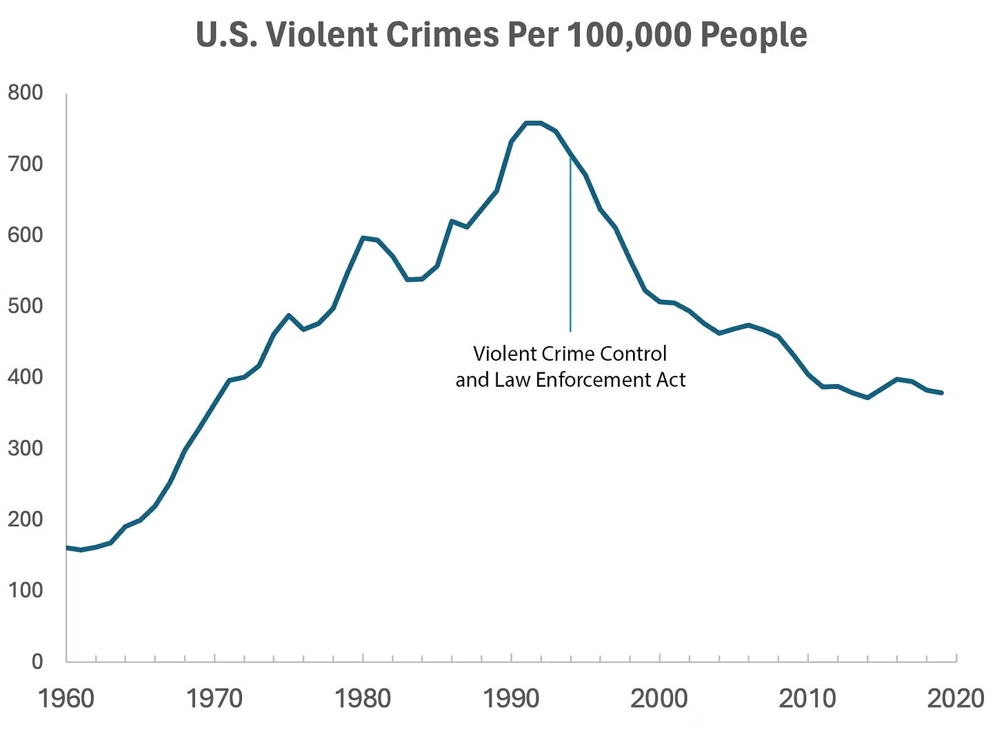
But can we infer, as this chart seems to ask us to, that the bill caused the drop in crime?
As it turns out, this chart wasn’t put together by sociologists or political scientists who’ve studied violent crime. Rather, we—a mathematician and a writer—devised it to make a point: Although charts seem to reflect reality, they often convey narratives that are misleading or entirely false.
Upon seeing that violent crime dipped after 1990, we looked up major events that happened right around that time—selecting one, the 1994 Crime Bill, and slapping it on the graph. There are other events we could have stuck on the graph just as easily that would likely have invited you to construct a completely different causal story. In other words, the bill and the data in the graph are real, but the story is manufactured.
Perhaps the 1994 Crime Bill really did cause the drop in violent crime, or perhaps the causality goes the other way: the spike in violent crime motivated politicians to pass the act in the first place. (Note that the act was passed slightly after the violent crime rate peaked!)
Charts are a concise way not only to show data but also to tell a story. Such stories, however, reflect the interpretations of a chart’s creators and are often accepted by the viewer without skepticism. As Noah Smith and many others have argued, charts contain hidden assumptions that can drastically change the story they tell.
This has important consequences for science, which, in its ideal form, attempts to report findings as objectively as possible. When a single chart can be the explanatory linchpin for years of scientific effort, unveiling a data visualization’s hidden assumptions becomes an essential skill for determining what’s really true. As physicist Richard Feynman once said: In science, “the first principle is that you must not fool yourself, and you are the easiest person to fool.”What we mean to say is—don’t be fooled by charts…
[Greenberg unpacks a couple of powerful examples…]
… to avoid producing a chart that misleads scientists, which misleads journalists, which misleads the public, and which then contributes to widespread confusion, you must think carefully about what you actually aim to measure. Which representation of the data best reflects the question being asked and relies on the sturdiest assumptions?
After all, scientific charts are a means to read data rather than an explanation of how that data is collected. The explanation comes from a careful reading of methods, parameters, definitions, and good epistemic practices like interrogating where data comes from and what could be motivating the researchers who produced it.
In the end, the story a chart tells is still just that—a story—and to be a discerning reader, you must reveal and interrogate the assumptions that steer those narratives…
Eminently worth reading in full: “How charts can inadvertently manipulate reality,” from @spencrgreenberg.bsky.social.
* Alberto Cairo, How Charts Lie: Getting Smarter about Visual Information
###
As we ferret out the facts, we might recall that it was on this date in 1874 that Florence Nightingale became the first female President of the Royal Statistical Society.
Famed for her work as a nurse in the Crimean War, she went on to found training facilities and nursing homes– pioneering both medical training for women and what is now known as Social Entrepreneuring. Less well-known are Nightingale’s contributions to epidemiology, statistics, and the visual communication of data in the field of public health. Always good at math, she pioneered the use of the polar area chart (the equivalent to a modern circular histogram or rose diagram) and popularized the pie chart (which had been developed in 1801 by William Playfair). Nightingale later became an honorary member of the American Statistical Association.

“Diagram of the causes of mortality in the army in the East” by Florence Nightingale, an example of the the polar area diagram (AKA, the Nightingale rose diagram) source

You must be logged in to post a comment.