Posts Tagged ‘data visualization’
“The story of the events and the people who, over centuries, came together to bring us in from the cold and to wrap us in a warm blanket of technology is a matter of vital importance, since more and more of that technology infiltrates every aspect of our lives”*…

From Étienne Fortier-Dubois, the Historical Tech Tree, “a timeline to visualize the full history of all major technologies (or 1,780 of them, at least), from 3.3 million years ago to today. More importantly, it also contains more than 2,000 connections between them: prerequisites, improvements, inspirations: anything that allows you to understand how one thing led to another”…
The historical tech tree is a project by Étienne Fortier-Dubois to visualize the entire history of technologies, inventions, and (some) discoveries, from prehistory to today. Unlike other visualizations of the sort, the tree emphasizes the connections between technologies: prerequisites, improvements, inspirations, and so on.
These connections allow viewers to understand how technologies came about, at least to some degree, thus revealing the entire history in more detail than a simple timeline, and with more breadth than most historical narratives. The goal is not to predict future technology, except in the weak sense that knowing history can help form a better model of the world. Rather, the point of the tree is to create an easy way to explore the history of technology, discover unexpected patterns and connections, and generally make the complexity of modern tech feel less daunting….
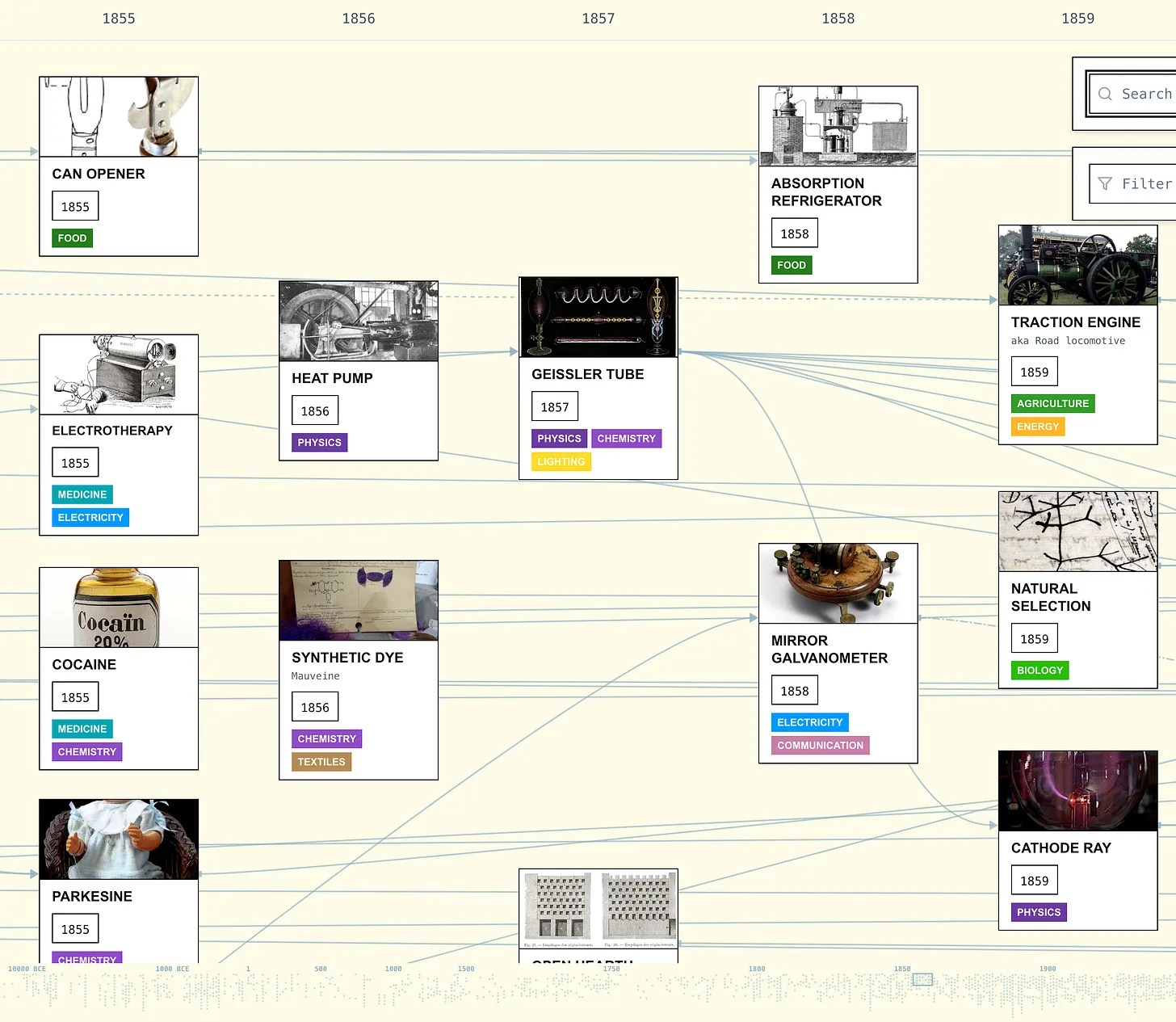
How one thing led to another: “Historical Tech Tree.”
See also: “Introducing the Historical Tech Tree.”
* “The story of the events and the people who, over centuries, came together to bring us in from the cold and to wrap us in a warm blanket of technology is a matter of vital importance, since more and more of that technology infiltrates every aspect of our lives. It’s become a life-support system without which we can’t survive. And yet, how much of it do we understand?”- James Burke, in the first episode of Connections.
###
As we ponder progress, we might recall that it was on this date in 1633, following an Inquisition, that the Holy Office in Rome forced Galileo Galilei to recant his view that the Sun, not the Earth, is the center of the Universe in the form in which he presented it. Gaileo had used a telescope (1603 on the Timeline) to reach his (correct) conclusion.
He refused to recant, and put under house arrest, where he effectively remained for the rest of his life. He dedicated his time in restriction to one of his finest works, Two New Sciences, in which he summarised work he had done some forty years earlier, on the two sciences now called kinematics and strength of materials, and published in Holland to avoid the censor. As a result of this work– highly praised by Albert Einstein– Galileo is often called the “father of modern physics.”

“Only in our dreams are we free. The rest of the time we need wages.”*…

The Economist is repurposing one of its famous indices…
Since 1986 The Economist has produced the Big Mac index as a light-hearted gauge of whether currencies are at their “correct” level. The famous burger is a good test of currency valuations because of its global uniformity and ubiquity. The same properties make it a useful way of comparing international salaries: how many Big Macs, in principle, can a typical worker afford with their wages?
The more conventional way of comparing incomes is to convert wages in different countries into a common currency. But that is misleading because exchange rates are volatile. Moreover, one American dollar goes a lot farther in, say, the Philippines than it does in America itself. The Big Mac helps to solve this problem as a ready-made illustration of purchasing power: it represents a bundle of goods (or, rather, a bun of goods) that is identical everywhere, and so it serves as a yardstick of the real cost of things from country to country.
For the Big Mac wage analysis (the MacWage, for short), we started with full-time, pre-tax earnings in 2023 as reported by the OECD, a club of 38 mostly rich countries. We then made a simple adjustment, dividing wages by the price of a Big Mac—all in local currencies. That gave us the number of burgers that the average full-time worker can buy annually.
The results? Americans can perhaps be forgiven for having somewhat expansive waistlines. Although fast-food prices have rocketed since the pandemic, Americans still earn more greasy calories than any others in our analysis [chart below]. The average American worker takes home the equivalent of 14,000 Big Macs in wages for a year of full-time work. At 590 calories a pop, they could buy enough burgers to keep ten adults fed for a year. The Swiss and Danes come, respectively, second and third in MacWages. At the bottom are Mexican workers, who can afford to buy about 2,500 Big Macs with their average annual wages.

A standard objection to any measure of higher incomes in America is that its workers generally get less time off. To factor this in, we looked at average hours worked, based on data from the OECD and the Conference Board, a business-research group. This yields slightly different results (see chart 2). Americans still get more than enough Big Macs—pulling in the equivalent of about 7.4 per hour on the job—but they drop to third in the ranking. The burger champions are the Danes, who earn 8.1 per hour, followed by the Swiss. Looked at another way, the average Dane works for just seven minutes to make enough money to buy a Big Mac. In Mexico—still at the bottom of the rankings after this hourly adjustment—workers must toil for about 57 minutes.

The MacWage is, of course, far from perfect. Danes may celebrate their top performance, but our measure misses how income taxes (which can surpass 50% in Denmark) eat into their burger budgets. Much else of what goes into the cost of living, from housing to transportation, is also barely reflected in the price of burgers. In a developing country like Mexico, where housing is relatively cheap and American fast-food indulgences relatively expensive, a burger-based wage calculation understates how much stuff an average worker can actually afford. Still, as a quick method for comparing incomes around the world, the MacWage is easily digestible…
The purchasing power of average earners across the OECD: “An alternative use for The Economist’s Big Mac index” from @ECONdailycharts in @TheEconomist.
* Terry Pratchett
###
As we supersize that, we might recall that it was on this date in 1979 that the U.S. government agreed to a bailout of the Chrysler Corporation. The smallest of the “Big Three” automakers, but still the 10th largest company in America, Chrysler suffering from a combination a bad management decisions and increased competition from Japanese and German automakers. Facing a $500 million loss for the year (and probably bankruptcy), newly-installed CEO Lee Iacocca asked the government for a guarantee on a $1.5 Billion loan package. In return for detailed plans from Chrysler detailing both how the company would right its ship and how other constituents (employees, suppliers, lenders) would make concessions, the Carter Administration (which feared that a Chrysler failure could lead to a “depression”– and depression-level unemployment– in the auto industry) agreed. In return for its guarantee, the government received stock warrants in the company.
Chrysler did turn itself around: it proceeded to introduce the “K-Car” line, then mini-vans, then the earliest generation of SUVs. The company repaid the government-guaranteed debt ahead of schedule; the Treasury made about $500 million on its warrants.
But of course, nearly thirty years later, in 2008, Chrysler received billions in a new bailout from the U.S. government in the aftermath of the financial crisis that decimated automotive sales over the following few years. Chrysler filed for Chapter 11 bankruptcy in April 2009, before being acquired in total by Fiat in 2014.

“The great men turn out to be all alike. They never stop working. They never lose a minute. It is very depressing.”*…
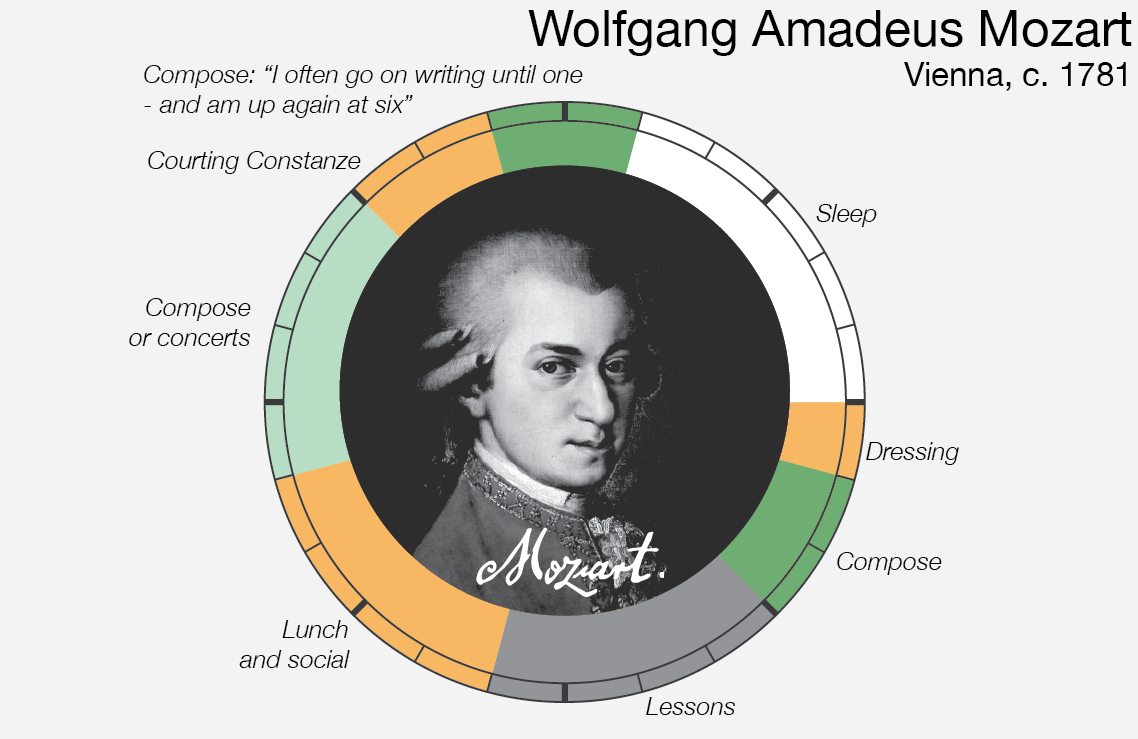
Data storyteller RJ Andrews demonstrates…
How do creatives – composers, painters, writers, scientists, philosophers – find the time to produce their opus?
Each routine day is represented as a continuous 24 hour cycle. Midnight is placed at 12 o’clock position and noon at 6 o’clock. Colors mark major categories of activity including work, sleep, and exercise…

The daily rituals of great creators: “Creative Routines,” from @infowetrust.
* Mason Curry, Daily Rituals: How Artists Work (the source of much of the data that informed the gaphics above)
###
As we contemplate cultivating customs, we might send learned birthday greetings to Desiderius Erasmus Roterodamus, better known simply as Erasmus; he was born on this date in 1466. A Catholic priest, social critic, teacher, translator, and theologian, probably best remembered for his book In Praise of Folly, he was the greatest scholar of the northern Renaissance, the first editor of the New Testament (“Do unto others…”), and an important figure in patristics and classical literature.
Erasmus had contrasting experiences of routine: on being orphaned, Erasmus was sent to a series of monastic or semi-monastic schools, which he despised both for their discipline and for their disdain of inquiry. Graduating with few prospects, he joined an Augustinian monastery where he considered his superiors “barbarians” discouraging his classical studies. On ordination, he escaped– and began a career that began in struggle (as he balanced the demands of study with those of serving as a Clerk, and Priest, a tutor… all while trying to distinguish himself as a poet.
His luck changed in 1499, when he connected with a reformist English circle (notably John Colet and Thomas More), then with radical French Franciscan Jean Vitrier, and later with the Aldine New Academy in Venice… which led, in the Reformation, to his emergence as a prime influencer of European thought. Among fellow scholars and philosophers of that era he was– and is still– known as the “Prince of the Humanists.”
Erasmus’ views were contentious on his time and elicited a good bit of criticism. While we don’t know too much about his daily routine, we do know that for the last half of his life it included enough time on a regular basis to read these attacks and to prepare and publish apologetic works in his own defense, in many cases leading to a long series of back-and-forth polemical books… kind of like Twitter feud, but at the speed of Gutenberg.

Portrait of Erasmus of Rotterdam (1523) by Hans Holbein the Younger
“The greatest value of a picture is when it forces us to notice what we never expected to see”*…

The breath-takingly broadly talented Joesph Preistley left us much– not least, Alyson Foster explains, a then-new way of understanding history…
It’s a testament to the wide-ranging and unconventional nature of Joseph Priestley’s mind that no one has settled on a term to sum up exactly what he was. The eighteenth-century British polymath has been described as, among other things, a historian, a chemist, an educator, a philosopher, a theologian, and a political radical who became, for a period of time, the most despised person in England. Priestley’s many contradictions—as a rationalist Unitarian millenarian, as a mild-mannered controversialist, as a thinker who was both ahead of his time and behind it—have provided endless fodder for the historians who have debated the precise nature of his legacy and his place among his fellow Enlightenment intellectuals. But his contributions—however they are categorized—have continued to live on in subtle and surprisingly enduring ways, more than two hundred years after his death, at the age of seventy, in rural Pennsylvania.
Take, for example, A Chart of Biography, which is considered to be the first modern timeline. This unusual, and unusually beautiful, pedagogical tool, which was published by Priestley in 1765, while he was in his thirties and working as a tutor at an academy in Warrington, England, tends to get lost in the shuffle of Priestley’s more notable achievements—his seminal 1761 textbook on language, The Rudiments of English Grammar, say, or his discovery of nine gases, including oxygen, 13 years later. But the chart, along with its companion, A New Chart of History, which Priestley published four years later, has become a curious subject of interest among data visualization aficionados who have analyzed its revolutionary design in academic papers and added it to Internet lists of notable infographics. Recently, both charts have become the focus of an NEH-supported digital humanities project, Chronographics: The Time Charts of Joseph Priestley, produced by scholars at the University of Oregon.
Even those of us ignorant of (or uninterested in) infographics can look at the painstakingly detailed Chart of Biography for a moment or two and appreciate how it has become a source of fascination. The two-foot-by-three-foot, pastel-striped paper scroll—which contains the meticulously inscribed names of approximately 2,000 poets, artists, statesmen, and other famous historical figures dating back three millennia—is visually striking, combining a formal, somewhat ornate eighteenth-century aesthetic with the precise organization of a schematic. Every single one of the chart’s subjects is grouped vertically into one of six occupational categories, then plotted out chronologically along a horizonal line divided into ten-year increments. Despite the huge quantity of information it contains, it is extremely user-friendly. Any one of Priestley’s history students could run his eye across the chart and immediately gain a sense of the temporal lay of the land. Who came first: Copernicus or Newton? How many centuries separate Genghis Khan from Joan of Arc? Which artists were working during the reign of Henry VIII? The chart was a masterful blend of form and function…
The most significant design feature of Priestley’s chart—as historians point out—was the way in which he linked units of time to units of distance on the page, similar to the way a cartographer uses scale when creating a map. (The artist Pietro Lorenzetti lived two hundred years before Titian and thus is situated twice as far from Titian as Jan van Eyck, who predated Titian by about a century.) If this innovation is hard for contemporary viewers to fully appreciate, it’s probably because Priestley’s representation of time has become a convention that’s used everywhere in visual design and seems so obvious it’s now taken for granted.
To Priestley’s contemporaries, though, who were accustomed to cumbersome Eusebian-style [see here] chronological tables or the visually striking but often obscure “stream charts” created by the era’s chronographers, Priestley’s method of capturing time on the page revealed something revelatory and new—a way of seeing historical patterns and connections that would have otherwise remained hidden. “To many readers,” wrote Daniel Rosenberg and Anthony Grafton in their book, Cartographies of Time, Priestley’s Chart of Biography offered a never-before-seen “picture of time itself.”
It was no wonder, then, that eighteenth-century readers found themselves drawn to it. A Chart of Biography sold well in both England and the United States, accruing many fans along the way. Along with the New Chart of History, it would go on to be printed in at least 19 editions and spawn numerous imitations, including one by Priestley’s future friend Thomas Jefferson, who developed his own “time chart” of market seasons in Washington, and the historian David Ramsay, who acknowledged Priestley’s influence in his Historical and Biographical Chart of the United States. The time charts marked Priestley’s first major commercial success and played a key role in establishing his reputation as a serious intellectual, earning him an honorary degree from the University of Edinburgh, and helping him secure a fellowship nomination to the Royal Society of London.
As much as anything he published, and he published a staggering amount—somewhere between 150 and 200 books, articles, papers, and pamphlets—Priestley’s time charts encapsulate his uniqueness as a thinker. Of his many intellectual gifts, his gift for synthesis—for knitting together the seemingly disparate things that caught his attention—might have been his greatest…
Read on for how Priestley went on to become the most controversial man in England: “Joseph Priestley Created Revolutionary ‘Maps’ of Time,” by @alysonafoster in @humanitiesmag from @NEHgov.
More info on the Chart– and magnified views– here.
###
As we celebrate constructive charts, we might spare a thought for Edward Lorenz, a mathematician and meteorologist, best remembered as a pioneer of Chaos Theory; he died on this date in 2008. Having noticed that his computer weather simulation gave wildly different results from even tiny changes in the input data, he began investigating a phenomenon that he famously outlined in a 1963 paper— and that came to be known as the “butterfly effect,” that the flap of a butterfly’s wings could ultimately determine the weather thousands of miles away and days later… generalized in Chaos Theory to state that “slightly differing initial states can evolve into considerably different [later] states.”

“Tell me what you eat and I will tell you what you are”*…

Back in 2016, Nathan Yau of Flowing Data created a fascinating set of animated infographics illustrating how the American diet had changed over the prior several decades. A few years later, he used an even more comprehensive data set to update the picture…
The United States Department of Agriculture keeps track of food availability for over 200 items, which can be used to estimate food consumption at the national level. They have data for 1970 through 2019, so we can for example, see how much beef Americans consume per year on average and how that has changed over four decades.
So that’s what I did.
How long will chicken reign supreme? Who wins between lemon and lime? Is nonfat ice cream really ice cream? Does grapefruit ever make a comeback? Find out in the charts below.
The rankings are broken into six main food groups: proteins [pictured above], vegetables, fruits, dairy, grains, and added fats…
Illuminating: “Seeing How Much [and of what] We Ate Over the Years,” from @flowingdata (where one will find larger, more legible versions of the chart above and its companions).
* Jean Anthelme Brillat-Savarin
###
As we contemplate consumption, we might recall that it was on this date in 1953 that the Cabinet-level Department of Health, Education, and Welfare (HEW) was created under President Eisenhower. Its first Secretary was Oveta Culp Hobby. (In 1979, the Department of Education Organization Act was signed into law, providing for a separate Department of Education. HEW became the Department of Health and Human Services, officially arriving on May 4, 1980.)

You must be logged in to post a comment.