Posts Tagged ‘maps’
“I want to make a long journey”*…
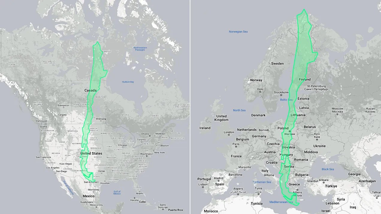
Thomas Pueyo on how geography shaped the longest (and proportionately thinnest) country in the world…
Chile is as long as the [vertical dimensions of]US and Canada combined.
Chile is as long as all of Europe!Chile is so long, it’s curved.

How long is it?
Why not longer?
Why is no other country as thin?
How does that make Chileans incomprehensible?
These questions (and more) answered: “Why Is Chile So Long?” from @tomaspueyo
* (Chilean poet) Pablo Neruda
###
As we stretch, we might recall that it was on this date in 1730 that the Valparaíso earthquake occurred. (As Pueyo explains, Chile’s unique geography and geology have frequently seismic implications.)
The quake had an estimated magnitude of 9.1–9.3 and triggered a major tsunami with an estimated magnitude of Mt 8.75, that inundated the lower parts of Valparaíso and caused severe damage from La Serena to Chillan; the tsunami affected more than 620 mi of Chile’s coastline.
While damage was widespread, only a few deaths were recorded due to the earthquake, reportedly because a strong foreshock had prompted people to leave their homes. Similarly, the subsequent tsunami: inhabitants ran to higher ground after seeing the water recede, so that only a few were killed.

“Nature is the source of all true knowledge”*…

Jonathan Keats on why– and how– clocks that use nature to measure time can reintegrate people into the environment and counteract the calamities of the Anthropocene…
In his studio on the east coast of Vancouver Island, the master clockmaker Phil Abernethy is crafting a timepiece that will be calibrated in a manner that no horologist has ever attempted. It won’t show the minutes and hours of an ordinary human day. Instead, his clock will display time as experienced by some of the oldest trees on the planet.
Using techniques he’s honed over a lifetime, Abernethy will machine the gears by hand in traditional materials such as steel and brass. But the pendulum will respond to the forest: When trees grow quickly, the hours will advance more rapidly; more lethargic growth will result in a slower tempo. Over centuries, the long-term fate of the canopy will be registered on a calendar that may deviate from the Gregorian date by decades or more.
Abernethy has been commissioned to fabricate the arboreal clock by the Nevada Museum of Art. Standing 12 feet tall, the clock will be the first physical manifestation of an environmental timekeeping project I have been developing over the past decade. Some of the clocks in the project respond to rivers; Abernethy’s enlists a stand of bristlecone pine trees in Nevada’s Great Basin as living timekeepers.
Fluctuations in the bristlecones’ growth rate, affected by environmental conditions ranging from local rainfall to planetary climate change, will be measured by analyzing the thickness of tree rings in microcores retrieved from the mountain each year. These data will be used to determine the center of gravity for the pendulum, which will swing slower or faster depending on the tree ring thickness. Though the clock face will display time in the usual way, it won’t serve as a mechanism for human planning — a technology to impose order on the environment for our convenience — but rather to pace our lives to match the lived reality of other organisms.
Abernethy’s arboreal clock, in other words, upsets more than just the standards of horology. The environmental calamity known as the Anthropocene is a consequence of a worldview in which all that is not human is construed as a resource — even time itself. Other life forms are going extinct at an unprecedented rate, laid waste at a pace set by the world economy. Factory farming and logging, fossil fuel and plastics production, mining, human construction and infrastructure — all disregard the timing with which nonhuman systems emerge, ebb and flow. The globalized logic of industry, with its planetary supply chain, must keep up with human demand, turning civilization itself into a manifestation of logistics.
Our mastery of the world is a mastery of time. And as every industrialist knows, mastery of time requires the precision of a master clock to provide a temporal standard against which everything can be measured and controlled. Whether regulated by the swing of a pendulum or the oscillations of a strontium atom — as the most advanced atomic clocks are today — the master clock operates without an external feedback mechanism. The clock has become the ultimate authority. To question it would be tantamount to questioning modernity.
The design of Abernethy’s arboreal clock may be novel, but the underlying ideas are ancient. They predate pendulums and gearwork, originating in an era when people observed time in relation to other beings in order for all to flourish together. Ancient but mostly forgotten, these ideas are urgently needed today. Whatever practical use it might have, the arboreal clock is intended primarily to serve as a philosophical instrument…
…
… Humankind appears to be the only species to have contrived clocks that count without reference to something outside of themselves. We also appear to be the only species to have use for these contraptions, to use time in this peculiar way. (Mumford astutely described clocks as “power machinery whose ‘product’ is seconds and minutes.”)
All life depends on timekeeping. But nonhuman life treats time as a mixed medium: entangled with the environment, dependent on other organisms…
…
… Near the peak of Mt. Washington in Nevada’s Great Basin, which rises more than 11,600 feet above sea level, the bristlecone pines are as scraggly as the tree in “A Charlie Brown Christmas.” Until very recently, bristlecones didn’t grow at this elevation. To walk down the slope is to stroll through time, eventually reaching trees that are several thousand years old and as solid as sculpted stone.
Over the past decade, I have gotten to know these trees, visiting with members of the Long Now Foundation, the organization that stewards part of the mountaintop and has partnered with me on the clock at the Nevada Museum of Art. By observing the trees and their embodied experience of time, I have been able to see the inadequacy of my wristwatch.
The trees sensitized me to the time reckoning of other life forms, both plants and animals. They attuned me to the time kept collectively in living systems such as rivers, where the flow rate is affected by the melting of glaciers and the eagerness of beavers, not to mention the unquenchable thirst of industrial agriculture. By gearing the flow of time to match the flow of the Susitna or Matanuska — as I have done in partnership with the Anchorage Museum — fluvial clocks can integrate people into local watersheds.
An arboreal clock can likewise integrate people into the forest. Or to be more accurate, it can reintegrate people into their ecosystems, counteracting the human denaturing of the Anthropocene…
Eminently worth reading in full: “A Clock In The Forest,” from @jonathonkeats in @NoemaMag @longnow.
* Leonardo da Vinci
###
As we think about time, we might also contemplate natural space, and spare a thought for Abraham Ortelius; he died on this date in 1598. A cartographer, geographer, and cosmographer, he created the first modern atlas, the Theatrum Orbis Terrarum (Theatre of the World)– “the book that invented the world.”
Ortelius is generally considered one of the founders (with Gemma Frisius and Gerardus Mercator) of the Netherlandish school of cartography and geography. He was an important geographer of Spain during the age of discovery– and the first person proposing that the continents were joined before drifting to their present positions.

“The purpose of a system is what it does”*…

Via Patrick Tanguay and his wonderful newsletter, Sentiers. Tanguay observes, “diagnosing what’s going on in society right now, how our multiple systems function and the issues that emerge from that, is not an easy task. It’s probably unfair then to also expect solutions from one article, but that’s what I was hoping for by the end of this one,” by Barath Raghavan and Bruce Schneier…
Technology was once simply a tool—and a small one at that—used to amplify human intent and capacity. That was the story of the industrial revolution: we could control nature and build large, complex human societies, and the more we employed and mastered technology, the better things got. We don’t live in that world anymore. Not only has technology become entangled with the structure of society, but we also can no longer see the world around us without it. The separation is gone, and the control we thought we once had has revealed itself as a mirage. We’re in a transitional period of history right now.
We tell ourselves stories about technology and society every day. Those stories shape how we use and develop new technologies as well as the new stories and uses that will come with it. They determine who’s in charge, who benefits, who’s to blame, and what it all means.
Some people are excited about the emerging technologies poised to remake society. Others are hoping for us to see this as folly and adopt simpler, less tech-centric ways of living. And many feel that they have little understanding of what is happening and even less say in the matter.
But we never had total control of technology in the first place, nor is there a pretechnological golden age to which we can return. The truth is that our data-centric way of seeing the world isn’t serving us well. We need to tease out a third option. To do so, we first need to understand how we got here.
When we describe something as being abstract, we mean it is removed from reality: conceptual and not material, distant and not close-up. What happens when we live in a world built entirely of the abstract? A world in which we no longer care for the messy, contingent, nebulous, raw, and ambiguous reality that has defined humanity for most of our species’ existence? We are about to find out, as we begin to see the world through the lens of data structures.
Two decades ago, in his book Seeing Like a State, anthropologist James C. Scott explored what happens when governments, or those with authority, attempt and fail to “improve the human condition.” Scott found that to understand societies and ecosystems, government functionaries and their private sector equivalents reduced messy reality to idealized, abstracted, and quantified simplifications that made the mess more “legible” to them. With this legibility came the ability to assess and then impose new social, economic, and ecological arrangements from the top down: communities of people became taxable citizens, a tangled and primeval forest became a monoculture timber operation, and a convoluted premodern town became a regimented industrial city.
This kind of abstraction was seemingly necessary to create the world around us today. It is difficult to manage a large organization, let alone an interconnected global society of eight billion people, without some sort of structure and means to abstract away details. Facility with abstraction, and abstract reasoning, has enabled all sorts of advancements in science, technology, engineering, and math—the very fields we are constantly being told are in highest demand.
The map is not the territory [quoth Alfred Korzybski], and no amount of intellectualization will make it so. Creating abstract representations by necessity leaves out important detail and context. Inevitably, as Scott cataloged, the use of large-scale abstractions fails, leaving leadership bewildered at the failure and ordinary people worse off.
But our desire to abstract never went away, and technology, as always, serves to amplify intent and capacity. Now, we manifest this abstraction with software. Computing supercharges the creative and practical use of abstraction. This is what life is like when we see the world the way a data structure sees the world. These are the same tricks Scott documented. What has changed is their speed and their ubiquity…
… Data structures dominate our world and are a byproduct of the rational, modern era, but they are ushering in an age of chaos. We need to embrace and tame, but not extinguish, this chaos for a better world…
…
As [Lewis] Mumford wrote in his classic history of technology, “The essential distinction between a machine and a tool lies in the degree of independence in the operation from the skill and motive power of the operator.” A tool is controlled by a human user, whereas a machine does what its designer wanted. As technologists, we can build tools, rather than machines, that flexibly allow people to make partial, contextual sense of the online and physical world around them. As citizens, we can create meaningful organizations that span our communities but without the permanence (and thus overhead) of old-school organizations.
Seeing like a data structure has been both a blessing and a curse. Increasingly, it feels like it is an avalanche, an out-of-control force that will reshape everything in its path. But it’s also a choice, and there is a different path we can take. The job of enabling a new society, one that accepts the complexity and messiness of our current world without being overwhelmed by it, is one all of us can take part it. There is a different future we can build, together…
A fascinating and important piece: “Seeing Like a Data Structure,” @schneierblog @BelferCenter. Eminently worth reading in full.
See also: “Empty Innovation“
###
As we reframe, we might send free birthday greetings to Matthias Ettrich; he was born on this date in 1972. A computer scientist interested in Linux and open source software, he Ettrich founded KDE in 1996 to create (as he put it on Usenet) “consistent, nice looking free desktop environment” for Unix-like systems using Qt as its widget toolkit– to which end, he has developed LyX. A German, operating in Berlin, Ettrich was awarded the Federal Cross of Merit for his contributions to free software.

“The greatest value of a picture is when it forces us to notice what we never expected to see”*…

The breath-takingly broadly talented Joesph Preistley left us much– not least, Alyson Foster explains, a then-new way of understanding history…
It’s a testament to the wide-ranging and unconventional nature of Joseph Priestley’s mind that no one has settled on a term to sum up exactly what he was. The eighteenth-century British polymath has been described as, among other things, a historian, a chemist, an educator, a philosopher, a theologian, and a political radical who became, for a period of time, the most despised person in England. Priestley’s many contradictions—as a rationalist Unitarian millenarian, as a mild-mannered controversialist, as a thinker who was both ahead of his time and behind it—have provided endless fodder for the historians who have debated the precise nature of his legacy and his place among his fellow Enlightenment intellectuals. But his contributions—however they are categorized—have continued to live on in subtle and surprisingly enduring ways, more than two hundred years after his death, at the age of seventy, in rural Pennsylvania.
Take, for example, A Chart of Biography, which is considered to be the first modern timeline. This unusual, and unusually beautiful, pedagogical tool, which was published by Priestley in 1765, while he was in his thirties and working as a tutor at an academy in Warrington, England, tends to get lost in the shuffle of Priestley’s more notable achievements—his seminal 1761 textbook on language, The Rudiments of English Grammar, say, or his discovery of nine gases, including oxygen, 13 years later. But the chart, along with its companion, A New Chart of History, which Priestley published four years later, has become a curious subject of interest among data visualization aficionados who have analyzed its revolutionary design in academic papers and added it to Internet lists of notable infographics. Recently, both charts have become the focus of an NEH-supported digital humanities project, Chronographics: The Time Charts of Joseph Priestley, produced by scholars at the University of Oregon.
Even those of us ignorant of (or uninterested in) infographics can look at the painstakingly detailed Chart of Biography for a moment or two and appreciate how it has become a source of fascination. The two-foot-by-three-foot, pastel-striped paper scroll—which contains the meticulously inscribed names of approximately 2,000 poets, artists, statesmen, and other famous historical figures dating back three millennia—is visually striking, combining a formal, somewhat ornate eighteenth-century aesthetic with the precise organization of a schematic. Every single one of the chart’s subjects is grouped vertically into one of six occupational categories, then plotted out chronologically along a horizonal line divided into ten-year increments. Despite the huge quantity of information it contains, it is extremely user-friendly. Any one of Priestley’s history students could run his eye across the chart and immediately gain a sense of the temporal lay of the land. Who came first: Copernicus or Newton? How many centuries separate Genghis Khan from Joan of Arc? Which artists were working during the reign of Henry VIII? The chart was a masterful blend of form and function…
The most significant design feature of Priestley’s chart—as historians point out—was the way in which he linked units of time to units of distance on the page, similar to the way a cartographer uses scale when creating a map. (The artist Pietro Lorenzetti lived two hundred years before Titian and thus is situated twice as far from Titian as Jan van Eyck, who predated Titian by about a century.) If this innovation is hard for contemporary viewers to fully appreciate, it’s probably because Priestley’s representation of time has become a convention that’s used everywhere in visual design and seems so obvious it’s now taken for granted.
To Priestley’s contemporaries, though, who were accustomed to cumbersome Eusebian-style [see here] chronological tables or the visually striking but often obscure “stream charts” created by the era’s chronographers, Priestley’s method of capturing time on the page revealed something revelatory and new—a way of seeing historical patterns and connections that would have otherwise remained hidden. “To many readers,” wrote Daniel Rosenberg and Anthony Grafton in their book, Cartographies of Time, Priestley’s Chart of Biography offered a never-before-seen “picture of time itself.”
It was no wonder, then, that eighteenth-century readers found themselves drawn to it. A Chart of Biography sold well in both England and the United States, accruing many fans along the way. Along with the New Chart of History, it would go on to be printed in at least 19 editions and spawn numerous imitations, including one by Priestley’s future friend Thomas Jefferson, who developed his own “time chart” of market seasons in Washington, and the historian David Ramsay, who acknowledged Priestley’s influence in his Historical and Biographical Chart of the United States. The time charts marked Priestley’s first major commercial success and played a key role in establishing his reputation as a serious intellectual, earning him an honorary degree from the University of Edinburgh, and helping him secure a fellowship nomination to the Royal Society of London.
As much as anything he published, and he published a staggering amount—somewhere between 150 and 200 books, articles, papers, and pamphlets—Priestley’s time charts encapsulate his uniqueness as a thinker. Of his many intellectual gifts, his gift for synthesis—for knitting together the seemingly disparate things that caught his attention—might have been his greatest…
Read on for how Priestley went on to become the most controversial man in England: “Joseph Priestley Created Revolutionary ‘Maps’ of Time,” by @alysonafoster in @humanitiesmag from @NEHgov.
More info on the Chart– and magnified views– here.
###
As we celebrate constructive charts, we might spare a thought for Edward Lorenz, a mathematician and meteorologist, best remembered as a pioneer of Chaos Theory; he died on this date in 2008. Having noticed that his computer weather simulation gave wildly different results from even tiny changes in the input data, he began investigating a phenomenon that he famously outlined in a 1963 paper— and that came to be known as the “butterfly effect,” that the flap of a butterfly’s wings could ultimately determine the weather thousands of miles away and days later… generalized in Chaos Theory to state that “slightly differing initial states can evolve into considerably different [later] states.”

“Are you green and growing or ripe and rotting?”*…

From our old friend (see, e.g., here and here) Flowing Data‘s Nathan Yau…
I read that there are more golf courses than there are McDonald’s locations in the United States, which seemed surprising. There are about 16,000 golf courses and 13,000 McDonald’s locations. How could this be? Obviously, there are a lot of McDonald’s locations, but where are all these golf courses? Some maps made it clear.
[The yellow circles in the map above show] the distribution of McDonald’s locations across the conterminous United States. As you might expect, they concentrate around cities.
An area in East Los Angeles has 110 locations within a 10-mile radius, which makes it the most dense area. This makes sense because McDonald’s was founded in southern California. The second most is an area just outside Chicago with 88 locations. This also makes sense, because McDonald’s headquarters are in Chicago.
At first glance, [the distribution of] golf courses [the green circles in the map above] looks similar to the McDonald’s one. There is a higher concentration around cities, but golf courses are more widespread, especially in the Midwest.
This makes more sense now. You can have a golf course in an area where there aren’t that many people, because people will travel to play golf. Few people are going to travel specifically for McDonald’s.
…
The high number of golf courses along the Florida coast and in the northeast jump out to me, someone who has never played a round of golf. I also noticed it’s fairly common for smaller golf courses to sit next to each other, whereas you’re not going to see neighboring McDonald’s restaurants, which seems to contribute to the higher totals for the former…
Amazing but true: “McDonald’s Locations vs. Golf Courses,” from @flowingdata.
* Ray Kroc (founder of McDonalds-as-we-know-it)
###
As we get down with data, we might recall that it was on this date in 1945 that Byron Nelson teed off in the first round of the 1945 Miami International Four Ball Tournament. For five months– from that swing through August 4– he was untouchable: Nelson won that tournament and his next 10, a record 11 events in a row, and shot 50 consecutive rounds under par.

You must be logged in to post a comment.