Posts Tagged ‘cartography’
“You cannot escape the responsibility of tomorrow by evading it today”*…

… But you might be able to make a buck on it.
We humans are prone to illusions– ideological enthusiasms, avoidance, et al.– that don’t just allow, but encourage us to avoid hard truths. If there’s one sector in which that’s less true, it’s likely finance– where the altogether unemotional logic of profit-making prevails. But as Corbin Hiar illustrates, that can accrue as finding ways to profit from, rather than avoid, the problems that are brewing…
Top Wall Street institutions are preparing for a severe future of global warming that blows past the temperature limits agreed to by more than 190 nations a decade ago, industry documents show.
The big banks’ acknowledgment that the world is likely to fail at preventing warming of more than 2 degrees Celsius above preindustrial levels is spelled out in obscure reports for clients, investors and trade association members. Most were published after the reelection of President Donald Trump, who is seeking to repeal federal policies that support clean energy while turbocharging the production of oil, gas and coal — the main sources of global warming.
The recent reports — from Morgan Stanley, JPMorgan Chase and the Institute of International Finance — show that Wall Street has determined the temperature goal is effectively dead and describe how top financial institutions plan to continue operating profitably as temperatures and damages soar.
“We now expect a 3°C world,” Morgan Stanley analysts wrote earlier this month, citing “recent setbacks to global decarbonization efforts.”
The stunning conclusion indicates that the bank believes the planet is hurtling toward a future in which severe droughts and harvest failures become widespread, sea-level rise is measured in feet rather than inches and tropical regions experience episodes of extreme heat and humidity for weeks at a time that would bring deadly risks to people who work outdoors.
The global Paris Agreement, from which the U.S. is withdrawing under Trump, aims to limit average temperature increases to well below 2 degrees Celsius. Scientists have warned that permanently exceeding 1.5 degrees — a threshold the world breached for the first time last year — could lead to increasingly severe climate impacts, such as the demise of coral reef ecosystems that hundreds of millions of people rely on for food and storm surge protection.
Morgan Stanley’s climate forecast was tucked into a mundane research report on the future of air conditioning stocks, which it provided to clients on March 17. A 3 degree warming scenario, the analysts determined, could more than double the growth rate of the $235 billion cooling market every year, from 3 percent to 7 percent until 2030.
“The political environment has changed, so some of them are conforming to that,” Gautam Jain, a former investment banker who is now a senior research scholar at Columbia University, said of Wall Street’s increasingly dire climate projections. “But mostly it is a rational business decision.”
The new warming estimates come as heat-trapping gases continue to rise globally and as international commitments to limit the burning of oil, gas and coal that’s responsible for the bulk of emissions have stalled. Meanwhile, megabanks like Wells Fargo are backsliding on their previous climate pledges and exiting from the Net-Zero Banking Alliance, a United Nations-backed group that encouraged members to slash their emissions in line with the Paris Agreement.
Morgan Stanley, which in October watered down its climate-related lending targets, declined to comment.
Betting on potentially catastrophic global warming is both an acknowledgment of the current emissions trajectory and a politically savvy move in the second Trump era, according to Jain.
“Nobody wants to be seen as going against” the administration’s pro-fossil-fuel energy policy, he said. “These banks are businesses, so they have to look at the risk that they have in their portfolio and the opportunities that they see in the most likely environment.”…
Making hay in the havoc: “Big Banks Quietly Prepare for Catastrophic Warming,” from @corbinhiar.bsky.social and @eenews.bsky.social via @sciam.bsky.social.
Related: “Reinsurers: placing an economic price on climate change.”
* Abraham Lincoln
###
As we sweat it out, we might spare a thought for Hugh Robert Mill; he died on this date in 1950. A geographer (President of the Geographical Association) and meteorologist (President of the Royal Meteorological Society), he was influential in the maturation of geography and cartography– and relevantly to this post, in the development of meteorology as a science.

“What is it about maps? I could look at them all day”*…
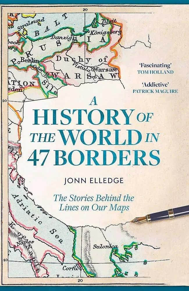
Jonn Elledge devotes the current issue of his nifty newsletter to a series of fascinating facts from his wonderful book, A Brief History of the World in 47 Borders (as it’s known in its U.S. edition, as compared to the less qualified title of the U.K. original pictured above)…
… Back in May, the good people at the UK’s leading maps and travel specialist bookshop Stanfords were kind enough to select my new book A History of the World in 47 Borders as their book of the month. And to promote it, they asked me to make a quick video, talking about it…
My initial thought was to list a single fact from each of the book’s 47 chapters, but that, I soon realised, would go on forever and take an absurd number of takes to get right. So in the end I decided on a top 10: that took an absurd number of takes to get right too, and also features me the wrong way round, for some reason, but at least it’s only three minutes long…
… as a special Christmas treat, not to mention shameless attempt to get more of you to buy the book for yourself or a loved one, here are all 47 of the facts I originally chose…
You’ll find tidbits like these:
The oldest known international border was the one between what today we call Upper Egypt and Lower Egypt. We know about it today because, sometime around 3100BCE, someone abolished it.
The Great Wall is not really one wall, but many. And the first Chinese emperor used to kidnap young men to make them build them.
The Open Borders Policies of Genghis Khan basically created the modern world.
In 1884, the great powers agreed to divide up the entire map of Africa without ever visiting. No Africans were in attendance, and one who’d asked for an invite, the Sultan of Zanzibar, was openly laughed at.
There’s a piece of Africa which two countries, Egypt and Sudan, both aggressively claim belongs to the other.
There’s an opera house in which the US/Canada border divides audience from stage.
There’s a coral atoll a thousand miles from Japan which is technically classed as a suburb of Tokyo.
Air traffic control zones cover the entire planet except the Galapagos Islands and the bit of the Arctic where Santa lives.
So much more at “47 Facts from A History of the World in 47 Borders,” from @jonnelledge.bsky.social
* Bill Bryson
###
As we muse on maps, we might send acutely observant birthday greetings to an astute student of the human animal, anthropologist Margaret Mead; she was born on this date in 1901. Best-known for her studies of the nonliterate peoples of Oceania, she was 23 when she first traveled to the South Pacific to conduct research for her doctoral dissertation. The book that resulted, Coming of Age in Samoa, was– and remains– a best-seller.

“Unlimited tolerance must lead to the disappearance of tolerance”*…

In 1945, in The Open Society and Its Enemies, Karl Popper described “the paradox of tolerance“…
The so-called paradox of freedom is the argument that freedom in the sense of absence of any constraining control must lead to very great restraint, since it makes the bully free to enslave the meek. The idea is, in a slightly different form, and with very different tendency, clearly expressed in Plato.
Less well known is the paradox of tolerance: Unlimited tolerance must lead to the disappearance of tolerance. If we extend unlimited tolerance even to those who are intolerant, if we are not prepared to defend a tolerant society against the onslaught of the intolerant, then the tolerant will be destroyed, and tolerance with them. — In this formulation, I do not imply, for instance, that we should always suppress the utterance of intolerant philosophies; as long as we can counter them by rational argument and keep them in check by public opinion, suppression would certainly be unwise. But we should claim the right to suppress them if necessary even by force; for it may easily turn out that they are not prepared to meet us on the level of rational argument, but begin by denouncing all argument; they may forbid their followers to listen to rational argument, because it is deceptive, and teach them to answer arguments by the use of their fists or pistols. We should therefore claim, in the name of tolerance, the right not to tolerate the intolerant. We should claim that any movement preaching intolerance places itself outside the law, and we should consider incitement to intolerance and persecution as criminal, in the same way as we should consider incitement to murder, or to kidnapping, or to the revival of the slave trade, as criminal…
Mark Manson offers a critique…
… Popper proposed the Paradox of Tolerance to explain why a German public full of otherwise good people allowed Hitler to come to power and commit so many atrocities. Since then, the Paradox of Tolerance has survived and has occasionally become a talking point in discussions about social justice. The idea is that it’s okay to be a piece of shit to someone because they, too, are a piece of shit.
But the problem is that, most of the time, it’s not crystal clear what defines “tolerance” and “intolerance.”… Like most thought experiments inspired by Hitler, it doesn’t really work when you don’t have someone who is so obviously evil to unite against. As a result, the definition of an intolerant person has become so muddied and loose to the point where it might as well mean, “someone who believes things that make me feel bad.”…
The problem with Popper’s reasoning is that it quickly devolves into a cascade of dickish, self-righteous behavior.
Let’s say Person B decides that Person A’s behavior is intolerant and a threat to society. Person B then decides that it is morally correct to be intolerant of Person A and treat her like crap.
But then, Person C strolls by and notices Person B being a totally intolerant assface to Person A. Person C then decides that it’s morally correct to be actively intolerant of Person B. But then Person D strolls by, and notices Person C being horribly intolerant towards Person B…
You can see where this is going. And if you ever doubt the realism of this scenario, I invite you to spend a few hours on Twitter some time.
The irony is that in order to practice tolerance, you must be willing to sit with things that upset you or make you uncomfortable.
Yet, if your adopted ethic is that no one should ever be upset or uncomfortable, then you make any sort of tolerance impossible…
– source
I imagine that Popper might respond first that, of course, Manson is right that the definition of intolerance is slippery and that most varieties of unshared disapproval are best tolerated– indeed, that’s the essence of an open society.
But I suspect that he’d further argue that it is possible, well shy of Hitlerian extremes, to identify the intent (beyond disapproving) to debar– to abridge the fundamental rights of others. Even then, of course, it’s tricky– especially in social/cultural periods in which xenophobia and othering are in the ascendant, when difference isn’t perceived to be simply difference or disagreement, but a threat.
Still (presuming again to channel Popper), if one values an open society, one must practice the art (which is to say that it’s not a science) of protecting against this extreme, imperious intolerance– lest it squelch all alternatives to itself. This was the challenge taken up by the Founding Fathers in crafting the U.S. Constitution. And as they observed (but we tend to forget) it’s an on-going challenge. They imagined that the Constitution would be continually revised, both to reflect “learning” (what worked and what didn’t– practical learning) and to reflect changing circumstances and culture (the social and cultural learning/development on which, as Humanists, they were counting).
It’s hard… but then, as my old man used to say, that’s why they call it a paradox…
* Karl Popper
With apologies, another “hiatus notice”: I’m headed into three days of very intense meetings, so (R)D will be off until Friday…
###
As we deal with dichotomies, we might spare a cartographically-constructive thought for one of history’s most impactful scientific artists: Gerardus Mercator; he died on this date in 1594. The most renown cartographer of his time, he created a world map based on a new projection– the Mercator Projection— on which parallels and meridians are rendered as straight lines spaced so as to produce at any point an accurate ratio of latitude to longitude and sailing courses of constant bearing are represented as straight lines, an approach still employed in nautical charts used for navigation. He also introduced the term “atlas” for a collection of maps.
While he is most esteemed as the foremost geographer of his day, Mercator was also an accomplished engraver, calligrapher and maker of globes and scientific instruments. And he studied theology, philosophy, history, mathematics, and magnetism.

“I am told there are people who do not care for maps, and I find it hard to believe”*…

A marvelous account of the oldest surviving map in the world…
Taking a first glance at the Babylonian Map of the World, few of us could recognize it for what it is. But then again, few of us are anything like the British Museum Middle East department curator Irving Finkel, whose vast knowledge (and ability to share it compellingly) have made him a viewer favorite on the institution’s YouTube channel. In the Curator’s Corner video below, he offers an up-close view of the Babylonian Map of the World — or rather, the fragment of the clay tablet from the eighth or seventh century BC that he and other experts have determined contains a piece of the oldest map of the known world in existence.
“If you look carefully, you will see that the flat surface of the clay has a double circle,” Finkel says. Within the circle is cuneiform writing that describes the shape as the “bitter river” that surrounds the known world: ancient Mesopotamia, or modern-day Iraq.
Inside the circle lie representations of both the Euphrates River and the mighty city of Babylon; outside it lie a series of what scholars have determined were originally eight triangles. “Sometimes people say they are islands, sometimes people say they are districts, but in point of fact, they are almost certainly mountains,” which stand “far beyond the known world” and represent, to the ancient Babylonians, “places full of magic, and full of mystery.”
Coming up with a coherent explanation of the map itself hinged on the discovery, in the nineteen-nineties, of one of those triangles originally thought to have been lost. This owes to the enthusiasm of a non-professional, a student in Finkel’s cuneiform night classes named Edith Horsley. During one of her once-a-week volunteer shifts at the British Museum, she set aside a particularly intriguing clay fragment. As soon as Finkel saw it, he knew just the artifact to which it belonged. After the piece’s reattachment, much fell into place, not least that the map purported to show the distant location of the beached (or rather, mountained) ark built by “the Babylonian version of Noah” [Utnapishtim in the Epic of Gilgamesh, himself likely based on the earlier Mesopotamian flood navigator Ziusudra] — the search for which continues these nine or so millennia later…
“An Introduction to The Babylonian Map of the World–the Oldest Known Map of the World,” from @openculture.
Sort of apposite– and very amusing: “The Many Lives of Null Island.”
* Robert Louis Stevenson
###
As we contemplate cartography, we might send exploratory birthday greetings to Samuel de Champlain; he was born (baptismal records suggest) on this date in 1567. An explorer, navigator, cartographer, draftsman, soldier, geographer, ethnologist, diplomat, and chronicler, he made between 21 and 29 trips across the Atlantic Ocean and founded Quebec City, the territory of New France, and a number of colonial settlements in what we now know as Canada– of which Champlain created the first accurate coastal map during his explorations.

“Nature is the source of all true knowledge”*…

Jonathan Keats on why– and how– clocks that use nature to measure time can reintegrate people into the environment and counteract the calamities of the Anthropocene…
In his studio on the east coast of Vancouver Island, the master clockmaker Phil Abernethy is crafting a timepiece that will be calibrated in a manner that no horologist has ever attempted. It won’t show the minutes and hours of an ordinary human day. Instead, his clock will display time as experienced by some of the oldest trees on the planet.
Using techniques he’s honed over a lifetime, Abernethy will machine the gears by hand in traditional materials such as steel and brass. But the pendulum will respond to the forest: When trees grow quickly, the hours will advance more rapidly; more lethargic growth will result in a slower tempo. Over centuries, the long-term fate of the canopy will be registered on a calendar that may deviate from the Gregorian date by decades or more.
Abernethy has been commissioned to fabricate the arboreal clock by the Nevada Museum of Art. Standing 12 feet tall, the clock will be the first physical manifestation of an environmental timekeeping project I have been developing over the past decade. Some of the clocks in the project respond to rivers; Abernethy’s enlists a stand of bristlecone pine trees in Nevada’s Great Basin as living timekeepers.
Fluctuations in the bristlecones’ growth rate, affected by environmental conditions ranging from local rainfall to planetary climate change, will be measured by analyzing the thickness of tree rings in microcores retrieved from the mountain each year. These data will be used to determine the center of gravity for the pendulum, which will swing slower or faster depending on the tree ring thickness. Though the clock face will display time in the usual way, it won’t serve as a mechanism for human planning — a technology to impose order on the environment for our convenience — but rather to pace our lives to match the lived reality of other organisms.
Abernethy’s arboreal clock, in other words, upsets more than just the standards of horology. The environmental calamity known as the Anthropocene is a consequence of a worldview in which all that is not human is construed as a resource — even time itself. Other life forms are going extinct at an unprecedented rate, laid waste at a pace set by the world economy. Factory farming and logging, fossil fuel and plastics production, mining, human construction and infrastructure — all disregard the timing with which nonhuman systems emerge, ebb and flow. The globalized logic of industry, with its planetary supply chain, must keep up with human demand, turning civilization itself into a manifestation of logistics.
Our mastery of the world is a mastery of time. And as every industrialist knows, mastery of time requires the precision of a master clock to provide a temporal standard against which everything can be measured and controlled. Whether regulated by the swing of a pendulum or the oscillations of a strontium atom — as the most advanced atomic clocks are today — the master clock operates without an external feedback mechanism. The clock has become the ultimate authority. To question it would be tantamount to questioning modernity.
The design of Abernethy’s arboreal clock may be novel, but the underlying ideas are ancient. They predate pendulums and gearwork, originating in an era when people observed time in relation to other beings in order for all to flourish together. Ancient but mostly forgotten, these ideas are urgently needed today. Whatever practical use it might have, the arboreal clock is intended primarily to serve as a philosophical instrument…
…
… Humankind appears to be the only species to have contrived clocks that count without reference to something outside of themselves. We also appear to be the only species to have use for these contraptions, to use time in this peculiar way. (Mumford astutely described clocks as “power machinery whose ‘product’ is seconds and minutes.”)
All life depends on timekeeping. But nonhuman life treats time as a mixed medium: entangled with the environment, dependent on other organisms…
…
… Near the peak of Mt. Washington in Nevada’s Great Basin, which rises more than 11,600 feet above sea level, the bristlecone pines are as scraggly as the tree in “A Charlie Brown Christmas.” Until very recently, bristlecones didn’t grow at this elevation. To walk down the slope is to stroll through time, eventually reaching trees that are several thousand years old and as solid as sculpted stone.
Over the past decade, I have gotten to know these trees, visiting with members of the Long Now Foundation, the organization that stewards part of the mountaintop and has partnered with me on the clock at the Nevada Museum of Art. By observing the trees and their embodied experience of time, I have been able to see the inadequacy of my wristwatch.
The trees sensitized me to the time reckoning of other life forms, both plants and animals. They attuned me to the time kept collectively in living systems such as rivers, where the flow rate is affected by the melting of glaciers and the eagerness of beavers, not to mention the unquenchable thirst of industrial agriculture. By gearing the flow of time to match the flow of the Susitna or Matanuska — as I have done in partnership with the Anchorage Museum — fluvial clocks can integrate people into local watersheds.
An arboreal clock can likewise integrate people into the forest. Or to be more accurate, it can reintegrate people into their ecosystems, counteracting the human denaturing of the Anthropocene…
Eminently worth reading in full: “A Clock In The Forest,” from @jonathonkeats in @NoemaMag @longnow.
* Leonardo da Vinci
###
As we think about time, we might also contemplate natural space, and spare a thought for Abraham Ortelius; he died on this date in 1598. A cartographer, geographer, and cosmographer, he created the first modern atlas, the Theatrum Orbis Terrarum (Theatre of the World)– “the book that invented the world.”
Ortelius is generally considered one of the founders (with Gemma Frisius and Gerardus Mercator) of the Netherlandish school of cartography and geography. He was an important geographer of Spain during the age of discovery– and the first person proposing that the continents were joined before drifting to their present positions.

You must be logged in to post a comment.