Posts Tagged ‘cartography’
“Everything we care about lies somewhere in the middle, where pattern and randomness interlace”*…

… A French mathematician has just won the Abel Prize for his decades of work developing a set of tools now widely used for taming random processes…
Random processes take place all around us. It rains one day but not the next; stocks and bonds gain and lose value; traffic jams coalesce and disappear. Because they’re governed by numerous factors that interact with one another in complicated ways, it’s impossible to predict the exact behavior of such systems. Instead, we think about them in terms of probabilities, characterizing outcomes as likely or rare…
… the French probability theorist Michel Talagrand was awarded the Abel Prize, one of the highest honors in mathematics, for developing a deep and sophisticated understanding of such processes. The prize, presented by the king of Norway, is modeled on the Nobel and comes with 7.5 million Norwegian kroner (about $700,000). When he was told he had won, “my mind went blank,” Talagrand said. “The type of mathematics I do was not fashionable at all when I started. It was considered inferior mathematics. The fact that I was given this award is absolute proof this is not the case.”
Other mathematicians agree. Talagrand’s work “changed the way I view the world,” said Assaf Naor of Princeton University. Today, added Helge Holden, the chair of the Abel prize committee, “it is becoming very popular to describe and model real-world events by random processes. Talagrand’s toolbox comes up immediately.”
…
A random process is a collection of events whose outcomes vary according to chance in a way that can be modeled — like a sequence of coin flips, or the trajectories of atoms in a gas, or daily rainfall totals. Mathematicians want to understand the relationship between individual outcomes and aggregate behavior. How many times do you have to flip a coin to figure out whether it’s fair? Will a river overflow its banks?
Talagrand focused on processes whose outcomes are distributed according to a bell-shaped curve called a Gaussian. Such distributions are common in nature and have a number of desirable mathematical properties. He wanted to know what can be said with certainty about extreme outcomes in these situations. So he proved a set of inequalities that put tight upper and lower bounds on possible outcomes. “To obtain a good inequality is a piece of art,” Holden said. That art is useful: Talagrand’s methods can give an optimal estimate of, say, the highest level a river might rise to in the next 10 years, or the magnitude of the strongest potential earthquake…
Say you want to assess the risk of a river flooding — which will depend on factors like rainfall, wind and temperature. You can model the river’s height as a random process. Talagrand spent 15 years developing a technique called generic chaining that allowed him to create a high-dimensional geometric space related to such a random process. His method “gives you a way to read the maximum from the geometry,” Naor said.
The technique is very general and therefore widely applicable. Say you want to analyze a massive, high-dimensional data set that depends on thousands of parameters. To draw a meaningful conclusion, you want to preserve the data set’s most important features while characterizing it in terms of just a few parameters. (For example, this is one way to analyze and compare the complicated structures of different proteins.) Many state-of-the-art methods achieve this simplification by applying a random operation that maps the high-dimensional data to a lower-dimensional space. Mathematicians can use Talagrand’s generic chaining method to determine the maximal amount of error that this process introduces — allowing them to determine the chances that some important feature isn’t preserved in the simplified data set.
Talagrand’s work wasn’t just limited to analyzing the best and worst possible outcomes of a random process. He also studied what happens in the average case.
In many processes, random individual events can, in aggregate, lead to highly deterministic outcomes. If measurements are independent, then the totals become very predictable, even if each individual event is impossible to predict. For instance, flip a fair coin. You can’t say anything in advance about what will happen. Flip it 10 times, and you’ll get four, five or six heads — close to the expected value of five heads — about 66% of the time. But flip the coin 1,000 times, and you’ll get between 450 and 550 heads 99.7% of the time, a result that’s even more concentrated around the expected value of 500. “It is exceptionally sharp around the mean,” Holden said.
“Even though something has so much randomness, the randomness cancels itself out,” Naor said. “What initially seemed like a horrible mess is actually organized.”…
“Michel Talagrand Wins Abel Prize for Work Wrangling Randomness,” from @QuantaMagazine.
* James Gleick, The Information
###
As we comprehend the constructs in chance, we might spare a thought for Caspar Wessel; he died on this date in 1818. A mathematician, he the first person to describe the geometrical interpretation of complex numbers as points in the complex plane and vectors.
Not coincidentally, Wessel was also a surveyor and cartographer, who contributed to the Royal Danish Academy of Sciences and Letters‘ topographical survey of Denmark.

“Make visible what, without you, might perhaps never have been seen”*…

Lawrence Weschler is no stranger to controversy. In 2000 he published an article in The New Yorker, recounting a theory that David Hockey had shared with him, that ignited a fire storm in the art world– and that burns (or at least smolders) to this day.
And he’s at it again…
A few months back—in the lee of the Rijksmuseum’s epic Vermeer show and Ren’s [Wechsler’s] controversial Atlantic magazine article (featured in our Issue #39) on Vermeer and Benjamin Binstock’s intriguing contention that eight of the thirty-four paintings conventionally attributed to the Delft master were in fact by his daughter Maria—the eminent curator Helen Molesworth invited Ren and Claudia Swan (the historian behind Rarities of These Lands and other classics on the Dutch Golden Age) to engage in a conversation evaluating both that show and Binstock’s thesis for an episode of her ongoing Dialogues podcast, out of the David Zwirner Gallery. And indeed, that half-hour episode dropped yesterday—and we thought you might enjoy hearing it here. Spoiler alert: Two of the top people in the field seem decidedly open to Binstock’s theory…

Fascinating: “Vermeer’s Daughter?”
* Robert Bresson
###
As we argue over attribution, we might send grateful birthday greetings to Leon Battista Alberti; he was born on this date in 1404. The archetypical Renaissance humanist polymath, Alberti was an author, artist, architect, poet, priest, linguist, philosopher, cartographer, and cryptographer. Indeed, with Johannes Trithemius, he is considered the father of cryptography. And he collaborated with Toscanelli on the maps used by Columbus on his first voyage.
But he is surely best remembered as the man who “wrote the book” on perspective: he authored of the first general treatise– De Pictura (1434)– on the the laws of perspective, which built on and extended Brunelleschi’s work to describe the approach and technique that established the science of projective geometry… and fueled the progress of painting, sculpture, and architecture from the Greek- and Arabic-influenced formalism of the High Middle Ages to the more naturalistic (and Latinate) styles of Renaissance.


“The world is a globe — the farther you sail, the closer to home you are”*…

A good globe is a thing of beauty and a source of wonder, perhaps none more than those made by Peter Bellerby, founder of artisan globemakers Bellerby & Co. Globemakers, one of only two handmade globemaking companies in the world. In an excerpt from his book, The Globemakers: The Curious Story of an Ancient Craft, he explains how it’s done…
The simplest way to make a globe is to construct a sphere and paint it. The earliest globes would have been made of wood or metal, with the celestial or terrestrial map painted directly on by hand. Later, in the sixteenth century, hollow globes were made of thin sheets of metal which were then hand-painted. Mapping doesn’t lend itself to painting and lettering by hand, and cartography was in its infancy, so early painted globes were necessarily very inaccurate.
Later makers pasted blank gores onto the sphere to create a more forgiving canvas for the hand-painted map and lettering. These are called manuscript globes. The invention of the printing press meant that maps could be printed as gores. A silversmith or skilled engraver would etch a reverse map on copper plates before printing using a process known as intaglio, from the Italian word for ‘carving.’ In intaglio printing the etched plate is coated with ink, then wiped to leave ink only in the incised depressions, before being run through an etching press, in which dampened paper picks up the ink to create the printed image. Copper is a soft metal, so the plates lose their clarity relatively quickly; smaller print runs were therefore common. The effect, though, is very satisfying, with an intense character to the image. The globemaker then pasted the printed gores onto the globe and finally the painter would add color.
It was at this point that the globemaking craft became assimilated with the printing and publishing industry. Globes were after all now printed just like books, and since this time each edition has been referred to as a ‘publication.’ And as in book publishing, copying the map from a rival’s globe is plagiarism.
The golden age of the printed and then hand-painted globe coincided with the age of European expansion, reaching its peak at the beginning of the seventeenth century. In this period, as astronomical, geographical and cartographical knowledge developed apace, globemakers too were inspired to experiment and refine their art. In turn, the proliferation of printing presses made it possible over time to produce more globes at a less than exorbitant cost so they became more affordable to a greater number of people.
Nevertheless, the acquisition or commission of a globe was still the preserve of the aristocracy and the affluent merchant class. Because of the delicate and time-consuming nature of the work, a budding globemaker probably would have required considerable financial backing. Globes therefore were prized symbols of status and prestige.
Studying these venerable antique globes, it was striking to see how little the methods of manufacture had changed from the mid-sixteenth century until the twentieth century, albeit there is always a mystery about the exact construction and methods because so much is hidden under the surface – it was only in the last century that the rot set in. I knew that I had high aspirations but did not want to simply reproduce some sort of cheap faux-antique facsimile. Instead, my ambition was to produce a handmade globe that felt classic yet at the same time unusual, relevant and contemporary…
Read on for a fascinating unpacking of the ingenuity and skill involved: “On the Artisanal Craft of Making a Globe,” from @globemakers in @lithub.
* Terry Pratchett
###
As we spin the sphere, we might send cartographical birthday greetings to Dimitrie Cantemir; he was born on this date in 1673. A Moldavian prince, statesman, and man of letters, he led a storied life as a statesman (twice serving as voivode of Moldavia), but also distinguished himself as a philosopher, historian, composer, musicologist, linguist, ethnographer, and geographer.
To that lattermost distinction, Cantemir’s c. 1714 manuscript map of Moldova (as the region which Moldavia centered was also known) was the first real map of the country, containing geographical detail as well as administrative information. Printed in 1737 in the Netherlands, it formed the basis of most European maps of the country for decades.

“Dust to dust”*…
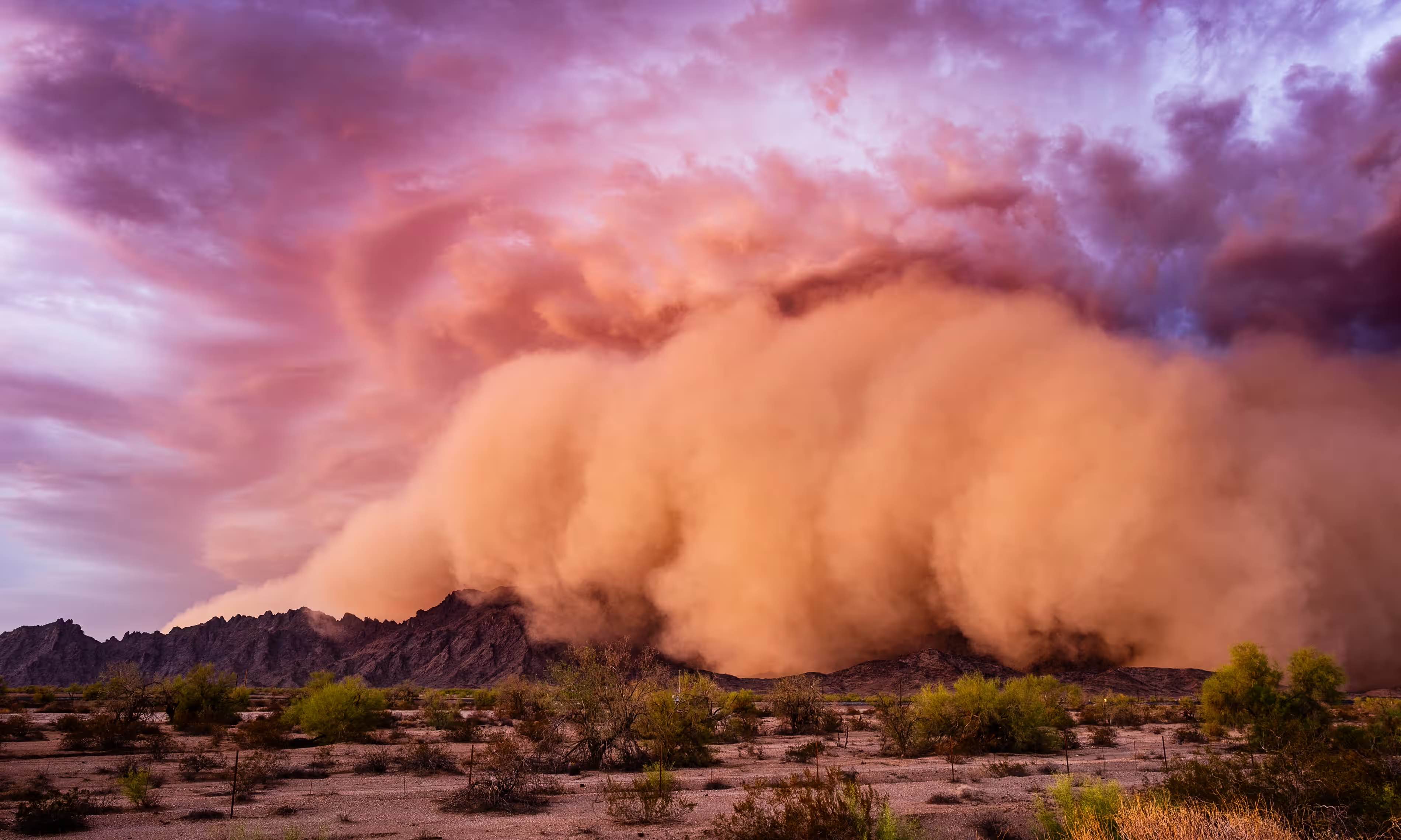
Back in 2016, we visited Jay Owens and his fascinating newsletter on dust… which went silent a couple of years later. Those of us who missed it, and were worried about its author were relieved to learn that he’d pulled back in order to turn his thinking into a book. That book is now here: Dust: The Modern World in a Trillion Particles, and The Guardian is here with an excerpt…
… Nobody normally thinks about dust, what it might be doing or where it should go: it is so tiny, so totally, absolutely, mundane, that it slips beneath the limits of vision. But if we pay attention, we can see the world within it.
Before we go any further, I should define my terms. What do I mean by dust? I want to say everything: almost everything can become dust, given time. The orange haze in the sky over Europe in the spring, the pale fur that accumulates on my writing desk and the black grime I wipe from my face in the evening after a day traversing the city. Dust gains its identity not from a singular material origin, but instead through its form (tiny solid particles), its mode of transport (airborne) and, perhaps, a certain loss of context, an inherent formlessness. If we knew precisely what it was made of, we might not call it dust, but instead dander or cement or pollen. “Tiny flying particles,” though, might suffice as a practical starting definition…
…
Dust is simultaneously a symbol of time, decay and death – and also the residue of life. Its meaning is never black or white, but grey and somewhat fuzzy. Living with dust – as we must – is a slow lesson in embracing contradiction: to clean, but not identify with cleanliness; to respect the material need for hygiene while distrusting it profoundly as a social metaphor…
A fascinating sample of a fascinating book: “Empire of dust: what the tiniest specks reveal about the world,” from @hautepop in @guardian.
Pair with: “Nothing is built on stone; all is built on sand” and “In every grain of sand there is the story of the earth.”
* from the burial service in the Book of Common Prayer
###
As we examine the elemental, we might send exploratory birthday greetings to Friedrich Wilhelm Heinrich Alexander von Humboldt; he was born on this date in 1769. The younger brother of the Prussian minister, philosopher, and linguist Wilhelm von Humboldt, Alexander was a geographer, geologist, archaeologist, naturalist, explorer, and champion of Romantic philosophy. Among many other contributions to human knowledge, his quantitative work on botanical geography laid the foundation for the field of biogeography; he surveyed and collected geological, zoological, botanical, and ethnographic specimens, including over 60,000 rare or new tropical plants.
As a geologist, Humboldt made pioneering observations of geological stratigraphy, structure (he named the Jurassic System), and geomorphology; and he understood the connections between volcanism and earthquakes. His advocacy of long-term systematic geophysical measurement laid the foundation for modern geomagnetic and meteorological monitoring.
For more, see: The Invention of Nature: Alexander Von Humboldt’s New World.

“The map? I will first make it.”*…

For map enthusiasts of all ages– Very Expensive Maps. As its self-description explains…
You get what you pay for: Very Expensive Maps is a podcast by cartographer Evan Applegate in which he interviews better cartographers. Listen to the best living mapmakers describe how they create worlds in ink, pixels, graphite, threads, paint, ceramic, wood and metal.
A podcast about maps? Let Jason Kottke reassure you…
A podcast about a visual medium like maps is maybe a tiny bit like dancing about architecture, but Applegate makes it work. The archives [from which, the examples above] are a key part of the show… lots of links to the maps discussed during each episode…
Applegate’s hope that you will be inspired: “Remember: you can, and should, make your own maps.“
* Patrick White, Voss
###
As we contemplate cartography, we might recall that it was on this date in 1682 that William Penn receives the area that is now the state of Delaware (from James, the Duke of York, who gotten it from the defeated previous owners, the Dutch), and added it to his colony of Pennsylvania. New maps were created.

You must be logged in to post a comment.