Paolo Veronese, The Adoration of the Magi, 1571 (source)
Attending to attentive canine figures in half a dozen paintings by Paolo Veronese, Thomas W. Laqueur explores the work of an artist whose love of dogs landed him in hot water with the Inquisition (and here)…
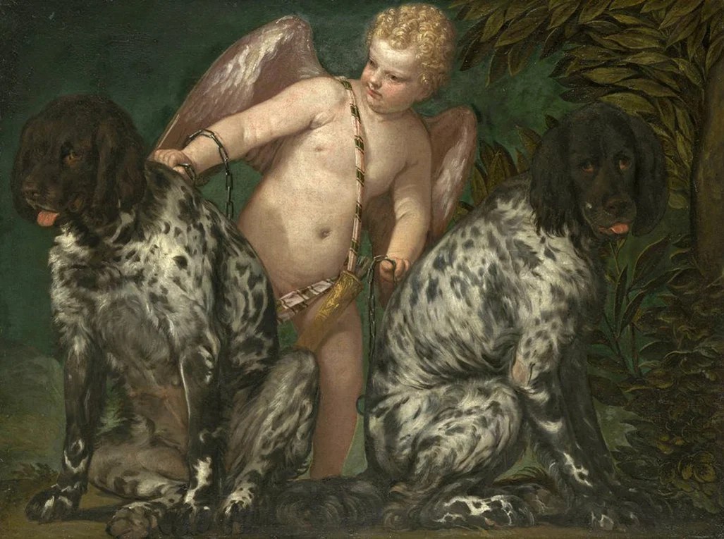
The art historian Kenneth Clark thought that Veronese was “the greatest dog lover of the Renaissance”. We have absolutely no biographical evidence to support this claim but we do have the evidence of numbers: there are a great many dogs in Veronese’s paintings. And Clark could have gotten support of a different kind from the great nineteenth-century critic John Ruskin. For Ruskin, Veronese’s dogs had a distinctive moral and social quality, which was especially prominent in one particular painting: Cupid with Two Dogs, a “great heroic poem”. Here, he wrote, two dogs are represented with the “highest, or spiritual view” of their nature: two magnificent mastiffs, “wildest of beasts perhaps they would have been by nature”. Between them is a beautiful boy, “golden quivered” — who represents, Ruskin thought, human love — holding the great beasts by a chain in his hands.
Paolo Veronese, Cupid with Two Dogs, 1580, a “great heroic poem” (source)
Love conquers savagery is how Ruskin interpreted the painting. But perhaps Cupid serves less as a stand-in for love (and its unpredictable nature) and more as a caretaker for these spectacular dogs, known for their steadfastness, who speak to a different kind of amorous union: one as faithful as dogs are to humans. The animals’ allegorical meaning, whatever it is, seems to me less important than the sweet intimacy with which the dogs are painted, grounded in their gaze and their sheer benign weightiness. The one on the right looks quizzically and seductively out at us; the other, the more relaxed one on the left, looks with Cupid toward the painter outside the frame. Perhaps contemporary viewers would have seen them as having been once the “wildest of beasts” but they seem very far from that now.
Visually they are the stars of the show in their almost psychedelically painted black-on-white spotted fur, their red tongues and glistening eyes like points of light. The curves of their backs frame the bathed, soft flesh of the Cupid figure; the leg of the dog on the left is intertwined with his leg — he is astride of it — and touches the left paw of the other dog. All this in a severely constrained space, a vignette, that stands at one end of a scale, with Veronese’s great theatrical scenes (and their dogs) at the other. This is a formally virtuosic painting, whatever else it is about or means, about dogs, doggishness, and the gaze. It would be a surprise, given his careful attention, if Veronese did not in fact love dogs…
[Laqueur considers other s of Veronese’s dogs…]
… We in fact have almost no documentary evidence why any painter, and Veronese in particular, was interested in thinking with dogs. But we do in his case have a tantalizing small hint because on July 18, 1573, he was called before the Inquisition to answer questions about one of his paintings, specifically about a dog that figures prominently, front and centre.
The Inquisitor asked if he had any idea why he had been summoned. Veronese replied that he did not although he speculated it might have been because the Inquisitors had summoned the Prior of San Giovani e Paulo who had commissioned a “Last Supper” from him as a replacement for a Titian on the same subject and “ordered him to have painted [in the picture] a Magdalen in place of a dog”. It had been more than three months since the painting had been finished; the dog was still there; no penitent prostitute had been added. Veronese confessed, that he had not done what they had ordered the Prior to order him to do. He told the Inquisitor that he would gladly do “everything necessary for my honour and for that of my painting”, but that he did “not understand how a figure of Magdalen would be suitable there.”
He had every reason not to understand. It is generally accepted that the painting in question was intended to be, as requested by the monastery, a Last Supper; we can identify it from all the detailed questions the Inquisitors asked and from its subsequent history. He might himself have caused some confusion by saying the painting was of the “Last Supper that Jesus Christ took with His Apostles in the House of Simon” when the Inquisitor asked what picture he was speaking about, although the Last Supper was neither at the house of Simon the Pharisee where the Magdalen story took place (Luke 7:36–50) nor of Simon the Leper (Mark 14:3–9) and Matthew 26:6–13) where Mary anointed Jesus. Veronese made no pretence in any of his feast scenes or other religious painting of faithfully illustrating a text. He was not unusual in this regard.
This was also not a Galileo moment: dogs in religious paintings did not threaten the teachings of the Church; there are plenty of them in paintings of The Last Supper. And they would be particularly appropriate in a commission from a Dominican monastery because of their well-known association with the order’s founder, St Dominic de Guzman. A black dog had announced to the saint’s mother “that she would bear in her womb a dog who, with a burning torch in his mouth and leaping from her womb, seemed to set the whole earth on fire”.6 She named her son after St Dominic of Silo, who had interceded on her behalf when she had failed to conceive. A dog with a torch in its mouth had already become in the late Middle Ages an iconographical sign for her son, the saint, in painting and sculpture for the order named after him and a logo until this day also for parishes named after the order’s founder. Everyone would know this. And, either in response to this story or independently much was made already in the Middle Ages of how the name of the order in Latin — Dominicanus — could easily be repurposed as Domini canis (“Dogs of the Lord”): dogs as the doppelgängers of the monks themselves, scurrying around corralling souls as in Andrea di Bonaiuto’s 1365 fresco Allegory of the Active and Triumphant Church.
But the problem was not, as Veronese first guessed, the presence of a dog instead of a Magdalen. In fact, he was not summoned in front of the Venetian Inquisition for heresy or even dubious iconography, although that charge was the ostensible subject of his trial. Veronese was collateral damage of local ecclesiastical politics, caught up in a struggle between Rome and Venice. The Inquisitor needed to prove himself to a new papal nuncio. In the context of the Counter-Reformation this painting could be construed as suspicious because of its indisputable theatrical extravagance; the Council of Trent had charged bishops with making sure that religious paintings were appropriately decorous and true to text.
Veronese’s only defence against this sort of attack — in addition to trying to claim he was no worse than Michelangelo in allowing his imagination full play — was a version of art for art’s sake: “We painters take the same licence the poets and the jesters take”. He filled the vast space of the canvas appropriately as his imagination dictated: his job was “to create the painting as I thought fit, it was large and could accommodate numerous figures”: “figures as ornaments, of my own invention”. The Inquisitor would have none of this. Everything in appropriate religious art, he was told, everything “befits the spiritual — there are no jesters, no dogs, no weapons, or any such silliness [as in yours]”. Veronese was ordered to “correct the painting” within three months.
In fact, all he did was put in a label where before there had been none. It read in the Latin of the Vulgate “Et fecit ei convivium magnum Levi in domo sua” (“Levi made the Lord a Great Feast”, Luke 5:29). A new name transformed Veronese’s Last Supper, in which soldiers and dogs and jesters might be regarded as sacrilegious and disrespectful, into a painting of a relatively obscure dinner with tax collectors and a great company of publicans at a rich man’s house to which Jesus had been invited. The Feast in the House of Levi, as the painting was now called, remained in the refectory of the priory for which it had been painted, watching over the monks as they ate, until it was moved to the Gallerie dell’Accademia in Venice in the nineteenth century.
Veronese, The Feast in the House of Levi (detail), 1573 (source)
* Martin Luther (speaking of his dog Tölpel [German for “klutz”]) in “Table Talk No. 2803” (1531), in Tischreden, vol. 3 (Weimar: Böhlaus Nachfolger, 1914) (author’s translation)
Henri Matisse, View of Notre Dame, 1914, oil on canvas, 58 x 37 ⅛ in, via Wikimedia Commons. Public domain.
Eminent art critic and historian Hal Foster has started what will be a four-part series in The Paris Review on looking at– and seeing– art…
Many of us look at art in the company of others; I have done so with a close friend, off and on, for five decades. We meet at a museum, wander around, settle on a painting (or, rather, it settles on us), look, talk, look more, talk more. We attend to the work and to each other; we enter its world together. Only recently and rarely have we written up our reactions, which we do individually. A testament to our friendship, this writing is also a tribute to the art, to the discursivity that informs it and the sociability that it allows.
Paintings call out to us in myriad ways. My friend and I are most drawn to pictures that are reflexive about looking, that anticipate it, that sharpen it, that alter our habits of seeing. This may be a Modernist criterion, but it hardly disqualifies older art; we have ranged as far back as Early Netherlandish painting. In this selection, though, I focus on pictures that date from the past hundred and fifty years. (For better or worse, that’s also my academic field.)
My aim in this exercise isn’t to tease out context, which is almost too present in wall texts today. Immediacy may be a mirage, but I try to come to my chosen works as directly as possible. It’s not that I ignore the texts on the walls; I just don’t get stuck there. I don’t pretend to see with a “period eye,” as Michael Baxandall called the attempt to perceive as historical viewers may have. Contextual information may often be necessary, but I keep it at a useful minimum. And though I sometimes get speculative, that’s part of the fun. In fact, one purpose of these studies is to be loosened from my scholarly superego (which isn’t very strong, in any case). I want to demystify the viewing of art a little, not to deskill it exactly, but to suggest that anyone can do it. Ignorant Art History is a big tent.
Looking at a painting is a welcome respite from scanning a screen. In that sense, this exercise is reactive: I labor in the small cottage industry of attention that has sprouted up in the cracks of the massive complex of distraction all around us. A phenomenological turn often occurs at times of intensive mediation, but the point is not simply to have our perceptions mirrored back to us. T. J. Clark has put the aim nicely: “When I am in front of a picture the thing I most want is to enter the picture’s world: it is the possibility of doing so that makes pictures worth looking at for me.” To look at a painting is also to exit our world for a while, and then to return to it cast in a different—distant—light. The time travel is often wonderful, and almost free…
The first of his short essays, on the Matisse pictured above, just dropped…
… As we approach this painting, we have little idea of what it depicts, or whether it depicts anything at all. A washy blue covers the entire surface unevenly, and its space is traversed by several black vectors. A vertical line stretches the length of the canvas on the far right, where it intersects with two horizontal lines that cut across the center of the picture. In the lower half of the painting, three diagonal lines run roughly parallel to one another, also toward the right.
The main motif floats in the top third of the painting. Outlined heavily in black, its interior is made up of the same blue as elsewhere except for one white blotch and a few black planes, scratched to reveal the white underneath. Three thin, white planes also appear in the interior, each crossed with a horizontal black stripe; the central plane divides the space in two.
All this is hard to sort out, and two more pieces on the right—a green blob beside a black one—only add to the puzzle. It is a complicated painting, but its complication is borne of simplicity. Completed in 1914, at the beginning of World War I, it is an austere work in an austere time.
The title offers a kind of lifeline: View of Notre Dame. But what kind of view and from where? And what are all the black lines? Neither abstract nor representational, the painting requires a shift in our way of looking: its elements are less images of things than signs for them.
We know that the Notre-Dame sits on the western end of the Île de la Cité in Paris. So the three diagonals might signify the quai along the Left Bank, the low path alongside the Seine, and the great river. The two horizontal lines then read as a bridge over the Seine, and the slight curve underneath them as its arched support. Finally, the long vertical line serves as the near edge of the quai, or perhaps of the very building from which the view is taken. The angles suggest that we look down on the scene from a Left Bank apartment several floors up. The overall blue signifies air and water where that seems appropriate, and anything else (or nothing at all) where it does not.
How does the squarish motif convey the famous cathedral? If the bisected shape suggests the two great towers, the white plane between them might evoke the rose window. Since we view the cathedral from the Left Bank, it appears turned away from us slightly, its south side more exposed. If the black areas register the sides of the building in deep shadow, the white ones might signify the play of light across the facade. And the blobs in green and black? The green could be a plant, and the black its shadow.
The pieces don’t add up completely or neatly. But then signification is about signaling-just-enough rather than representing-in-full. Here, seeing is guesswork. It often is elsewhere, too; we just don’t acknowledge it. Sometimes a sign doesn’t signify and sometimes it suggests more than one thing. The diagonals evoke both the quai and the river; the black areas convey a material thing here and an immaterial shadow there.
Around this time, Matisse kept a studio above the quai Saint-Michel. Might View of NotreDame double as a view of the interior from which it was painted? In that case, the Paris cathedral is also a French window, with blue sky and white clouds seen in or through the glass; the green shrub is also a plant on the sill; the lines of the bridge are also the molding in the room; and—who knows?—the diagonals of the bank are also the easel on which this very painting was produced…
The remaining three installments will drop weekly into May.
* “The most beautiful experience we can have is the mysterious. It is the fundamental emotion that stands at the cradle of true art and true science.” – Albert Einstein
###
As we appreciate art, we might recall that on this date in 1808, at the outbreak of the Peninsular War, the people of Madrid rose up in rebellion against French occupation.
Gregory T. Clark with an appreciation of van Eyck and of the recent Louvre exhibition of his work…
Over the course of the thirty years that I taught art history to college undergraduates, introducing my students to the manuscript illuminations and panel paintings of the fifteenth-century Flemish painter Jan van Eyck always gave me an especial pleasure. I wanted my students to share in my wonderment at Jan’s seemingly effortless ability to present nature rather than represent it, right down to the most infinitesimal details, without compromising the integrity of the whole, his powers of observation complemented by an uncanny ability to capture light, texture, and atmosphere.
The earliest surviving works of Jan—who is thought to have been born around 1390 in Maaseyck, modern-day Belgium—date to the first lustrum of the 1420s. In 1425, he was appointed court painter to Philip the Good, Duke of Burgundy, whose empire then comprised almost the entirety of the Low Countries and a large wedge of northeastern France together with his home duchy of Burgundy and the contiguous Franche-Comté (Free County) to the east. Moving to Bruges in 1430, Jan produced paintings for the Burgundian court, nobility, and haute bourgeoisie right up until his death there in 1441…
Jan van Eyck, Rolin Madonna, ca. 1435, Oil on panel, Musée du Louvre, Paris
… A like visual mastery characterizes the much larger Rolin Madonna itself. Measuring some twenty-six by twenty-five inches, the work shows the kneeling chancellor in prayer immediately before the enthroned Virgin and Child in a loggia that gives onto a sprawling landscape divided by a meandering river.
On Nicolas’s sinister side is a small town and beyond it a hillside with vineyards; the Rolin family drew much of its wealth from viticulture. On the holy figures’ dexter side rises a city composed almost entirely of churches, the two agglomerations linked by a single bridge across the river. Perhaps Jan is subtly warning the chancellor and all of us not to succumb to the blandishments of this mortal world, but rather to hew to the Christian faith and thereby cross the figurative River Jordan to the eternal City of God on the river’s other side.
The removal of centuries of grime and darkened varnish means that we can truly see Jan’s handiwork as he would have wished it. But what to marvel at first: Nicolas’ fur-edged brocade woven of chocolate-brown wool and silk and threads of gold? The gemstones that stud the hem of the Madonna’s red robe, the gold crown held by an angel over her head, and the cross of gold that surmounts the crystal orb in the baby Jesus’s left hand? The sprawling landscape beyond the three arches behind the chancellor and holy figures? Everywhere one looks there are details that astonish and enchant the eye but never compromise the unity of Jan’s vision.
Reproductions can only do partial justice to the paintings of Jan van Eyck; they beg to be seen face to face, and the Louvre exhibition offers the opportunity to see five of them together with fifty-nine objects that complement and widen our understanding of both his extraordinary art and his milieu…
* van Eyck’s motto, inscribed on the frame of the painting atop this post
###
As we look closely, we might spare a thought for Andrea Mantegna; he died on this date in 1506. An artist and printmaker, he was a key figure in Italian Renaissance painting (and the son-in-law of Jacopo Bellini).
Asked what he thought of Western civilisation, Mahatma Gandhi is said to have quipped that such a thing “would be a good idea”. (The West, he suggested, was not so enlightened.) But as Josephine Quinn makes clear in her new book, Western civilisation has always been a bad idea, or at any rate a wrong-headed one. To compartmentalise history into a set of distinct and essentially self-contained civilisations is a misguided quest that has dangerously distorted our understanding of the world, Ms Quinn asserts: “It is not peoples that make history, but people, and the connections that they create with one another.”
Ms Quinn, a historian and archaeologist who teaches at Oxford, does not spend 500-odd pages trashing what generations of schoolchildren have been taught to take pride in as European achievements. Instead, she demolishes the underlying concept of what she calls “civilisational thinking”. Her argument is simple, persuasive and deserving of attention.
The idea of civilisation, Ms Quinn points out, is relatively recent. The word was first used only in the mid-18th century and did not take hold of Western imaginations until the late 19th century. In that imperialist age, historians found that Greek, Roman and Christian civilisations made nice building blocks that could be stacked into a grand-looking construct, which they labelled “Western” or “European” civilisation. To this they attributed a host of inherited “classical” virtues: vigour, rationality, justice, democracy and courage to experiment and explore. Other civilisations, by contrast, were regarded as inferior.
It does not take much unpacking by Ms Quinn to expose the folly of this approach. Behold, for instance, John Stuart Mill, a philosopher in the 19th century, claiming that the Battle of Marathon, Persia’s first invasion of Greece in 490BC, was more important to English history than William the Conqueror’s triumph at Hastings in 1066. (Without an Athenian victory, the logic goes, the magical seed of Greek civilisation might never have grown into Western civilisation.) Or consider “The Clash of Civilisations” (1996) by Samuel Huntington, an American historian, who declared it impossible to understand history without classifying humanity into mutually hostile civilisations between which, “during most of human existence”, contact has been “intermittent or non-existent”.
What is non-existent is any truth to that notion. Ms. Quinn’s brisk, scholarly romp across the arc of European history shows that, far from being rare, contact across and between cultures, often over surprisingly long distances, has been the main motor of human advancement in every age. Rather than being prickly and inward-looking, most societies have proved receptive to ideas, fashions and technologies from their neighbours…
As we ponder the past’s presence in our present, we might send civilized birthday greetings to a man who contributed mightily to the paradigms that Quinn questions, Bernard Ashmole; he was born on this date in 1894. A historian, archaeologist, and art historian, he taught at both the University of London and Oxford and served as Keeper of Greek and Roman Antiquities at the British Museum from 1939 to 1956.
A few months back—in the lee of the Rijksmuseum’s epic Vermeer show and Ren’s [Wechsler’s] controversial Atlantic magazine article (featured in our Issue #39) on Vermeer and Benjamin Binstock’s intriguing contention that eight of the thirty-four paintings conventionally attributed to the Delft master were in fact by his daughter Maria—the eminent curator Helen Molesworth invited Ren and Claudia Swan (the historian behind Rarities of These Lands and other classics on the Dutch Golden Age) to engage in a conversation evaluating both that show and Binstock’s thesis for an episode of her ongoing Dialogues podcast, out of the David Zwirner Gallery. And indeed, that half-hour episode dropped yesterday—and we thought you might enjoy hearing it here. Spoiler alert: Two of the top people in the field seem decidedly open to Binstock’s theory…
As we argue over attribution, we might send grateful birthday greetings to Leon Battista Alberti; he was born on this date in 1404. The archetypical Renaissance humanist polymath, Alberti was an author, artist, architect, poet, priest, linguist, philosopher, cartographer, and cryptographer. Indeed, with Johannes Trithemius, he is considered the father of cryptography. And he collaborated with Toscanelli on the maps used by Columbus on his first voyage.
But he is surely best remembered as the man who “wrote the book” on perspective: he authored of the first general treatise– De Pictura(1434)– on the the laws of perspective, which built on and extended Brunelleschi’s work to describe the approach and technique that established the science of projective geometry… and fueled the progress of painting, sculpture, and architecture from the Greek- and Arabic-influenced formalism of the High Middle Ages to the more naturalistic (and Latinate) styles of Renaissance.



You must be logged in to post a comment.