Posts Tagged ‘statistics’
“It’s the bell curve again”*…

Joseph Howlett on how the central limit theorem, which started as a bar trick for 18th-century gamblers, became something on which scientists rely every day…
No matter where you look, a bell curve is close by.
Place a measuring cup in your backyard every time it rains and note the height of the water when it stops: Your data will conform to a bell curve. Record 100 people’s guesses at the number of jelly beans in a jar, and they’ll follow a bell curve. Measure enough women’s heights, men’s weights, SAT scores, marathon times — you’ll always get the same smooth, rounded hump that tapers at the edges.
Why does the bell curve pop up in so many datasets?
The answer boils down to the central limit theorem, a mathematical truth so powerful that it often strikes newcomers as impossible, like a magic trick of nature. “The central limit theorem is pretty amazing because it is so unintuitive and surprising,” said Daniela Witten, a biostatistician at the University of Washington. Through it, the most random, unimaginable chaos can lead to striking predictability.
It’s now a pillar on which much of modern empirical science rests. Almost every time a scientist uses measurements to infer something about the world, the central limit theorem is buried somewhere in the methods. Without it, it would be hard for science to say anything, with any confidence, about anything.
“I don’t think the field of statistics would exist without the central limit theorem,” said Larry Wasserman, a statistician at Carnegie Mellon University. “It’s everything.”
Perhaps it shouldn’t come as a surprise that the push to find regularity in randomness came from the study of gambling…
Read on for the fascinating story of: “The Math That Explains Why Bell Curves Are Everywhere,” from @quantamagazine.bsky.social.
Howlett concludes by observing that “The central limit theorem is a pillar of modern science, ultimately, because it’s a pillar of the world around us. When we combine lots of independent measurements, we get clusters. And if we’re clever enough, we can use those clusters to find out something interesting about the processes that made them”– which follows from the story he shares.
Still, we’d do well to remember that there are limits to its applicability, both descriptively (as Nassim Nicholas Taleb points out, “because the bell curve ignores large deviations, cannot handle them, yet makes us confident that we have tamed uncertainty”) and prescriptively (as Benjamim Bloom argues, “The bell-shaped curve is not sacred. It describes the outcome of a random process. Since education is a purposeful activity….the achievement distribution should be very different from the normal curve if our instruction is effective).
For (much) more, see Peter Bernstein‘s wonderful Against the Gods: The Remarkable Story of Risk
* Robert A. Heinlein, Time Enough for Love
###
As we noodle on the normal distribution, we might send curve-shattering birthday greetings to Norman Borlaug; he was born on ths date in 1914. An agronomist, he developed and led initiatives worldwide that contributed to the voluminous increases in agricultural production we call “the Green Revolution.” Borlaug was awarded multiple honors for his work, including the Nobel Peace Prize, the Presidential Medal of Freedom, and the Congressional Gold Medal; he’s one of only seven people to have received all three of those awards.

“You get what you measure”*…

Matt Stoller takes the occasion of Trump’s selection of Kevin Warsh to head the Fed (“an orthodox Wall Street GOP pick, though he is married to the billionaire heiress of the Estee Lauder fortune and was named in the Epstein files. He’s perceived not as a Trump loyalist but as an avatar of capital”) to ponder why public satisfaction with the economy is so low (“if you judge solely by consumer sentiment, Trump’s first term was the third best economy Americans experienced since 1960. Trump’s second term is not only worse than his first, it is the worst economic management ever recorded by this indicator”).
Stoller argues that we’re mesuring the wrong things (or, in some cases, the right things in the wrong ways)…
… the models underpinning how policymakers think about the economy just don’t reflect the realities of modern commerce. The fundamental dynamic is that those models were constructed in an era where America was one discrete economy, with Wall Street and the public tied together by the housing finance system. But today, Americans increasingly live in tiered bubbles that have less and less to do with one another. Warsh will essentially be looking at the wrong indicators, pushing buttons that are mislabeled.
While corporate America is experiencing good times, much of the country is experiencing recessionary conditions. Let’s contrast consumer sentiment indicators with statistics showing an economic boom. Last week, the government came out with stats on real gross domestic product increasing at a scorching 4.4% in the third quarter of last year. There’s higher consumer spending, corporate investment, government spending, and a better trade balance. Inflation, according to the Consumer Price Index, is low at 2.6.% over the past year. And while official numbers aren’t out for the final three months of the year, the Atlanta Fed’s GDPNow forecast shows that it estimates growth at 4.2%. And there are other indicators showing prosperity, from low unemployment to high business formation, which was up about 8% last year, as well as record corporate profits…
… Behavioral economists and psychologists have all sorts of reasons to explain that people don’t really understand the economy particularly well. But in general, when the stats and the public mood conflict, I believe the public is usually correct. Often, there are some weird anomalies with the data used by policymakers. In 2023, I noticed that the consumer price index, the typical measure of inflation, didn’t account for borrowing costs, so the Fed hike cycle, which caused increases in credit card, mortgage, auto loan, payday loans, et al, just wasn’t incorporated. The public wasn’t mad at phantom inflation, they were mad at real inflation that the “experts” didn’t see.
I don’t think that’s the only miscalculation…
[Stoller goes on to explain the ways in which “consumer spending” doesn’t tell us much about consumers anymore, about the painful reality of “spending inequality,” and about the obscure(d) problem of monopoly-driven inflation. He concludes…]
… Finally, there’s a more philosophical point, which I don’t think explains the short-term frustrations people feel, but is directionally correct. Do people actually want what the economy is producing? For most of the 20th century, the answer was yes. When Simon Kuznets invented these measurement statistics in 1934, financial value and the value that Americans placed on products and services were similar. A bigger economy meant things like toilets and electricity spreading across rural America, and cars and food and washing machines.
Today? Well, that’s less clear. According to the Bureau of Labor Statistics, the second fastest growing sector of the economy in terms of GDP growth from 2019-2024 was gambling. Philip Pilkington wrote a good essay last summer on the moral assumptions behind our growth statistics. There is no agreed upon notion of what makes up an economically valuable object or activity, so our stats are inherently subtle moral judgments. Classic moral philosophers like Adam Smith believed in the “use value” of an item, meaning how it could be used, whereas neoclassical economists believed in the “exchange value” of an item, making no judgments about use and are just counting up its market price.
Normal people subscribe on a moral level to use value. Most of us see someone spending money on a gambling addiction as doing something worse than providing Christmas presents for kids, but not because of price. However, our GDP models use the market value basis. Kuznets, presumably, was not amoral, he just thought that our laws would ban immoral activities like gambling, and so use value and market value wouldn’t diverge. But they have.
It’s not just things like gambling or pornography or speculation. A lot of previously unmeasured activity has been turned into data and monetized, which isn’t actually increasing real growth but measuring what already existed. Take the change from meeting someone at a party to using a dating app. One is part of GDP, the other isn’t. Both are real, but only one would show a bigger economy.
Beyond that much of our economy is now based on intangibles – the fastest growing sector was software publishing. Is Microsoft moving to a subscription fee model for Office truly some sort of groundbreaking new product? It’s hard to say, while corporate assets used to be hard things like factories, today much of it is intangibles like intellectual property.
A boomcession, where the rich and corporate America experience a boom while working people feel a recession, is a very unhealthy dynamic. It’s certainly possible to create metrics to measure it, and to help policymakers understand real income growth among different subgroups. You could start looking at real income after non-discretionary consumer spending, or find ways of adjusting for price discrimination.
But I think a better approach is to try to knit us into one society again. The kinds of policymakers who could try to create metrics to understand the different experiences of classes, and ameliorate them, don’t have power. Instead, the people in charge still use models which presume one economy and one relatively uniform set of prices, where “consumer spending” means stuff consumers want.
I once noted a speech in 2016 by then-Fed Chair Janet Yellen in which she expressed surprise that powerful rich firms and small weak ones had different borrowing rates, which affected the “monetary transmission channel” the Fed relied on. Sure it was obvious in the real world, but she preferred theory.
Or they don’t use models at all; Kevin Warsh is not an economist, he’s a lawyer and political operative, and is uninterested in academic theory. He cares about corporate profits and capital formation. That probably won’t work out well either.
At any rate, we have to start measuring what matters again. If we don’t, then we’ll continue to be baffled that normal people hate the economy that looks fine on our charts…
The models used by policymakers to understand wages, economic growth, and consumer spending are misleading. That’s why corporate America is having a party, and everyone else is mad. Eminently worth reading in full: “The Boomcession: Why Americans Hate What Looks Like an Economic Boom,” from @matthewstoller.bsky.social (or @mattstoller.skystack.xyz).
* Richard Hamming (and also to the article above, see “Goodhart’s law“)
###
As we ponder the pecuniary, we might recall that it was on this date in 1958 that Benelux Economic Union was founded, creating the seed from the European Economic Community, then the European Union grew.
On that same day, Philadelphia doo wop group The Silhouettes started five weeks at the top of the Billboard R&B chart with their first single, “Get A Job.”
“The first principle is that you must not fool yourself – and you are the easiest person to fool”*…

We live in a time when a growing number of “authorities” in the U.S. and around the world are actively trading fact for convenient fiction. Science is under attack; there’s (all-too-grounded) concern that we may be headed into a new “Dark Age.”
C. Brandon Ogbunu pushes back, arguing that science– and more particularly, the emerging research field of metascience, a form of scientific self-examination– is essential for navigating our uncertain future…
On May 24, Vice President J.D. Vance authored a post on X that highlighted a “reproducibility crisis” in the sciences. Vance offered this amid a series of other critiques of higher education to justify the withholding of federal science funding to universities over the past several months. His post was timed to accompany a White House executive order that invoked the language of open science to introduce sweeping changes to our federal scientific infrastructure. It came just weeks after the release of plans to cut science funding in the 2026 fiscal year budget.
The playbook is standard: Fuse an aggressive political agenda to a more palatable set of criticisms. In this case, many agree that processes within professional science have, for decades, had significant flaws. In my view, politicians in power are using this as a justification to burn it down. And outside of a few higher-education legal efforts to fight back, the scientific community remains shell-shocked, unable to gather the momentum to resist effectively.
But in addition to resisting the changes, there might be other ways that we can navigate an uncertain future. In recent years, a field called “metascience” (often referred to as “the science of science”) has emerged, charged with understanding the processes of science, how it operates, and identifying themes in what is produced. I argue that this area is going to be essential moving forward in stormy times, as it can dispel the myth that science is an ideological leviathan incapable of self-reflection and can help us rebuild science into a craft that interrogates its fragilities.
As described in a 2018 review, the science of science “is based on a transdisciplinary approach that uses large data sets to study the mechanisms underlying the doing of science—from the choice of a research problem to career trajectories and progress within a field.” It asks questions about aspects of the scientific enterprise, including employment, publishing trends, economic incentives, merit, and other forces that influence science in ways that may escape our intuition…
[Ogbunu explains metascience, and explores examples of work-to-date and questions like: Who is doing science? What are their incentives (and how do they shape behavior)? How innovative is science? He reminds us that “metascientists” are following in the footsteps of humanists and social scientists (Bruno Latour, for example) have examined science practice for many decades…]
… metascience offers a lens that is especially important at this critical moment. Support for science in the face of attacks is critical and necessary. But ironically, one of the best ways to defend the craft might be for scientists to identify the fragilities before the enemy does. We can use data and models, not solely our op-ed voices and social media timelines (though all can be useful). The field is already disabusing us of the notion that science as practiced is based on defensible incentives, neutrality of any kind, or merit, however defined.
Instead, it operates on what looks more like a runaway Matthew Effect, whereby the most established scientists benefit disproportionately from the system of reward — and thus the rich get richer. And the problem isn’t that the flaws exist, but that science’s practitioners aren’t interested in a critical lens towards them.
Metascience won’t fix our problems, but it formalizes ways that we can use to reflect, which may implore us to change science for the better…
Physicians (and other scientists) healing themselves: “Metascience Is More Important Now Than Ever,” from @cbo.bsky.social in @undark.org.
###
As we commit to comprehension, we might send insightful birthday greetings to a forefather of metascience, Charles Sanders Peirce; he was born on this date in 1839. A scientist, mathematician, logician, and philosopher, he was (per philosopher Paul Weiss) “the most original and versatile of America’s philosophers and America’s greatest logician”. Bertrand Russell wrote “he was one of the most original minds of the later nineteenth century and certainly the greatest American thinker ever.” He is considered by many to be “the father of pragmatism“; he helped formalize the field of statistics; and his contributions logic were foundational– helping to found semiotics (the study of signs).
For Peirce, logic encompassed much of what is now called epistemology and the philosophy of science. Peirce approached science as a practice, defining the concept of abductive reasoning to explain scientific advance, as well as rigorously formulating mathematical induction and deductive reasoning.

“Any chart, no matter how well designed, will mislead us if we don’t pay attention to it. The world cannot be understood without numbers. And it cannot be understood with numbers alone.”*…
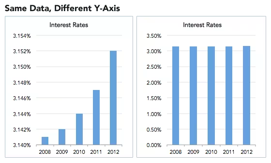
Spencer Greenberg on the critical importance of thinking critically about the charts and graphs that we constantly consume…
In 1994, the U.S. Congress passed the largest crime bill in U.S. history, called the Violent Crime Control and Law Enforcement Act. The bill allocated billions of dollars to build more prisons and hire 100,000 new police officers, among other things. In the years following the bill’s passage, violent crime rates in the U.S. dropped drastically, from around 750 offenses per 100,000 people in 1990 to under 400 in 2018.
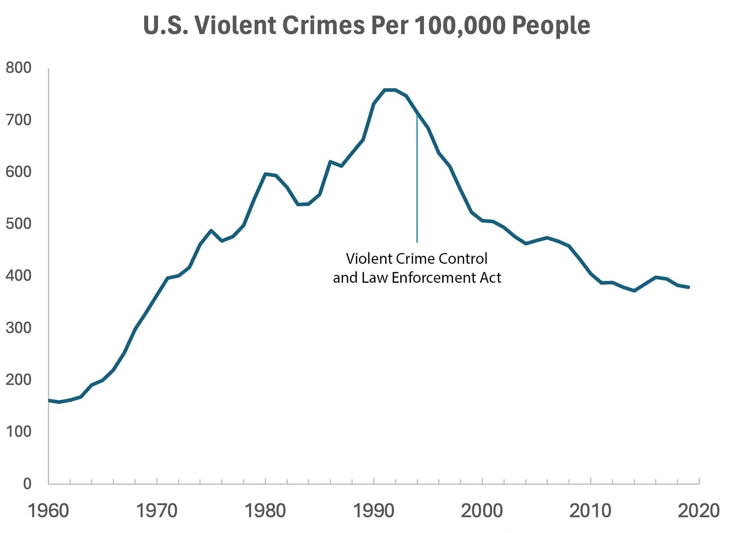
But can we infer, as this chart seems to ask us to, that the bill caused the drop in crime?
As it turns out, this chart wasn’t put together by sociologists or political scientists who’ve studied violent crime. Rather, we—a mathematician and a writer—devised it to make a point: Although charts seem to reflect reality, they often convey narratives that are misleading or entirely false.
Upon seeing that violent crime dipped after 1990, we looked up major events that happened right around that time—selecting one, the 1994 Crime Bill, and slapping it on the graph. There are other events we could have stuck on the graph just as easily that would likely have invited you to construct a completely different causal story. In other words, the bill and the data in the graph are real, but the story is manufactured.
Perhaps the 1994 Crime Bill really did cause the drop in violent crime, or perhaps the causality goes the other way: the spike in violent crime motivated politicians to pass the act in the first place. (Note that the act was passed slightly after the violent crime rate peaked!)
Charts are a concise way not only to show data but also to tell a story. Such stories, however, reflect the interpretations of a chart’s creators and are often accepted by the viewer without skepticism. As Noah Smith and many others have argued, charts contain hidden assumptions that can drastically change the story they tell.
This has important consequences for science, which, in its ideal form, attempts to report findings as objectively as possible. When a single chart can be the explanatory linchpin for years of scientific effort, unveiling a data visualization’s hidden assumptions becomes an essential skill for determining what’s really true. As physicist Richard Feynman once said: In science, “the first principle is that you must not fool yourself, and you are the easiest person to fool.”What we mean to say is—don’t be fooled by charts…
[Greenberg unpacks a couple of powerful examples…]
… to avoid producing a chart that misleads scientists, which misleads journalists, which misleads the public, and which then contributes to widespread confusion, you must think carefully about what you actually aim to measure. Which representation of the data best reflects the question being asked and relies on the sturdiest assumptions?
After all, scientific charts are a means to read data rather than an explanation of how that data is collected. The explanation comes from a careful reading of methods, parameters, definitions, and good epistemic practices like interrogating where data comes from and what could be motivating the researchers who produced it.
In the end, the story a chart tells is still just that—a story—and to be a discerning reader, you must reveal and interrogate the assumptions that steer those narratives…
Eminently worth reading in full: “How charts can inadvertently manipulate reality,” from @spencrgreenberg.bsky.social.
* Alberto Cairo, How Charts Lie: Getting Smarter about Visual Information
###
As we ferret out the facts, we might recall that it was on this date in 1874 that Florence Nightingale became the first female President of the Royal Statistical Society.
Famed for her work as a nurse in the Crimean War, she went on to found training facilities and nursing homes– pioneering both medical training for women and what is now known as Social Entrepreneuring. Less well-known are Nightingale’s contributions to epidemiology, statistics, and the visual communication of data in the field of public health. Always good at math, she pioneered the use of the polar area chart (the equivalent to a modern circular histogram or rose diagram) and popularized the pie chart (which had been developed in 1801 by William Playfair). Nightingale later became an honorary member of the American Statistical Association.

“Diagram of the causes of mortality in the army in the East” by Florence Nightingale, an example of the the polar area diagram (AKA, the Nightingale rose diagram) source

“Patience’s design flaw became obvious for the first time in my life: the outcome is decided not during the course of play but when the cards are shuffled, before the game even begins. How pointless is that?”*…

As Simone de Rochefort explains, Patience– or as we tend to know it, solitaire— illustrates the way in which some of humanity’s oldest toys are our most complex…
… last year, I got addicted to Solitaire.
Why me.
During the dark final days of 2024, I was averaging 12 wins per day in Sawayama Solitaire, one of the Solitaires created by developer Zachtronics. Sawayama Solitaire is a variant of Klondike — the one that’s been bundled into every version of Windows since 1990.
Some games of Sawayama Solitaire felt impossible. Some were absurdly easy. Most of them were a satisfying detangling of cards that had me immediately pressing that “new game” button once I got the win.
How was the most basic card game on Earth owning my life like this?
I think it’s because we don’t understand playing cards.
In 1969, as protests raged against the Vietnam War and counterculture made waves across the nation, a magician [and dear friend of Ricky Jay] named Persi Diaconis went to college.
Diaconis had been a professional magician since age 14, and was skilled in sleight-of-hand tricks. But it was probability that fascinated him.
He went on to take a degree in statistics. He became a world-renowned mathematician. In 1992, he proved that it takes seven riffle shuffles to truly randomize a 52-card deck, alongside fellow mathematician Dave Bayer. His research on card shuffling has implications for scientific fields as far-flung as the study of glass melting and the creation of magnets.
He doesn’t know how Solitaire works.
“One of the embarrassment of applied probability is that we can not analyze the original game of solitaire,” he wrote in the abstract for an academic talk called “The Mathematics of Solitaire,” given at the University of Washington in 1999. The talk has been given several times over the years, and is currently viewable on YouTube. One of his most recent appearances, in 2024, reiterates that despite all the technical advances we’ve made in science and mathematics, the complexity of cards is still somewhat a black box.
“What’s the chance of winning, how to play well, how do various changes of rules change the answers?” Diaconis wrote. “Surely you say, the computer can do this. Not at present, not even close.”
It’s not hard to see the relationship between magic and math. Cards contain limitless possibilities. In fact, math tells us there are more combinations of cards in a 52-card deck than there are atoms on Earth.
Writing for Quanta Magazine, Erica Klarreich asked mathematician Ron Graham what that means in practice. He told her, “If everyone had been shuffling decks of cards every second since the start of the Earth, you couldn’t touch 52 factorial,” the number of possible arrangements of a 52-card deck. Klarreich goes on: “Any time you shuffle a deck to the point of randomness, you have probably created an arrangement that has never existed before.”
So that’s nuts…
More amazement at “No one understands how playing cards work,” from @polygon.com.
And here:
* David Mitchell, Cloud Atlas
###
As we shuffle along, we might spare a thought for Christiaan Huygens; he died on this date in 1695. A mathematician, physicist, engineer, astronomer, and inventor, he was a key figure in the Scientific Revolution. In physics, Huygens made seminal contributions to optics and mechanics, while as an astronomer he studied the rings of Saturn and discovered its largest moon, Titan. As an engineer and inventor, he improved the design of telescopes and invented the pendulum clock, the most accurate timekeeper for almost 300 years. A talented mathematician and physicist, his works contain the first idealization of a physical problem by a set of mathematical parameters, and the first mathematical and mechanistic explanation of an unobservable physical phenomenon.
Relevantly to the piece above, Huygens also contributed to the development of probability theory and statistics. In 1665 he visited Paris and encountered the work of Fermat and Pascal, which led him to write what was, at the time, the most coherent presentation of a mathematical approach to games of chance in De Ratiociniis in Ludo Aleae (On reasoning in games of chance)– a work contains early game-theoretic ideas.

You must be logged in to post a comment.