Posts Tagged ‘graphics’
“Personally, I would like to renounce speech altogether and, like organic nature, communicate everything I have to say visually”*…

Driving across America, one encounters a wide variety of cultures, landscapes, people, and animals. But the one consistent thing that will stay the same from Maine to California are the signs one passes on the highway. That’s because, as Jon Keegan explains, America’s roads and highways have a big, fat style guide…
First published in 1935, the Federal Highway Administration’s (FHWA) “Manual on Uniform Traffic Control” (MUTCD), is a hefty tome consisting of close to 900 pages that contains the federal standards for all traffic safety signs, roadway markings and other “traffic control devices” that a driver on a road in the U.S. might encounter.
The MUTCD states that it “shall be recognized as the national standard for all traffic control devices installed on any street, highway, bikeway, or private road open to public travel”. Exact specifications for the font, size, spacing of letters, background colors, reflectivity, mounting location and orientation help ensure that traffic signs are consistently readable at a glance while driving anywhere in the U.S…

The remarkable– and enlightening– story: “The Style Guide for America’s Highways: The Manual on Uniform Traffic Control Devices,” from @jonkeegan. TotH to @kottke.
* Johann Wolfgang von Goethe
###
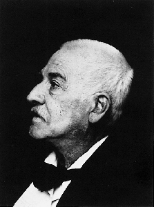
As we read the signs, we might send elegantly-designed birthday greetings to Walter de Silva; he was born on this date in 1951. A car designer and automotive executive, he began as a designer at Fiat in 1972, then went on to lead design at Alfa Romeo, SEAT, Audi, and finally Volkswagen Group– where, in 2007, he became Chairman.

“We often plough so much energy into the big picture, we forget the pixels”*…
Alvy Ray Smith (see also here) was born before computers, made his first computer graphic in 1964, cofounded Pixar, was the first director of computer graphics at Lucasfilm, and the first graphics fellow at Microsoft. He is the author of the terrific new book A Biography of the Pixel (2021), from which, this excerpt…
I have billions of pixels in my cellphone, and you probably do too. But what is a pixel? Why do so many people think that pixels are little abutting squares? Now that we’re aswim in an ocean of zettapixels (21 zeros), it’s time to understand what they are. The underlying idea – a repackaging of infinity – is subtle and beautiful. Far from being squares or dots that ‘sort of’ approximate a smooth visual scene, pixels are the profound and exact concept at the heart of all the images that surround us – the elementary particles of modern pictures.
This brief history of the pixel begins with Joseph Fourier in the French Revolution and ends in the year 2000 – the recent millennium. I strip away the usual mathematical baggage that hides the pixel from ordinary view, and then present a way of looking at what it has wrought.
The millennium is a suitable endpoint because it marked what’s called the great digital convergence, an immense but uncelebrated event, when all the old analogue media types coalesced into the one digital medium. The era of digital light – all pictures, for whatever purposes, made of pixels – thus quietly began. It’s a vast field: books, movies, television, electronic games, cellphones displays, app interfaces, virtual reality, weather satellite images, Mars rover pictures – to mention a few categories – even parking meters and dashboards. Nearly all pictures in the world today are digital light, including nearly all the printed words. In fact, because of the digital explosion, this includes nearly all the pictures ever made. Art museums and kindergartens are among the few remaining analogue bastions, where pictures fashioned from old media can reliably be found…
An exact mathematical concept, pixels are the elementary particles of pictures, based on a subtle unpacking of infinity: “Pixel: a biography,” from @alvyray.
###
As we ruminate on resolution, we might recall that it was on this date in 1947 that fabled computer scientist Grace Hopper (see here and here), then a programmer at Harvard’s Harvard’s Mark II Aiken Relay computer, found and documented the first computer “bug”– an insect that had lodged in the works. The incident is recorded in Hopper’s logbook alongside the offending moth, taped to the logbook page: “15:45 Relay #70 Panel F (moth) in relay. First actual case of bug being found.”
This anecdote has led to Hopper being pretty widely credited with coining the term “bug” (and ultimately “de-bug”) in its technological usage… but the term actually dates back at least to Thomas Edison…

“Without a map who would attempt to study geography?”*…

History and maps!…
Imagine creating a timeline of your country’s whole history stretching back to its inception.
It would be no small task, and simply weighing the relative importance of so many great people, technological achievements, and pivotal events would be a tiny miracle in itself.
While that seems like a challenge, imagine going a few steps further. Instead of a timeline for just one country, what about creating a graphical timeline showing the history of the entire world over a 4,000 year time period, all while having no access to computers or the internet?…
John B. Sparks maps the ebb and flow of global power going all the way back to 2,000 B.C. on one coherent timeline.

Histomap, published by Rand McNally in 1931, is an ambitious attempt at fitting a mountain of historical information onto a five-foot-long poster. The poster cost $1 at the time, which would equal approximately $18 when accounting for inflation.
Although the distribution of power is not quantitatively defined on the x-axis, it does provide a rare example of looking at historic civilizations in relative terms. While the Roman Empire takes up a lot of real estate during its Golden Age, for example, we still get a decent look at what was happening in other parts of the world during that period.
The visualization is also effective at showing the ascent and decline of various competing states, nations, and empires. Did Sparks see world history as a zero-sum exercise; a collection of nations battling one another for control over scarce territory and resources?
Crowning a world leader at certain points in history is relatively easy, but divvying up influence or power to everyone across 4,000 years requires some creativity, and likely some guesswork, as well. Some would argue that the lack of hard data makes it impossible to draw these types of conclusions (though there have been other more quantitative approaches.)
Another obvious criticism is that the measures of influence are skewed in favor of Western powers. China’s “seam”, for example, is suspiciously thin throughout the length of the timeline. Certainly, the creator’s biases and blind spots become more apparent in the information-abundant 21st century.
Lastly, Histomap refers to various cultural and racial groups using terms that may seem rather dated to today’s viewers.
John Spark’s creation is an admirable attempt at making history more approachable and entertaining. Today, we have seemingly limitless access to information, but in the 1930s an all encompassing timeline of history would have been incredibly useful and groundbreaking. Indeed, the map’s publisher characterized the piece as a useful tool for examining the correlation between different empires during points in history.
Critiques aside, work like this paved the way for the production of modern data visualizations and charts that help people better understand the world around them today…
Histomap: a 1931 attempt to visualize the 4,000 year history of global power. (via Visual Capitalist)
* John B. Sparks, creator of Histomap
###
As we ponder patterns in the past, we might spare a thought for Carl Jacob Christoph Burckhardt; he died on this date in 1897. Probably best known for The Civilization of the Renaissance in Italy (which established that period as the vaunted subject it has become), he was a historian of art and culture and an influential figure in the historiography of both fields. Indeed, he is considered one the the founders of cultural history.
Sigfried Giedion said of Burckhardt’s achievement: “The great discoverer of the age of the Renaissance, he first showed how a period should be treated in its entirety, with regard not only for its painting, sculpture and architecture, but for the social institutions of its daily life as well.”
“The magician and the politician have much in common: they both have to draw our attention away from what they are really doing”*…

Across his work as a designer and the publisher of CentreCentre books, London-based Patrick Fry is always looking for a stone unturned. This fascination with niche nuggets of cultural history has led to a unique selection of books, from a deep dive into Great British Rubbish, or forgotten postcards from South Yorkshire. His most recent venture, however, is into a subject a little more familiar – magic!
A long-time fan of traditional magic posters for their “lavish illustrations with magicians performing the impossible and their outrageous names written in fancy lettering,” surprisingly publishing a book on magic ephemera was something Patrick had never considered. This was largely due to it being “a world that has been recorded plenty” and against the criteria he would usually look for in a book, until he came across the vast magic collection of Philip David Treece.

Found during a scroll through Twitter, Patrick came across Philip’s magic history blog, Collecting Magic, where he writes about his collection of ephemera and apparatus spanning the past 25 years. Thankfully for Patrick too, “Philip isn’t primarily concerned with the monetary value of the pieces, and as such has amassed a fascinating array that speaks more of the social history surrounding everyday working magicians.” Presented with a huge collection of gems “away from the large-scale stage magicians… it quickly became clear that the less famous and smaller-run design pieces would create a brilliant book.”…

For fans of conjuring or design or (like your correspondent) both: “Magic Papers dives deep into the flamboyant design of magic ephemera.”
* Ben Okri
###
As we say “abracadabra,” we might recall that it was on this date that Universal released “Trolley Trouble” from Walt Disney Studios. The first Disney cartoon to spawn a series, it featured Oswald the Lucky Rabbit (the creation of Walt’s long-time collaborator Ub Iwerks). Oswald featured in 27 successful animated shorts– but Disney lost the rights to Universal. So, he and Iwerks created a new featured character, Mickey Mouse.
On this date three years later, Pluto made his debut (with Mickey) in the short, “The Chain Gang.”
“It is necessary to keep one’s compass in one’s eyes”*…

A “compass rose” is a graphic device found on maps and nautical charts (as well as on the faces of compasses and some monuments) that displays the orientation of the cardinal directions (north, east, south, and west) and their intermediate points.

And as these examples from the collection of the The American Geographical Society Library demonstrate, they can also be fascinating– and beautiful– graphic elements in their own right.
See more at the AGSL’s Compass Rose Flickr page. Browse the Library’s full digital collection here.
* Michelangelo
###
As we find our way, we might spare a pining thought for Petrarch (Francesco Petrarca); it was on this date in 1327, after he’d given up his vocation as a priest, that he first set eyes on “Laura” in the church of Sainte-Claire d’Avignon– an encounter that awoke in him a passion that spawned the 366 poems in Il Canzoniere (“Song Book”).
Considered by many to have been “the Father of Humanism,” and reputed to have coined the term “Renaissance,” Petrarch was most famous in his time for his paeans to his idealized lover (who was, many scholars believe, Laura de Noves, the wife of Hugues de Sade). But Petrarch’s more fundamental and lasting contribution to culture came via Pietro Bembo who created the model for the modern Italian language in the 16th century largely based on the works of Petrarch (and to a lesser degree, those of Dante and Boccaccio).
Laura de Noves died on this date in 1348.

Lura de Noves

Petrarch
You must be logged in to post a comment.