Posts Tagged ‘datat visualization’
“Without a map who would attempt to study geography?”*…

History and maps!…
Imagine creating a timeline of your country’s whole history stretching back to its inception.
It would be no small task, and simply weighing the relative importance of so many great people, technological achievements, and pivotal events would be a tiny miracle in itself.
While that seems like a challenge, imagine going a few steps further. Instead of a timeline for just one country, what about creating a graphical timeline showing the history of the entire world over a 4,000 year time period, all while having no access to computers or the internet?…
John B. Sparks maps the ebb and flow of global power going all the way back to 2,000 B.C. on one coherent timeline.

Histomap, published by Rand McNally in 1931, is an ambitious attempt at fitting a mountain of historical information onto a five-foot-long poster. The poster cost $1 at the time, which would equal approximately $18 when accounting for inflation.
Although the distribution of power is not quantitatively defined on the x-axis, it does provide a rare example of looking at historic civilizations in relative terms. While the Roman Empire takes up a lot of real estate during its Golden Age, for example, we still get a decent look at what was happening in other parts of the world during that period.
The visualization is also effective at showing the ascent and decline of various competing states, nations, and empires. Did Sparks see world history as a zero-sum exercise; a collection of nations battling one another for control over scarce territory and resources?
Crowning a world leader at certain points in history is relatively easy, but divvying up influence or power to everyone across 4,000 years requires some creativity, and likely some guesswork, as well. Some would argue that the lack of hard data makes it impossible to draw these types of conclusions (though there have been other more quantitative approaches.)
Another obvious criticism is that the measures of influence are skewed in favor of Western powers. China’s “seam”, for example, is suspiciously thin throughout the length of the timeline. Certainly, the creator’s biases and blind spots become more apparent in the information-abundant 21st century.
Lastly, Histomap refers to various cultural and racial groups using terms that may seem rather dated to today’s viewers.
John Spark’s creation is an admirable attempt at making history more approachable and entertaining. Today, we have seemingly limitless access to information, but in the 1930s an all encompassing timeline of history would have been incredibly useful and groundbreaking. Indeed, the map’s publisher characterized the piece as a useful tool for examining the correlation between different empires during points in history.
Critiques aside, work like this paved the way for the production of modern data visualizations and charts that help people better understand the world around them today…
Histomap: a 1931 attempt to visualize the 4,000 year history of global power. (via Visual Capitalist)
* John B. Sparks, creator of Histomap
###
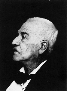
As we ponder patterns in the past, we might spare a thought for Carl Jacob Christoph Burckhardt; he died on this date in 1897. Probably best known for The Civilization of the Renaissance in Italy (which established that period as the vaunted subject it has become), he was a historian of art and culture and an influential figure in the historiography of both fields. Indeed, he is considered one the the founders of cultural history.
Sigfried Giedion said of Burckhardt’s achievement: “The great discoverer of the age of the Renaissance, he first showed how a period should be treated in its entirety, with regard not only for its painting, sculpture and architecture, but for the social institutions of its daily life as well.”
“A popular government without popular information or the means of acquiring it, is but a prologue to a farce, or a tragedy, or perhaps both”*…

The U.S. Census has long been a lightning rod for controversy. Does it wildly undercount minorities? Wildly overcount minorities? Or—as Michelle Bachmann warned us—is it a liberal plot orchestrated by ACORN?
But no one has ever accused our Census Bureau of being a hotbed of…graphic design. Until now.
A Handsome Atlas celebrates Uncle Sam’s data chops by reproducing three Statistical Atlases from the latter decades of the 19th century…
It’s the work of Jonathan Soma, cofounder of the Brooklyn Brainery and stat freak (tracker of everything from Tokyo breakfast habits to bike lanes)… and it’s fascinating.
… you can follow the decline of Charleston, South Carolina, after the Civil War and the sudden ascendency of Milwaukee following the arrival of Miller, Pabst, Schlitz, and Blatz.
Curious footnotes in American history pop up everywhere, as Soma discovered when he spotted an apparent flaw in a U.S. map. “Where Oklahoma should be, we had I.T.,” he says. “It turns out it was Indian Territory. In 1905 the Native Americans who lived there applied for statehood. They wanted to create something called the State of Sequoia. But they were shot down, and two years later Oklahoma was made.”
Together the Atlases show a country emerging from crisis to redefine itself: more urban, diverse, and if you lived in Illinois or Kentucky, substantially more wasted [as illustrated in the chart above]…

The first Statistical Atlas of the United States of America was published in 1874 to coincide with the nation’s centennial. Two of the most stunning Atlases, from 1880 and 1890, were produced by Henry Gannett, who went on to co-found the National Geographic Society. His final Atlas even contains intimations of the Information Age. The 1890 census was the first to use a punch-card tabulating machine devised by Henry Hollerith, whose company would form the foundation of IBM…
In one regard the census has changed dramatically. While the 2000 Census broke down race into 63 categories, a century earlier we came in only five “colors.” The language of these Atlases oozes xenophobia. Maps and charts refer to “natives” and “non-natives.” Non–European Americans are lumped in as “other foreign.” And slave populations are often omitted altogether.
Then there are the “deaf mutes, paupers, and prisoners,” gathered under the heading: “Defective, Dependent, and Delinquent Classes.” Or this antiquated guide to the “insane” of 1870. I mean, who would be insensitive enough to call for a national database of the mentally ill these days?

Read the whole colorful story in Jeffrey Rotter‘s “The Motley Roots of Data Visualization in 19th Century Census Charts.”
* James Madison
###
As we regret that we haven’t got more fingers and toes, we might recall that it was on this date in 1789 that George Washington became the first and only president to be unanimously elected by the Electoral College, a feat he repeated on the same date in 1792.
Washington’s overwhelming popularity made for a relatively smooth kick-off for the Republic. Still, the electoral system soon began to cause problems. History.com explains:
The peculiarities of early American voting procedure meant that although Washington won unanimous election, he still had a runner-up, John Adams, who served as vice president during both of Washington’s terms. Electors in what is now called the Electoral College named two choices for president. They each cast two ballots without noting a distinction between their choice for president and vice president. Washington was chosen by all of the electors and therefore is considered to have been unanimously elected. Of those also named on the electors’ ballots, Adams had the most votes and became vice president.
Although Washington’s overwhelming popularity prevented problems in 1789 and 1792, this procedure caused great difficulty in the elections of 1796 and 1800. In 1796, Federalist supporters of John Adams cast only one of their two votes in an effort to ensure that Adams would win the presidency without giving votes to any of the other candidates. This led to a situation in which the Federalist Adams won the highest number of votes and became president, but Thomas Jefferson, the opposing Democratic-Republican candidate, came in second and therefore became his opponent’s vice president.
In 1800, the system led to a tie between the Democratic-Republican candidates for president and vice president, Thomas Jefferson and Aaron Burr. This sent the vote to the House of Representatives, where Federalists voted for Burr instead of Jefferson, whom they despised. As a result, the Congressional vote ended in a tie 35 times before the Federalists decided to hand in blank ballots and concede the White House to Jefferson.
In 1804, the 12th Amendment to the Constitution ended this particular form of electoral chaos by stipulating that separate votes be cast for president and vice president.

You must be logged in to post a comment.