Posts Tagged ‘graphic design’
“Tools have their own integrity”*…

And now, thanks to Theodore Gray, they have their own taxonomy…
… The arrangement follows loosely the characteristic of the regular periodic table: tools with similar functions in each column, getting heavier as you move down the rows. The diagonal line between metals and non-metals on the right side becomes a line between drills and wrenches. The fiery 17th column, the halogens, is a column of tools that use heat, including soldering, welding, casting, and 3D printing…
Find a zoomable version here. See (and buy) this beauty and his other posters and books here.
And for a satisfying companion piece: “Let a Hundred Mechanisms Bloom,” a lovely celebration of 19th Century apple parers.
* Vita Sackville-West
###
As we do it ourselves, we might spare a thought for Edmund Gunter; he died on this date in 1626. A clergyman, mathematician, geometer, and astronomer, his mathematical contributions included the invention of the Gunter’s chain, the Gunter’s quadrant, and the Gunter’s scale.
But he is best remembered for creating the forerunner of that once-ubiquitous tool, the slide rule (IYKYK)…
Known as Gunter’s Rule, or simply a “Gunter”, [it was] the invention of Edmund Gunter (1581-1626), a London scholar and contemporary of John Napier, the Scottish inventor of Logarithms. Napier published he first table of logarithms in 1614, and armed with it one could replace multiplication and division with addition and subtraction of the equivalent logarithms — a clear benefit if you have to calculate by hand, as they certainly did in the 17th century. Still, it was one boring and laborious task, which Gunter did away with.
Gunter’s rule has many scales, but the revolutionary one is the one marked “NUM”, which has the numbers from 1 through 100 laid out as a two-cycle logarithmic scale. Now, instead of looking up the logarithms in a table, adding them and looking up the result of the multiplication, all you had to do was use a pair of dividers to add the lengths representing the two multiplicands on the NUM scale; the result could be read right off the same scale.
The true slide rule, invented by William Oughtred shortly afterward, is simply a pair of Gunter scales juxtaposed to allow adding the lengths without the dividers.
“Gunter’s rule”


“The element of mystery to which you want to draw attention should be surrounded and veiled by a quite obvious, readily recognisable commonness”*…
An appreciation of the marvelous M.C. Escher…
Despite being a fan of Rennaisance Art and the work of the Impressionists, he feels increasingly pulled in a different direction…
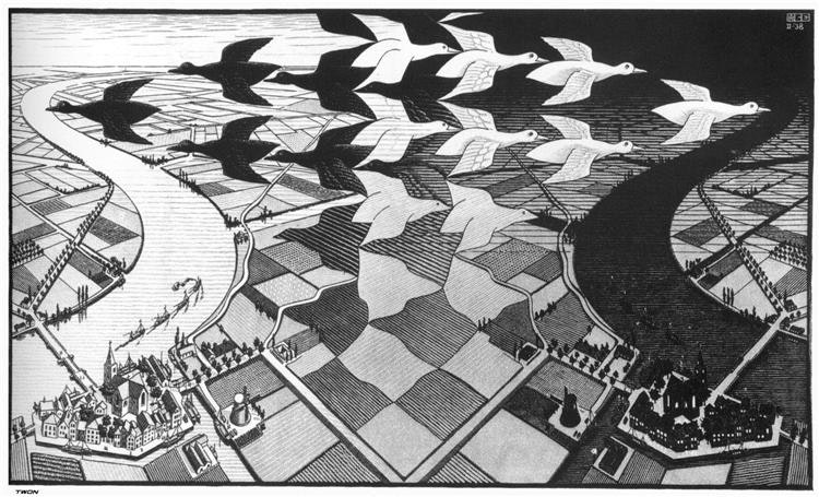
When you look at this picture, you’re flipping between world views. Either you’re seeing the white birds, and the bright, presumably sunlit day scene with its cheerful flotilla of steam ships puffing their way upriver – or you’re seeing the black birds, and your eye is drawn to the night-shrouded landscape where the houses have their lights on and the sky’s already eaten the horizon & is creeping nearer…
Except, that’s not quite right. The black birds are in the daylight side, and the white ones are flying into the night. These aren’t just mirror images: they’re like the Ancient Chinese yin-yang symbol, each side containing part of its opposite…
Escher’s love of the fantastical is primarily inspired by what he sees around him, not what he can dream up out of next to nothing… By looking closely at the real world, and trying to understand how it works, Escher will invite his initially small but intensely loyal fanbase to explore some very strange mysteries indeed.
…

It’s the 1960s now, and nonconformity is all the rage. Hair is getting longer, psychedelics-powered artistry is flourishing, and anything that seems to scream to hell with the rules is increasingly in vogue… Because of the fantastical elements of his work, Escher is acquiring a reputation as a surrealist. As a self-identifying “reality enthusiast,” it’s the very last thing he wants. Take Ascending & Descending, where he’s clearly turning his imagination to the futility of so much in the human-centred world. In a letter to a friend, he says:
“Yes, yes, we climb up and up, we imagine we are ascending; one step is about 10 inches high, terribly tiring – and where does it get us? Nowhere.”
But until the end of his career, his work will continue to speak to something deeper – a rebellion against human incuriosity, or a constant rallying-cry for the act of paying attention…
Read it in full: “Fooling With Certainty: The Impossibly Real Worlds Of MC Escher,” from Mike Sowden (@Mikeachim)
* M. C. Escher
###
As we look closely, we might recall that it was on this date in 1859 that our perspective was shifted in a different kind of way: Charles Darwin published The Origin of the Species. Actually, on that day he published On the Origin of Species by Means of Natural Selection, or the Preservation of Favoured Races in the Struggle for Life; the title was shortened to the one we know with the sixth edition in 1872.

(Roughly) Daily will be on a brief Thanksgiving hiatus, returning when the the tryptophan haze has passed…
“I traveled far and wide through many different times”*…

Fifty years ago this month Harold D. Craft, Jr., published a remarkable black-on-white plot in his Ph.D. dissertation at Cornell University. A stacked series of jagged lines displayed incoming radio waves from pulsar CP1919, as detected at Arecibo Observatory in Puerto Rico. Several months later the chart appeared as a full-page visualization in Scientific American, this time with white lines on a field of cyan [above]…
Scientific American
In 1977, the image was included in The Cambridge Encyclopaedia of Astronomy…

… where, two years after that, Factory Records graphic genius Peter Saville discovered it and adapted it as the cover art for Joy Division’s debut album, Unknown Pleasures. He reversed the image from black-on-white to white-on-black, against the band’s stated preference for the original. “I was afraid it might look a little cheap. I was convinced that it was just sexier in black.”

It has, of course, become an icon.
* Joy Division, “Wilderness,” from Unknown Pleasures
###
As we tap our toes, we might recall that it was on this date in 1985 that the U.S. Senate held hearings on what they called “porn rock.” The session was convened at the urging of the Parents Music Resource Center, a group founded by Tipper Gore, wife of Senator and later Vice President Al Gore; Susan Baker, wife of Treasury Secretary James Baker; Pam Howar, wife of Washington realtor Raymond Howar; and Sally Nevius, wife of former Washington City Council Chairman John Nevius, and devoted to forcing the music industry to affix Parental Advisory stickers– “warning labels”– to albums and CDs deemed to contain morally challenged material (like the “Filthy Fifteen” songs the group condemned).
Three musicians– Frank Zappa, John Denver, and Dee Snyder– testified in opposition to the proposal at the hearing… which was in the end moot, as the industry, afraid of negative publicity, agreed voluntarily to begin the labeling.
It is unclear that the “Tipper sticker” was/is effective in preventing children from being exposed to explicit content. Some, citing the “forbidden-fruit effect,” suggest that the sticker in fact increases record sales, arguing as Philip Bailey of Earth, Wind & Fire has: “for the most part [the sticker] might even sell more records… all you’ve got to do is tell somebody this is a no-no and then that’s what they want to go see.”

“Design is the intermediary between information and understanding”*…

Pages depicting flasks of urine for diagnosing disease, from The Twenty Jordans (MS. Ashmole, 1413). The pictures run across facing pages, so that you can compare samples easily (courtesy Bodleian Libraries, University of Oxford)
Designing English: Graphics on the Medieval Page at the University of Oxford’s Bodleian Libraries examines the how the creation of early English books, from their hand-written language to the bindings themselves, can be viewed as pioneering graphic design. Whether a hunting manual with ages of deers described through illustrations of antler growth, or an elegant 15th-century copy of The Canterbury Tales where borders and titles guide the reader through the text, these manuscripts grappled with engaging their readers through their visual design.
“We’ve deliberately used the term ‘design’ which wasn’t used in our sense during the Middle Ages,” Dan Wakelin, professor of medieval English paleography and curator of Designing English, told Hyperallergic. “First, the term ‘design’ helps us appreciate the creativity of the past. Medieval craftspeople left us few records of their own thought processes, so we often need to use our own terms when we try to reconstruct them. The term ‘design’ brings to light aspects of the thoughtfulness and ingenuity behind medieval manuscripts and artifacts which we might otherwise miss.”…
How early English authors and scribes worked to communicate: “How Medieval Manuscript Makers Experimented with Graphic Design.”
###
As we lay it out, we might recall that it was on this date in 1878 that the first telephone directory was issued. Consisting of a single piece of cardboard, it listed 50 individuals, businesses, and other offices in New Haven, Connecticut that had telephones. There were, as readers will note on the photo below, no numbers, as callers had to be connected by an operator.

“You cannot bore people into buying your product”*…

“… Unclear why Messam thinks it’s wise to feature a photo of himself running away from the voter.”
For those who think it trivializes our political process to judge candidates by their typography—what would you prefer we scrutinize? Qualifications? Ground into dust during the last election. Issues? Be my guest. Whether a candidate will ever fulfill a certain campaign promise about a certain issue is conjectural.
But typography—that’s a real decision candidates have to make today, with real money and real consequences. And if I can’t trust you to pick some reasonable fonts and colors, then why should I trust you with the nuclear codes?
Book publishers spend a lot on cover design. [The adage “don’t judge a book by its cover” dates from the time before books were sold with colorful jackets.] Candidates likewise spend a lot on their public presentation. Why? For the same reasons: voters (or readers) are going to make judgments based on design factors (whether consciously or not). So just as we should feel justified judging a book by its cover—because that’s what it’s for—we should likewise feel justified considering how typography reflects on each candidate.
Along those lines, my pet political theory is that even as they labor to reveal their characteristic strengths through typography, candidates tend to be more successful revealing their characteristic limitations. The evidence is left as a thought experiment for sufficiently motivated readers…
Writer, typographer, programmer, and lawyer Matthew Butterick‘s witty and wise observations on the design choices made by presidential candidates (so far): “Typography 2020: a listicle for America.”
* David Ogilvy
###
As we face up to face-value, we might recall that this is the “birthday” of the earliest-known dated printed book: the sacred Buddhist text the Diamond Sutra. A copy of the Tang-dynasty Chinese version of the Diamond Sūtra was found among the Dunhuang manuscripts in 1900, and has been dated back to May 11, 868.

Frontispiece of the Chinese Diamond Sūtra
You must be logged in to post a comment.