Posts Tagged ‘publishing’
“The large print giveth and the small print taketh away”*…

As Christine Ro explains, this timeless wisdom may be about to invert: Revisiting typography…
A typical paperback book accounts for around 1kg of carbon dioxide, according to sustainability expert Mike Berners-Lee.
Perhaps that does not sound like much. But in the US alone, where 767 million paperback books were sold in 2023, this is equivalent to the electricity use of more than 150,000 homes for a year.
Forest loss, paper production and printing, and transport of books are generally the largest contributors to the carbon emissions of printed books.
So, using less wood fibre, and shipping lighter loads, are important ways to reduce the emissions of print books (as well as the costs of producing them).
One simple method is reducing the thickness of the paper. Some publishers are turning to subtly thinner paper. There are limits to this: the most lightweight paper may be less durable. And for certain types of books, including art books, there’s a preference for heavier paper.
Yet between these extremes, most readers are unlikely to notice the difference.
Nor would most readers notice the design tweaks that allow more text to fit onto each page – as long as designers ensure that the text remains easy to read.
The publisher HarperCollins has experimented with compact typefaces that require less ink and paper. This has resulted in savings of hundreds of millions of pages.
A leader in this field is Sustainable Typesetting, a project of the design and typesetting company 2K/DENMARK. One of the company’s focus areas is complex typesetting for long texts, including Bibles.
Andreas Stobberup, project lead at 2K/DENMARK, says that Sustainable Typesetting can achieve page count reductions of up to 50%, although he recommends less dramatic changes for novels.
While it’s common to simply increase the point size to make text easier to read, Mr Stobberup says that readability is actually determined by x-height. The x-height is the height of most lowercase letters in the Latin alphabet, and makes up nearly all of the printed marks on a page.
The x-height can be increased without enlarging all of the text. For many designers, increasing the x-height is key to increasing legibility…

Reducing point size is not always the optimal way to reduce the physical size of a book, Mr Stobberup emphasises.
Perhaps some lessons can be drawn from large print books, which are aimed at older readers or those with visual impairments.
They feature larger point sizes, which can lead to bigger books.
But other design features of large print books include more blocked letters and, if images are involved, more attention to the contrast between the foreground and the background.
“It’s a totally different typeface,” says Greg Stilson, head of global technology innovation for the American Printing House for the Blind.
Mr Stobberup concedes that incorporating such design in regular books “will not look as aesthetic”.
But he believes that most readers will not care about the typeface used for the bulk of the book. Meanwhile, more artistic fonts could be used on places like book covers.
And the savings might well justify the change – according to Mr Stobberup, a 20% reduction in pages would be equivalent to a roughly 20% reduction in carbon emissions.
However, the saving depends on many factors, including the size of the print run, the type of energy used for printing, the transport distances, and even the ink used.
Then there’s the word count: a textbook or Bible can achieve more drastic reductions in weight than a book of poetry.
Mr Stobberup is keenly aware of the financial pressures affecting the publishing industry.
“We need to make sustainability cheaper,” he says. “We simply need to show that we don’t think it’s a compromise. We think it’s a better product.”
David Miller is the president and publisher of Island Press, a small non-profit publisher of environment-themed nonfiction.
Printing costs have soared in the last few years, he says. The Covid-19 pandemic led to supply chain issues.
Meanwhile, paper manufacturers have been switching over to making cardboard due to the boom in the delivery businesses.
This has driven up the expense of producing books. In some cases Island Press has simply had to absorb the extra costs itself rather than passing them onto consumers, according to Mr Miller.
Initially he wasn’t sure about Sustainable Typesetting. But after seeing that a 19% reduction in pages could lead to at least a 10% cost savings, while readability actually improved, Mr Miller has become a fan.
Sustainable Typesetting has been applied to two Island Press books published so far. And he’s interested in going even further than a 19% trimming.
Mr Miller calls this a technology that is “only starting to poke its nose out behind the door” within different segments of the publishing industry.
“It’s a sort of revolution in thinking about what typography can be and how it can be put to use in a very productive way.”…
Using design to address climate change, one page at a time: “Publishers try skinnier books to save money and emissions,” from @BBC.
* Tom Waits
###
As we conserve, we might note that today is the annual celebration of a set of books that are strong candidates for this sort of type redesign: it is Hobbit Day, a reference to its being the birthday of the hobbits Bilbo and Frodo Baggins, two characters in J. R. R. Tolkien‘s popular set of books The Hobbit and The Lord of the Rings. In the books’ lore, Bilbo was born in the year of 2890 and Frodo in the year of 2968 in the Third Age (in Shire-Reckoning). Tolkien Week is the week containing Hobbit Day.

“Type design: an exacting, arcane craft that is underappreciated for its impact on how people communicate and receive communication”*…

Jeremy Nguyen considers the typeface.
Typography is two-dimensional architecture, based on experience and imagination, and guided by rules and readability. And this is the purpose of typography: The arrangement of design elements within a given structure should allow the reader to easily focus on the message, without slowing down the speed of his reading. – Herman Zapf
* Bruce Weber
###
As we squint, we might recall that it was on this date in 1945 that farmer Lloyd Olsen of Fruita, Colorado, planning to eat supper with his mother-in-law, tried to behead a five-and-a-half-month-old Wyandotte chicken named Mike. The axe removed the bulk of the head, but missed the jugular vein, leaving one ear and most of the brain stem intact. The chicken was still able to balance on a perch and walk clumsily. He attempted to preen, peck for food, and crow, though with limited success; his “crowing” consisted of a gurgling sound made in his throat. When Mike did not die, Olsen decided to care for the bird.
Mike achieved national fame until his death in March 1947. In Fruita, an annual “Mike the Headless Chicken Day” is held in May.

“No one’s gonna tell me how to write. I’m gonna write the way I wanna write!”*…

Gill Paul on two pioneering women who revolutionized the book world…
During the Sixties, book publishing, like the rest of the country, was undergoing an upheaval. That venerable industry was at the beginning of a dramatic changing of the guard that would affect the staff they hired, the authors they published, and the way books were marketed to the reading public. And at the heart of it there were two trailblazing women, Jacqueline Susann and Jackie Collins.
In previous decades, publishing had been a refined gentleman’s business, peopled by well-educated men of independent means—figures such as Bennett Cerf, Horace Liveright, and Alfred A. Knopf who cared about Literature with a capital L. Knopf famously declared that he intended to publish “the best literature, whether it sold or not.” They acted on hunches, made deals over long lunches, and worked with authors to develop their long-term careers, even if their earliest books flopped.
Then, in 1959, the money men of Wall Street, sniffing around for the next bonanza, alighted on books. When Alfred A. Knopf’s company was absorbed into Random House in 1960, it was only the first of a series of mergers and acquisitions that would transform publishing from a career for literary gentlemen into a corporate money-making machine.
As an immediate result of the M&As, publishers had more cash to wave around, so they could offer big advances to authors whom they guessed (and it was largely guesswork) would be capable of delivering big sales. To find them, they began to rely on agents, who pushed the prices even higher. The corporate honchos wanted fast returns on their big bucks, so the books had to be what became known as ‘blockbusters’—incidentally, a term that originated during the war for bombs capable of destroying entire blocks.
Enter Jacqueline Susann. She knew exactly what she was doing when she wrote Valley of the Dolls, a thick, gossipy novel, which contained scenes of drug abuse and ‘kinky’ sex, and had leading characters said to have been based on famous actresses of the day (Judy Garland, Ethel Merman, and Carole Landis). Her sex is pretty tame compared to later bestsellers like Fifty Shades, but it was radical for its time. Legal judgements on previously banned books Lady Chatterley’s Lover (1959) and Tropic of Cancer (1964) had established that the courts did not have the right to suppress a book so long as it had literary merit.
Jacqueline Susann and, a couple of years later, Jackie Collins, were inspired by the sexy soap opera-style novels being produced by Harold Robbins, to great sales if not great reviews. “My only criticism of his books,” Collins said, “Was that his women were either in the kitchen or the bedroom.” Both Susann and Collins wrote about strong women with their own careers, who took control in the boardroom as in the bedroom, and demanded athletic performances from their men. Their subjects weren’t ladylike; they were raw and honest and sometimes the stories ended in tears, reflecting the way women’s real lives were being transformed but adding a splash of aspirational glamour…
…
… It was partly due to the two Jackies that publishers finally clocked there was a vast female audience for novels—and that they didn’t want challenging literary works from pompous white men. They wanted to be entertained by stories about women who faced similar life crises to them, and the best people to write those stories were other women.
Back in 1960, only 18 per cent of all books published in the US were written by women but, as publishers cottoned onto their female audience, strategies began to change: by 1970, a third of all books were by women and by 2021 that had risen to 50.45%. The divide is even starker in fiction: today, roughly three-quarters of published novels are written by women and roughly 80 per cent of fiction readers are women. There’s still a long way to go in terms of diversity, but novels by people of different social and ethnic backgrounds and sexual orientation are increasingly being championed by publishers.
While they were looking for female authors for a female readership, publishers were forced to reflect on the fact that their in-house decision-makers were almost exclusively male. If women were employed at all, it was in low-paid secretarial posts where they could use their home-maker skills to bring tea for the boys. Gradually, a few women managed to maneuver themselves from clerical to editorial positions but they were still excluded from the upper echelons of management, and equal pay was a distant pipe dream. The transformation took decades but now, women form the majority of the workforce in publishing: 78 per cent of editorial staff are female and 92% of publicists, according to a 2021 UK Publishers’ Association diversity study—though most of them are still white and cisgender. And on average they are paid less than employees in other communication industries.
Publishing is constantly evolving and seems likely to become more diverse in future; it’s unthinkable that it would ever revert to an exclusive gentleman’s club. And among the people responsible for this change were Jacqueline Susann and Jackie Collins….
Credit where credit is due: “How Jacqueline Susann and Jackie Collins Changed the Face of Publishing,” from @GillPaulAUTHOR in @lithub.
* Jacqueline Susann
###
As we turn the page, we might recall that it was on this date in 1922 that a woman who had her own massive impact on publishing tied the knot: Margaret Mitchell– the author of Gone With the Wind, of which over 30 million copies have been sold– married Berrien (“Red”) Kinnard Upshaw… in a union that may have contributed to Mitchell’s portrayal of the Scarlett-Rhett union.
Upshaw was an Annapolis drop out who supported himself bootlegging out of the Georgia mountains. By December the marriage to Upshaw had dissolved and he left. Mitchell suffered physical and emotional abuse, the result of Upshaw’s alcoholism and violent temper. Upshaw agreed to an uncontested divorce after the best man at their wedding, John Marsh, gave him a loan and Mitchell agreed not to press assault charges against him. Upshaw and Mitchell were divorced on October 16, 1924. Then (in a Susann/Collins-worthy twist), Mitchell and Marsh were married the following year.

“If all else fails, there’s always print or web zines”*…

Gabriela Riccardi, with a history of– and an homage to– the zine…
After Martin Luther furiously (supposedly) hammered his 95 Theses to a local church door in the 16th century, chroniclers of history saw his act as plenty of things: a righteous rally against Catholic excess, a call to arms for renewed values, a firing shot for one ripper of a Reformation.
Others, though, saw it as the world’s first zine.
The zine — that unruly riff on the glossy magazine, often handmade and always self-published — has long been associated with revolution. DIY dabblers and political thought guerrillas, superfan scenesters and couriers of counterculture have all found a home in the humble zine.
Maybe that’s because a zine’s proposition — permission self-granted, gates unkept — is a boon companion to those who operate outside of the mainstream. Or maybe it’s just because they’re a lot of fun to make.
In any case, these exuberant little publications have something big to say: Small presses, indeed, can turn over heavy pages of history….
An appreciation of handcrafted publishing: “Zines: Scan and release,” from @griccardi_ in @qz.
See also: “Zines, the Punks of Print Media: A Creative Rebellion in Branding and Design” (source of the image above)
* Rudy Rucker
###
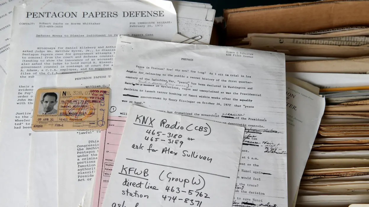
As we do it ourselves, we might recall that this date in 1972 was a milestone in (a different kind of) guerilla publishing: the New York Times begin publishing the “Pentagon Papers”…
… the 47-volume Pentagon analysis of how the U.S. commitment in Southeast Asia grew over a period of three decades. Daniel Ellsberg, a former Defense Department analyst who had become an antiwar activist, had stolen the documents. After unsuccessfully offering the documents to prominent opponents of the war in the U.S. Senate, Ellsberg gave them to the Times.
Officially called The History of the U.S. Decision Making Process on Vietnam, the “Pentagon Papers” disclosed closely guarded communiques, recommendations, and decisions concerning the U.S. military role in Vietnam during the Kennedy and Johnson administrations, along with the diplomatic phase in the Eisenhower years. The publication of the papers created a nationwide furor, with congressional and diplomatic reverberations as all branches of the government debated over what constituted “classified” material and how much should be made public.
The publication of the documents precipitated a crucial legal battle over “the people’s right to know,” and led to an extraordinary session of the U.S. Supreme Court to settle the issue. Although the documents were from the Kennedy and Johnson administrations, President Richard Nixon opposed their publication, both to protect the sources in highly classified appendices, and to prevent further erosion of public support for the war. On June 30, the Supreme Court ruled that the Times had the right to publish the material.
The publication of the “Pentagon Papers,” along with previous suspected disclosures of classified information to the press, led to the creation of a White House unit to plug information leaks to journalists. The illegal activities of the unit, known as the “Plumbers,” and their subsequent cover-up, became known collectively as the Watergate scandal, which resulted in President Nixon’s resignation in August 1974…
“I always said I’m a teacher who writes or an editor who writes”*…

Nobel Literature laureate Toni Morrison was indeed a teacher (a professor at Princeton from 1989 until 2006). Before that, she was an editor (at Random House, working with authors including Angela Davis, Gayl Jones, Toni Cade Bambara and Muhammad Ali), where, as Melina Moe explains, Morrison’s critical skills and generosity were already evident– as much in her rejection letters as in the works she shepherded through the press…
“I found it extremely honest, forthright, and moving in ways I had not expected it to be,” Toni Morrison wrote to an aspiring novelist in 1977, “but it is a shuddering book and one that offers no escape for any reader whatsoever.” Still, Morrison, then a senior editor at Random House, liked the manuscript so much that, before responding, she passed it around the office to drum up support. The verdict was “intelligent,” but also “very ‘down,’ depressing, spiritually abrasive.” Whatever the merits of the writing, Morrison’s colleagues predicted, the potent mix of dissatisfaction, anger, and mournfulness would limit the book’s commercial appeal—and Morrison reluctantly agreed. “You don’t want to escape and I don’t want to escape,” her letter concludes, “but perhaps the public does and perhaps we are in the business of helping them do that.”
During her 16 years at Random House, Morrison wrote hundreds of rejection letters. Usually typed on pink, yellow, or white carbonless copy paper, and occasionally bearing Random House’s old logo and letterhead, these are now filed among her correspondence in the Random House archives at Columbia University’s Rare Book & Manuscript Library. While many of the letters were mailed to New York, Boston, and even Rome, others were sent to writers in more obscure places; some are addressed to “general delivery” in various small towns across the United States.
Regardless of destination, Morrison’s rejections tend to be long, generous in their suggestions, and direct in their criticism. The letters themselves—generally one, two at most, exchanged with a given writer—constitute an asymmetrical archive. On one end of each communiqué is the ghost of a submitted manuscript (absent from the archive after being returned to the sender, although in some cases survived by a cover letter). On the other is a rejection from Morrison, sometimes brusque yet typically offering something more than an expression of disinterest—notes on craft, character development, the need for more (or less) drama. But also: Autopsies of a changing, and in many ways diminishing, publishing industry; frustrations with the tastes of a reading public; and sympathies for poets, short story writers, and other authors drawn to commercially hopeless genres…
A fascinating (and instructive) read that leaves one feeling even more warmly about Morrison: “There Is No Point in My Being Other Than Honest with You: On Toni Morrison’s Rejection Letters,” from @LAReviewofBooks.
(Image above: source)
* Toni Morrison
###
As we open the envelope, we might note that today mark’s the anniversary of another epistolary event of literary note: on this date in 1816, Jane Austen sent a momentous missive…
Towards the end of 1815, Jane came into contact with Rev. James Stanier Clarke, the Prince Regent’s Librarian. The Prince, it appeared, was an avid reader of novels and was a particular fan of Jane Austen’s works – keeping a set at each of his residences.
Stanier Clarke invited Jane to visit the Prince’s lavish library at Carlton House, and during the visit he suggested that, as the Prince admired her work, she would be ‘at liberty to dedicate any future novel to him’.
Jane did not like or approve of the Prince (or the ‘P.R.’ as she charmingly dubs him in her letters), who was famously debauched and profligate. Nevertheless, she complied with the royal request, dedicating Emma to the Prince…
Her correspondence with Stanier Clarke continued into the spring of 1816, when this letter was written. In it, Jane responds to Stanier Clarke’s suggestion that for her next work she might attempt a ‘Historical Romance illustrative of the History of the august house of Cobourg’.
She tactfully declines the idea, writing that although such a work might be more profitable or popular than her ‘pictures of domestic Life in Country Villages’, she ‘could no more write a Romance than an Epic Poem’…
“LETTER FROM JANE AUSTEN TO JAMES STANIER CLARKE, 1 APRIL 1816” Jane Auten House (facsimile at this link)

You must be logged in to post a comment.