Posts Tagged ‘infographics’
“I am told there are people who do not care for maps, and I find it hard to believe”*…
The confluence of different GPS technologies have led to more and more stunning map and data visualizations. Added bonus: casual map lovers have something to explore during periods of procrastination.
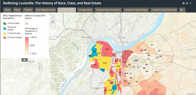
Last week, to the joy of data nerds everywhere, the Ash Center for Democratic Governance and Innovation at Harvard University’s Kennedy School of Government launched a database of interactive maps that use public sector data to visualize various city and community services, histories, and statistics. It sounds dry until you check out the selection of 200 mapping projects. Particularly interesting, deep dive-worthy ones include a map of immigrant communities across the U.S., a map of public art in Philadelphia, a visualization of the variety of trees in New York City, a map detailing the history of redlining and other forms of housing discrimination in Louisville, Kentucky [above]. and a map of access to high-speed internet in Kansas City, Missouri…
… and 195 others, including this visualization that answers the question “is the American dream still affordable?” and where:

More background at The Outline and at the Ash Center’s announcement page. Browse at their Data-Smart City Solutions Database search page.
* Robert Louis Stevenson
###
As we celebrate charts, we might send analytic birthday greetings to a man who drew epoch-making maps of a very different sort, Sigismund Schlomo Freud; he was born on this date in 1856. The father of psychoanalysis, he revolutionized the field of psychotherapy– so much so that later practitioners have often failed to recognize Freud’s scientific predecessors. Throughout his work (in such books as Interpretation of Dreams and the New Introductory Lectures on Psychoanalysis) he emphasized the role of unconscious and non-rational functioning, going against most contemporary thought by suggesting that dreams and “mistakes” may have affirmative meaning.

“Men argue. Nature acts.”*…

Scientists have converged on climate change predictions that a growing majority of Americans accept. Still, it can be hard to understand– at a visceral level– what a warming globe might mean. Here’s some help: a clever tool from Greg Schivley, a civil and environmental engineering PhD. student at Carnegie Mellon University (with help from Ben Noll; inspired by Sophie Lewis). Enter some key birth dates to project how the climate will have changed from your grandma’s birth to when your kids retire. The chart’s temperature changes are based on NASA’s historical and projected climate scenarios.
“Climate change and life events”
* Voltaire
###
As we sweat it out, we might send temperate birthday greetings to Sir William Napier Shaw; he was born on this date in 1854. A meteorologist and member of the Royal Society, he developed the tephigram, a diagram of temperature changes still commonly used in weather analysis and forecasting.

“Demography is destiny”*…

I think we can all benefit from knowing a little more about others who aren’t like us (or who are), no matter how small the tidbits. In the graphic below, select sex, age group, and race to see the demographics of others.
The percentages are based on estimates from the 2016 American Community Survey. Each grid represents 100 percent, and each cell represents a percentage point…
The always-illuminating Nathan Yau— Flowing Data– presents an interactive portrait of life in the U.S., sortable by age, gender, and ethnicity; check it out at “The Demographics of Others.”
* Ben Wattenberg and Richard M. Scammon, paraphrasing Heraclitus in The Real Majority: An Extraordinary Examination of the American Electorate (Often mis-attributed to Auguste Comte– who died before the word “demography” was first cited in print.)
###
As we put ourselves in perspective, we might spare a thought for Aldus Pius Manutius (AKA Aldo Manuzio); he died on this date in 1515. A Venetian humanist, scholar, and educator, he became a printer and publisher in his forties when he helped found the Aldine Press. In the books he published, he introduced a standardized system of punctuation and use of the semicolon; he designed many fonts, and introduced italic type (which he named for Italy); and he popularized the libelli portatiles, or portable little (specifically) classic books: small-format volumes that could be easily carried and read anywhere.

“Yet in opinions look not always back, / Your wake is nothing, mind the coming track”*…

One of ten trends to watch in 2018
From North Korea’s nuclear tests to global refugee flows, the rise or fall in numbers signals where the world may be headed in 2018. To help visualize what’s on the horizon, CFR [Council on Foreign Relations] editors asked ten of our experts to highlight the charts and graphs to keep an eye on in the coming year…
Ten charts and the short essays that explain their importance to our future: “Visualizing 2018: The Essential Graphics.”
* Yet in opinions look not always back,
Your wake is nothing, mind the coming track;
Leave what you’ve done for what you have to do;
Don’t be “consistent,” but be simply true.
― Oliver Wendell Holmes Sr.
###
As we monitor the gauges, we might send underwhelming birthday greetings to Millard Fillmore; he was born on this date in 1800. The last member of the Whig Party to serve as President, he was a Congressional Representative from New York who was elected to the Vice Presidency in 1848 on Zachary Taylor’s ticket. When Taylor died in 1850, Fillmore became the second V.P. to assume the presidency between elections.
Fillmore’s signature accomplishment was the passage of the Compromise of 1850 passed, a bargain that led to a brief truce in the battle over slavery– a package of legislation so ill-conceived (it contained the Fugitive Slave Act) and unpopular that Fillmore failed to get his own party’s nomination for President in the election of 1852, which he sat out. Unwilling to follow Lincoln into the new Republican Party, he got the endorsement of the nativist Know Nothing Party (dba, the American Party) four years later, and finished third in the 1856 election.

Matthew Brady’s photo of Fillmore
“Above all else show the data”*…

With the hope that your celebrations will be warm and peaceful, and with thanks for your kind attention over the last twelve months, (Roughly) Daily is going on it’s annual Holiday hiatus… So here, to tide us over, The Economist Graphics Unit’s wonderful “2017 Daily chart advent calendar” (the first installment of which, above)– a collection of 25 of the years best infographics, each with a short accompanying essay.
See you in the New Year!
* Edward Tufte
###
As we revel in new ways of seeing, we might send terrifyingly (and at the same time, amusingly) insightful birthday greetings to Edwin Abbott; he was born on this date in 1838. A schoolmaster and theologian, Abbott is best remembered as the author of the remarkable novella Flatland: A Romance of Many Dimensions (1884). Writing pseudonymously as “A Square,” Abbott used the fictional two-dimensional world of Flatland to offer pointedly-satirical observations on the social hierarchy of Victorian culture. But the work has survived– and inspired legions of mathematicians and science fiction writers– by virtue of its fresh and accessible examination of dimensionality. Indeed, Flatland was largely ignored on its original publication; but it was re-discovered after Einstein’s General Theory of Relativity– which posits a fourth dimension– was introduced; in a 1920 letter to Nature, Abbott is called a prophet for his intuition of the importance of time to explain certain phenomena.

You must be logged in to post a comment.