Posts Tagged ‘icon’
“Mangoes will make you forget anything but mangoes”*…
… Or not. As Christin Bohnke explains, sometimes a mango is more than just a mango…
What happens when ideologies are destroyed? When beliefs that shaped generations dissolve overnight? In the wreckage of old traditions, new symbols are created, and meaning is projected onto what was previously trivial. But not all of these new symbols are coherent or easily legible. Some are outright weird. Few events in history demonstrate the absurdity of political symbolism as clearly as the Mao Mango Mania that swept China during the infancy of the Cultural Revolution.
In 1966, Mao Zedong, Chairman of the Communist Party and China’s supreme leader, set in motion the Great Proletarian Cultural Revolution, a campaign to realign China with his revolutionary vision. His goal was to transform society, both economically and ideologically, by purging everything deemed traditional or capitalist. Over the next ten years, the Cultural Revolution changed the country in profound and painful ways, leading to more than a million estimated deaths as well as to immense human suffering.
Historian Lü Xiuyuan describes the period between 1966 and 1968 as the most destructive years of the entire movement. Following Mao’s directive to destroy the “Four Olds” (ideas, cultures, customs, and habits), his paramilitary youth groups, the Red Guards, swept the country with violence. They identified, tortured, and killed so-called “counterrevolutionaries,” raided temples and schools, and destroyed priceless artifacts. In 1968, university campuses, middle schools, and other public spaces became the sites of bloody battles, not only between Red Guards and alleged counterrevolutionaries but also between revolutionary factions. The chaos of the “Red Terror” couldn’t continue indefinitely, so Mao determined that Chinese workers would help suppress the Red Guard, restore order, and continue the revolution in a more measured manner. In this endeavor, Mao was helped, improbably, by a box of yellow-fleshed fruit.
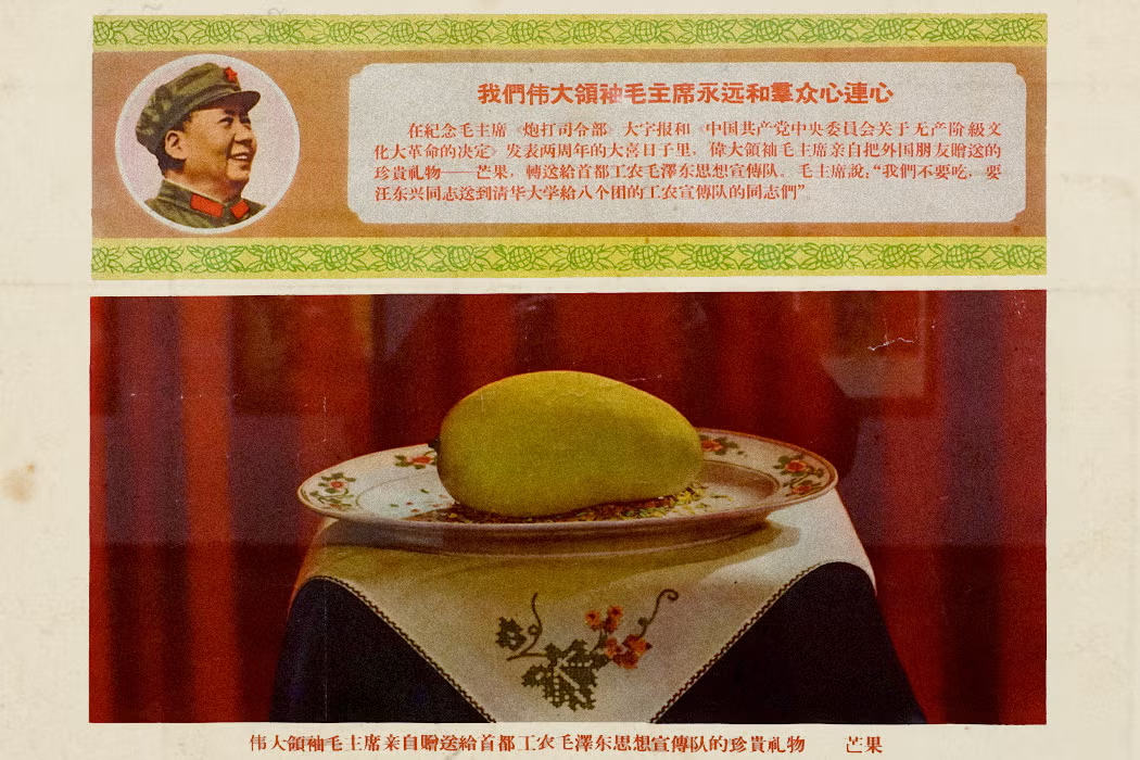
In August 1968, a visiting foreign minister from Pakistan, Mian Arshad Hussain, gave Mao a box of mangoes as a gift during a state visit. Presenting mangoes has a long tradition in Pakistan, but in China, the fruit was virtually unknown. Mao passed the box to workers occupying the Tsinghua campus in Beijing, who were attempting to control the Red Guards stationed there. The scholar of Chinese visual culture Alfreda Murck writes that the mangoes carried an implicit message: from now on, the workers, not the Red Guards, would be in charge of education and the transformation of China in Mao’s image.
According to Murck, even Mao could not have anticipated the consequences of his gift. Because the mangoes came from the supreme leader, they were transformed, in the eyes of the workers, from a simple fruit into an object endowed with attributes of the divine. William H. Hinton, the author of Fanshen, compiled eyewitness accounts of workers who reported staying up all night, touching the mangoes, and marveling at their new station as protégés of the Chairman. Using the momentum, the official party cadres concocted a propaganda campaign surrounding the mangoes, workers, and Mao, and in doing so, according to the political scientist Richard Baum, effectively signed “the death warrant of the Red Guards.”
Quickly, the Red Guards were disbanded, many of them sent for reeducation in the countryside where they labored and lived alongside rural peasants. By contrast, the workers who received Mao’s mangoes, a sign of his favor, were energized and became Cultural Revolution leaders. Yet, their promotion was an illusion. True power lay with the People’s Liberation Army. Despite, or because of that, the workers—and the mangoes—played a significant role in official propaganda in the months to come.
When the workers returned to their factories after putting down the Red Guards, Mao had a fresh mango delivered to them. Workers held welcoming ceremonies for the fruit, preserved it in wax, placed it on altars, and bowed to it when walking by. In one factory, the fruit was boiled down into sacred mango water; each devotee drank a spoonful. From there on, the cult of the mango escalated. Wax and even plastic mangoes were quickly produced in Chinese factories and appeared all over the country, often displayed in glass cases. Images of the mango adorned plates, wedding gifts, and cigarette packages. It was stitched onto blankets, and propaganda teams armed with wax replicas were sent into the remotest corners of the country to spread its lore. More than seventy different types of mango badges to stitch onto clothes were given away for free or sold at a low price to those who couldn’t afford more expensive mango-themed items. Alongside the mangoes were mentions of Mao’s selflessness and love for the people (though no reference to the fate of the Red Guards), and many badges bore the slogan “With each mango profound kindness.”…
… During the 1968 National Day parade in Beijing, the mango was front and center. At least three mango-themed floats participated in the parade, decorated with slogans that emphasized the significance of the working class, as well as a colossal white statue of Mao. The parade reinforced the importance of Mao as the supreme leader and the mango as a symbol of his power.
According to development studies scholar Xing Li, Mao viewed ideology as the primary means of mobilizing the masses and driving change, putting special emphasis on themes such as dedication, self-sacrifice, and hard work. The mango was a perfect vessel for Mao’s “love” for the workers. Unlike already established symbols such as the peony, peach, or pomegranate, the mango had no preexisting meaning in China and, importantly, no association with emperors or divinity. Quickly, rumors spread that mango trees only blossom every century—or every thousand years, according to others—and that eating the fruit would bring about a long life, similar to the peaches of immortality that feature prominently in Chinese legends. Mao’s refusal to keep the mangoes for himself was therefore seen as a great sacrifice on behalf of his people.
The veneration of the mango coincided with a high point in Mao’s personality cult. In the 1960s, one billion copies of the “Little Red Book,” a collection of Mao’s quotes, were printed. The book had to be waved and quoted at the beginning of each workday and whenever someone made a political statement. Mao was everywhere. And so were his mangoes. They became inextricably linked, and criticism of one meant criticism of the other. Murck tells of a dentist in Sichuan province, for example, who, after seeing a mango paraded through his town, said that the fruit resembled a sweet potato. He was arrested, tried as a counterrevolutionary, marched through the streets, and executed. His children were sent to the countryside for reeducation. Given the serious consequences of even the slightest criticism, it’s impossible to say how many people genuinely participated in the mango cult and how many complied out of fear.
Political movements need symbols to foster cohesion and emotional connection, but for these to thrive and remain, they must have at least some internal logic, cultural coherence, or tradition. The mango was an artificial symbol, created randomly, and the people’s devotion to the fruit must have been at least partially performative. By 1969, the mango cult had already begun to decline; it was no longer featured in official campaigns, although the sheer volume of mango-themed products ensured that it didn’t disappear entirely until the mid-1970s. After Mao’s death in 1976 and the 1980s reassessment of his personality cult, it became acceptable to discard mango ephemera that some Chinese still kept in their homes, or more prudently, to repurpose the wax mangoes as candles. Because the mango was so closely linked to Mao, it couldn’t remain a meaningful symbol without him.
Still, the mango as a political symbol never entirely faded. US-based Chinese author Ha Jin, who served in the Chinese army at the time of the Cultural Revolution and has been an outspoken critic of the Chinese government, wrote in his 2019 poem “A Sacred Mango:”
The mango was exhibited in the center of the hall.
We lined up to look at it
and to show our gratitude and respect.But that night some curious child tasted the fruit
and was not caught.
Our mayor, frightened and outraged, said,
“Damn it, if I knew which son of a rabbit bit the mango
I would turn his whole family
into counter-revolutionaries!”But what could we do?
We substituted a wooden mango for a real one.For Ha Jin, as for others, the mango remains not a sign of Mao’s power, but a reminder of the Cultural Revolution’s absurdity and the arbitrary labeling of counterrevolutionaries. Despite being a short-lived propaganda tool, the mango’s symbolism endures as a testament to the irrationality of Mao’s extreme personality cult.
Commercial production of the mango in China began around that time, but only really accelerated in the 1980s. Although some people still recall the mango cult and spoke about it in their interviews with Murck, today the meaning of this particular fruit is largely forgotten, and the mango, far from symbolizing Mao’s eternal love and sacrifice for the working class, has transformed once again. This time, into a refreshing summer treat…
A fleeting cult built around a fruit exposes the logic, and illogic, of Mao’s personality cult: “When Mao’s Mango Mania Took Over China,” from @jstordaily.bsky.social.
* Eve Babitz
###
As we pare away the peel, we might send decorative birthday greetings to Maria do Carmo Miranda da Cunha; she was born on this date in 1909. Better known by her stage name, Carmen Miranda (and her nickname, “the Brazilian Bombshell”), she was a successful singer, dancer, and actress.
As a young woman, Miranda designed clothes and hats in a boutique before making her debut as a singer, recording with composer Josué de Barros in 1929. Miranda’s 1930 recording of “Taí (Pra Você Gostar de Mim),” written by Joubert de Carvalho, catapulted her to stardom in Brazil as the foremost interpreter of samba. In 1939 she was invited to Broadway by producer Lee Shubert, and quickly lured from there to Hollywood, where she made 14 films in as many years.
Miranda did much to popularize Brazilian music and raise American awareness of Latin culture, for which she has been honored (e.g., with a museum) in Brazil. Here, she is largely remebered for her style, in particular for her large “fruit hats.”

“My favorite dish to prepare is something on the takeout menu”*…
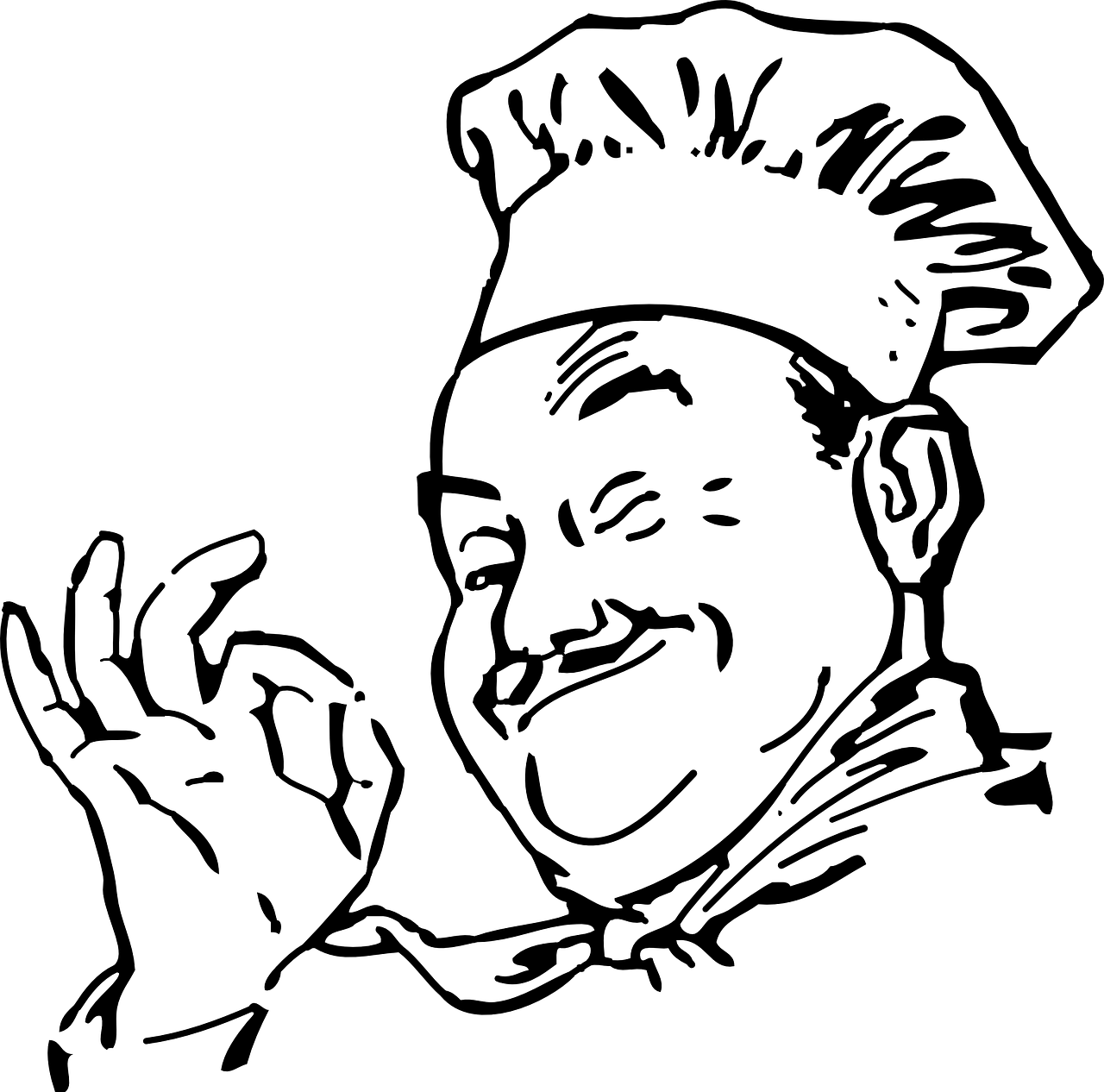
Who drew that winking chef on your pizza box? Anne Ewbank investigates…
Takeout containers—especially for pizza, Chinese food, and sushi—have an iconic art and style. Granted, it’s not always the most elegant or politically correct, but some of these designs are now instantly recognizable. So, today, we investigate the origins of the smiling chef of pizza-box fame, the ubiquitous red pagoda of American-Chinese takeout, and the surprising elegance of plastic sushi trays…
The iconography of take-out: “The Hidden Histories of To-Go Container Art,” from @AEwbank in @atlasobscura.
* Tyler Perry
###
As we forgo the extra cheese, we might send expressive birthday greetings to Ralph Steadman; he was born on this date in 1936. An artist and illustrator renowned for his political and social caricatures, cartoons, and picture books, he is probably best known for his collaborations with Hunter Thompson, especially on Fear and Loathing in Las Vegas and Fear and Loathing on the Campaign Trail ’72.
But Steadman also dabbled in comestible labeling; he brought his gonzo sensibility to the art for Flying Dog beer and designed the V logo used on Flying Dog’s packaging since 1995… work that occasioned censorship by the Colorado State Liquor Board, then an appeal by Flying Dog that was, in 2001, settled in Flying Dog’s favor.


“If you’re lucky, people will get the message”*…

From the early 80s to today, a graphic look at “The History of Icons.”
Special bonus: browse through the sketchbook of pioneer Susan Kare.
* “If you look at that blank canvas and say, ‘Now I’m going to create a masterpiece’ — that’s just foolhardy. You just have to make the best painting you can, and if you’re lucky, people will get the message.” – Susan Kare
###
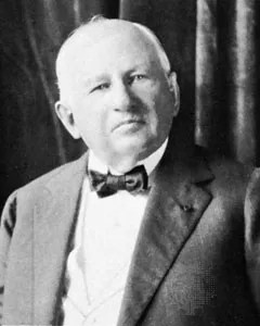
As we point and click, we might send mercantile birthday greetings to John Vansant Wanamaker; he was born on this date in 1838. A gifted merchant who helped define the modern consumer era, Wanamaker’s flagship store in Philadelphia– an enterprise that helped define the “department store”– was designed by famed architect Daniel Burnham, featured a pipe organ, an art gallery and a 2,500-pound bronze eagle that became a favored meeting place for Philadelphians.
Wanamaker was a committed innovator: he was the first to use electric arc lighting in a retail setting (in 1878); and starting in 1910, sensing its potential as an advertising medium, he used his stores as a base for experimentation with radio– starting a radio broadcast station in the store in 1922 to initiate radio receiver sales.
Wanamaker served as Postmaster General in the late 19th century, introducing the first commemorative stamp and laying the groundwork for Rural Free Delivery. And in the early 20th century, he helped establish Mother’s Day as an observance.
An aggressive advertiser and promoter, Wanamaker is credited with the famous observation, “half the money I spend on advertising is wasted; the trouble is I don’t know which half.”
You must be logged in to post a comment.