… What we read– and, librarian Carlo Iacono argues, how we read.
Our inabilty to focus isn’t a failing. It’s a design problem, and the answer isn’t getting rid of our screen time…
Everyone is panicking about the death of reading. The statistics look damning: the share of Americans who read for pleasure on an average day has fallen by more than 40 per cent over the past 20 years, according to research published in iScience this year. The OECD calls the 2022 decline in educational outcomes ‘unprecedented’ across developed nations. In the OECD’s latest adult-skills survey, Denmark and Finland were the only participating countries where average literacy proficiency improved over the past decade.Your nephew speaks in TikTok references. Democracy itself apparently hangs by the thread of our collective attention span.
This narrative has a seductive simplicity. Screens are destroying civilisation. Children can no longer think. We are witnessing the twilight of the literate mind. A recent Substack essay by James Marriott proclaimed the arrival of a ‘post-literate society’ and invited us to accept this as a fait accompli. (Marriott does also write for The Times.) The diagnosis is familiar: technology has fundamentally degraded our capacity for sustained thought, and there’s nothing to be done except write elegiac essays from a comfortable distance.
I spend my working life in a university library, watching how people actually engage with information. What I observe doesn’t match this narrative. Not because the problems aren’t real, but because the diagnosis is wrong.
The declinist position rests on a category error: treating ‘screen culture’ as a unified phenomenon with inherent cognitive properties. As if the same device that delivers algorithmically curated rage-bait and also the complete works of Shakespeare is itself the problem rather than how we decide to use it…
[… observing that “people who ‘can’t focus’ on traditional texts can maintain extraordinary concentration when working across modes, he argues that “we haven’t become post-literate. We’ve become post-monomodal. Text hasn’t disappeared; it’s been joined by a symphony of other channels.”…]
… What troubles me most about the declinist position is not its diagnosis but its conclusion. The commentators who lament the post-literate society often identify the same villains I do. They recognise that technology companies are, in Marriott’s words, ‘actively working to destroy human enlightenment’, that tech oligarchs ‘have just as much of a stake in the ignorance of the population as the most reactionary feudal autocrat.’
And then they surrender. As Marriott says: ‘Nothing will ever be the same again. Welcome to the post-literate society.’
This is the move I cannot follow. To name the actors responsible and then treat the outcome as inevitable is to provide them cover. If the crisis is a force of nature, ‘screens’ destroying civilisation like some technological weather system, then there’s nothing to be done but write elegiac essays from a comfortable distance. But if the crisis is the product of specific design choices made by specific companies for specific economic reasons, then those choices can be challenged, regulated, reversed.
The fatalism, however beautifully expressed, serves the very interests it condemns. The technology companies would very much like us to believe that what they’re doing to human attention is simply the inevitable result of technological progress rather than something they’re doing to us, something that could, with sufficient political will, be stopped.
Your inability to focus isn’t a moral failing. It’s a design problem. You’re trying to think in environments built to prevent thinking. You’re trying to sustain attention in spaces engineered to shatter it. You’re fighting algorithms explicitly optimised to keep you scrolling, not learning.
The solution isn’t discipline. It’s architecture. Build different defaults. Create different spaces. Establish different rhythms. Make depth as easy as distraction currently is. Make thinking feel as natural as scrolling currently does.
What if, instead of mourning some imaginary golden age of pure text, we got serious about designing for depth across all modes? Every video could come with a searchable transcript. Every article could offer multiple entry points for different levels of attention. Our devices could recognise when we’re trying to think and protect that thinking. Schools could teach students to translate between modes the way they once taught translation between languages.
Books aren’t going anywhere. They remain unmatched for certain kinds of sustained, complex thinking. But they’re no longer the only game in town for serious ideas. A well-crafted video essay can carry philosophical weight. A podcast can enable the kind of long-form thinking we associate with written essays. An interactive visualisation can reveal patterns that pages of description struggle to achieve.
The future belongs to people who can dance between all modes without losing their balance. Someone who can read deeply when depth is needed, skim efficiently when efficiency matters, listen actively during a commute, and watch critically when images carry the argument. This isn’t about consuming more. It’s about choosing consciously.
We stand at an inflection point. We can drift into a world where sustained thought becomes a luxury good, where only the privileged have access to the conditions that enable deep thinking. Or we can build something unprecedented: a culture that preserves the best of print’s cognitive gifts while embracing the possibilities of a world where ideas travel through light, sound and interaction.
The choice isn’t between books and screens. The choice is between intentional design and profitable chaos. Between habitats that cultivate human potential and platforms that extract human attention.
The civilisations that thrive won’t be the ones that retreat into text or surrender to the feed. They’ll be the ones that understand a simple truth: every idea has a natural form, and wisdom lies in matching the mode to the meaning. Some ideas want to be written. Others need to be seen. Still others must be heard, felt or experienced. The mistake is forcing all ideas through a single channel, whether that channel is a book or a screen.
Your great-grandchildren won’t read less than you do. They’ll read differently, as part of a richer symphony of sense-making. Whether that symphony sounds like music or noise depends entirely on the choices we make right now about the shape of our tools, the structure of our schools, and the design of our days.
The elegant lamenters offer a eulogy. I’m more interested in a fight…
As we turn the page, we might note that we’ve been here before, and celebrate the emergence of a design, an innovation, a technology that took on a life of its own and changed reading and… well, everything: this day in 1455 is the traditionally-given date of the publication of the Gutenberg Bible, the first Western book printed from movable type.
(Lest we think that there’s actually anything new under the sun, we might recall that TheJikji— the world’s oldest known extant movable metal type printed book– was published in Korea in 1377; and that Bi Sheng created the first known moveable type– out of wood– in China in 1040.)
Gutenberg Bible on display at the U.S. Library of Congress (source)
A “fore-edge painting” is an illustration or design which appears on the “fore-edge” of a book (i.e. on the edge which is opened up, opposite to the spine). The history of such embellishments is thought to go back to the tenth century but it wasn’t until the eighteenth century that the unusual practice really began to take off. The simplest form involved painting onto the fore-edge when the book was closed normally — hence the image appears by default — but a more advanced form involved a rather ingenious technique whereby the painting was applied to the page edges when the stack was fanned at a slight angle. This way the image is hidden from view when the book is closed normally. To hide any remnants of this secret image the exposed edge of the book, when closed normally, was gilded (or sometimes marbled). In his 1949 essay “On Fore-Edge Painting of Books” Kenneth Hobson came up with this rather nice metaphor to explain: “Imagine a flight of stairs, each step representing a leaf of the book. On the tread would be the painting and on the flat surface would be gold. A book painted and gilt in this way must be furled back before the picture can be seen.”
Bookbinders, such as Edwards of Halifax, got even cleverer with variations of the technique, producing books with “double fore-edge paintings”, where one image would be revealed when the book was fanned one way, and a second image revealed when fanned the other. “Triple fore-edge paintings” are where a third image is added instead of gilt or marbling. “Panoramic fore-edge paintings” utilise the top and bottom and edges to make continuous panoramic scenes. “Split double paintings” have two different illustrations, one on either side of the book’s centre, meaning that when the book is laid open in the middle, each is seen on either side. Very rare and skilled variations of the art only reveal the image when the the pages of the book are pinched or tented in a certain way.
Most often the artwork would reflect the content of the book (as shown in the chess example above). Sometimes it would depict the owner (through a portrait or picture of their home). And occasionally it would be oddly incongruous, such as The Poetical Works of John Milton being adorned with a painting of the tomb of Thomas Gray.
One of the finest collections of fore-edge paintings is held at Boston Public Library, which you can see on their Flickr, and on a dedicated website, which includes an introductory essay by Anne C. Bromer of Bromer Booksellers, who along with her husband gifted this wonderful collection to the Boston Public Library. In this post we’ve featured our highlights from their collection…
As we fan the folio, we might send delightfully-illustrated birthday greetings to Michael Bond; he was born on this date in 1926. A writer of both children’s books and teleplays, he is of course best known as the creator of of Paddington Bear.
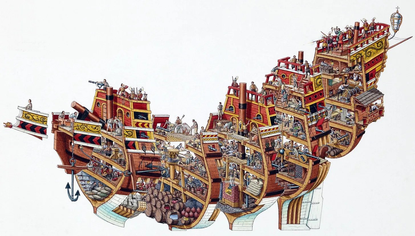
A few months ago I had the fleeting thought to write a post about Stephen Biesty, the DK books cross-section legend. After learning he’d passed only just last year, I was disheartened to discover his personal website and galleries had gone offline, and there were no significant retrospectives of his career that I could find.
Now, after having looked through nearly every single work he produced and having read literally everything I could find online about him, I have come to find his quiet denouement rather touching. He certainly seemed to be private by design, offering only a handful of interviews in his lifetime. The longest profile I could find is weirdly condemning of his workmanlike ethos:
The artist himself is not quite as immediately engaging. Biesty is 35, with the smooth face and straight jeans of a Microsoft programmer. He lives in a Somerset cottage of grey-gold stone between a village church and a pair of wandering geese.
Biesty’s garden glows in the late-summer sun, yet he leads the way straight up to his studio and questions about his business. The room is almost bare of artist’s clutter, more an office with fax and easel and three paintbrushes laid parallel on a tissue to dry. ‘I don’t collect stuff,’ says Biesty.
He talks about his illustrating with a stern set to his chin, as if filling out a tricky detail. He doesn’t sketch – “There isn’t time to be doing reams of doodles” – but expands his work straight from thumbnail ideas to full-scale final pieces. These he completes, eyes close to the paper and hand in rhythm, layer by repetitive layer, between 7.30am and 5.30pm every weekday. “At lunchtime I go downstairs for half an hour and a sandwich.”
Biesty makes all this sound like mass production. “You’re employed to do one thing,” he says, straight as a factory manager. “Something that’s going to sell.” There are no posters of his pictures on his studio walls.
[…] Often, he answers with “we” rather than “I”.
I have to confess a great soft spot for all this. My great grandfather was studying technical illustration at Pratt before he was drafted into the war and lost at sea. His daughter became a graphic designer, as did her daughter — my mom. I appreciate that we all sat somewhere between art and science, heart and mind. Biesty’s seeming indifference towards an artistic identity gives his work more credibility for my tastes.
Biesty’s breakout moment came when the K of DK books asked Biesty to draw a steamboat in cross section. “I tried it lengthways and he said, ‘Fine. But try it the other way, like a loaf.’” And lo:
This became the centerpiece for his first book, Incredible Cross-Sections [here], and the seed for the rest of his career. Anyone around my age and above a certain threshold of autistic will have burned much library time on this amazing ‘90s run of DK books…
[Cole goes on to show and discuss other examples of Biesty’s work and to examine his influences…]
… Later in life, Biesty was able to admit some of the depth so evident in the work, as he accepted an award in 2011 for Into the Unknown [here]:
In a world where most information is stored and conveyed electronically, conventional non-fiction books for young people have taken a heavy hit. So is Into The Unknown a dinosaur, a final example of a Dying Breed? I believe not. In the years ahead, certainly fewer paper books will be produced. But those that are designed, written, and manufactured will be a bit like medieval manuscripts — special creations, works of art, unique, beautiful products to be collected and cherished. Into the Unknown, therefore, is not the end of a line but the beginning of a new, fresh and very beautiful one, and you have so kindly recognized that fact. Thank you all very much indeed…
* Robert J. Bezucha, The Art of the July Monarchy: France, 1830 to 1848
###
As we show (in addition to telling), we might spare a thought for an illustrator of a different ilk, William Steig; he died on this date in 2003. A cartoonist (most notably, in The New Yorker), and illustrator and writer of children’s books, he’s best known for Shrek!, which inspired the film series of the same name, as well as others that included Sylvester and the Magic Pebble (which won the Caldecott Medal), Abel’s Island, and Doctor De Soto. He was the U.S. nominee for the biennial and international Hans Christian Andersen Awards, as both a children’s book illustrator in 1982 and a writer in 1988.
When asked his opinion about the movie based on his picture book, Shrek!, William Steig responded: “It’s vulgar, it’s disgusting — and I loved it.” (With the release of Shrek 2 in 2004, Steig became the first sole-creator of an animated movie franchise that went on to generate over $1 billion from theatrical and ancillary markets after only one sequel.)
Your correspondent is headed off on the road, so (R)D will be in temporary hiatus. Regular service should resume on/around October 13. To keep you occupied until then, this tasty tidbit from Neal.fun (Neal Agarwal): “I’m not a robot.”
Ah, but “good”?… Past a certain level of quality, our definitions of “good”– that’s to say, the books that entertain and enlighten– vary for each of us. How to choose? Literature-Map is here to help…
The Literature-Map is part of Gnod, the Global Network of Discovery.
It is based on Gnooks, Gnod’s literature recommendation system. The more people like an author and another author, the closer together these two authors will move on the Literature-Map.
If you found a typo or a duplicate, please report it here.
Is an author missing on the map? Please vote for them here.
Want to jump to a random place on the map? Click here
* Henry David Thoreau, A Week on the Concord and Merrimack Rivers
###
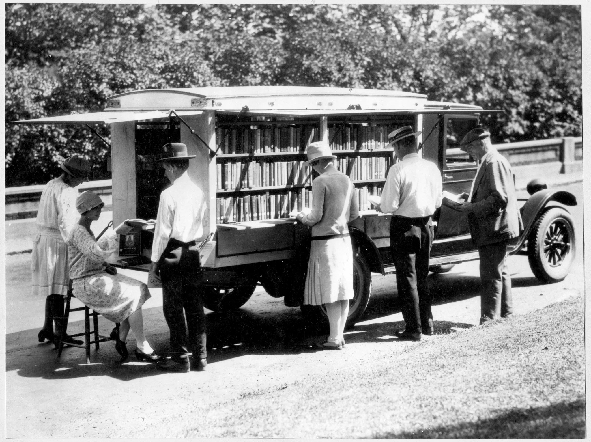
As we turn the page, we might recall that this date in 1935 was a big one for the book business:
Allen Lane, Chairman of the London publisher The Bodley Head, was returning home after traveling with author Agatha Christie and her husband. At the train station, he browsed the kiosks looking for something to read on his way home. All he could find were magazines or low-quality paperback stories that he had no interest in reading. Then the thought occurred to him that people, like himself, might be more inclined to read good quality books [literature in paperback was then mainly poor quality lurid fiction] if they were more affordable. And since he was in the position to help build up lagging sales for his company, he ventured into printing previously hard-back books into a paperback format. The first was released on this day in 1935…
Penguin Books featured no photos and were priced about a fifteenth the price of a hardcover book. The traditional book trade initially resisted; but the purchase of 63,000 books by Woolworths paid for the project outright, confirmed its worth, and allowed Lane to establish Penguin as a separate business in 1936. Indeed, by March 1936, ten months after the company’s launch, one million Penguin books had been printed.
Dan Sinykin with a plea for reading– really reading…
In Sigrid Nunez’s 2018 novel The Friend, a famous writer kills himself. Not long before, he complains to the narrator about readers: “People talking about a book as if it were just another thing, like a dish, or a product like an electronic device or a pair of shoes, to be rated for customer satisfaction—that was just the goddamn trouble.” Students submit papers that say, “I hate Joyce, he’s so full of himself.” Online reviewers imply, “if a book didn’t affirm what the reader already felt—what they could identify with, what they could relate to—the author had no business writing the book at all.” The famous author quits teaching, quits writing. The state of the novel, its place in the world, is too depressing.
“But hasn’t it always been this way?” asks the narrator.
“No doubt,” says the famous writer. “But in the past the writer didn’t have to know, the problem wasn’t right there in your face.”
We know it’s been this way—or something like it—for more than a century, because that’s how long it’s been since I. A. Richards conducted his experiment. A young Cambridge professor in the 1920s, Richards printed poems with their authors redacted, sent them home with his students, and asked them to produce commentary. They did, and their commentary, from these otherwise good students, was riddled with errors. Without the context of who wrote the poems or when, the students failed to make out the plain sense. They connected poems to irrelevant memories, offered stock responses, indulged in sentimentality, and allowed preconceptions about what poetry is to skew what they saw on the page. At a time when literature professors either lectured grandly or lingered over the minutiae of history, Richards set out a new path; he wanted to provide support for “those who wish to discover for themselves what they think and feel about poetry.”
Reading, a skill easily taken for granted, is difficult—all the more so when reading literature that wields language as a medium for art. In the wake of Richards’ revelations, scholars in Britain and the United States developed a technique to address our failures. Eventually that technique took the name “close reading,” and it remains the principal methodology of literary studies.
Close reading is untimely. It bristles against today’s universities, which treat students as customers to please and as future workers to train rather than as people in pursuit of human flourishing. Jeff Bezos’ empire—Amazon; Goodreads; Kindle Direct Publishing, which dominates the perfervid world of self-publishing—encourages readers to “talk about a book as if it were just another thing, like a dish, or a product like an electronic device.” Social media compels us to attend to what we’re seeing for as long as it takes to scroll by. Every day, AI produces more of the words we come across, making it hard—maybe impossible—to care about reading them. I’m sure there were college courses this semester where students completed their work with AI and professors graded it with AI, cutting humans from the loop. It’s easy to see why close reading, which demands patience, openness to others, and slow, careful thought, is having a moment among academics.
In January, literary critic John Guillory, emeritus faculty at NYU, well known in the small world of literary studies, published a slim volume, On Close Reading, accompanied by an exhaustive annotated bibliography compiled by Rhodes College professor Scott Newstok that demonstrated that more people are writing about close reading now than ever. Jonathan Kramnick’s Criticism and Truth has garnered disproportionate attention, occasioning roundtables, special sections of journals, and many reviews. Much more, including a volume I co-edited, is forthcoming. After a spell of taking it for granted, academics are rediscovering the quiet excitement of close reading, a relief from the overheated corporate pablum routinely suffocating us.
But close reading is not just for academics, and it deserves a bigger audience. Not because it’s virtuous. Not because it makes us better people. (I know some great close readers who are real assholes.) But because it’s a thrilling way to think with others, to claw back some of the time taken from us daily by tech oligarchs (I have looked at Twitter impulsively several times while writing this pointedly long, difficult sentence), and relearn some of our capacity, atrophied into passivity by algorithms, for aesthetics, a term that arose in modernity to name a storehouse of values in dialectical opposition to those of capitalism: above all, treating texts as ends in themselves rather than as means to productive ends—treating them, that is, as art…
* “To call for close reading, in fact, is to do more than insist on due attentiveness to the text. It inescapably suggests an attention to this rather than to something else: to the ‘words on the page’ rather than to the contexts which produced and surround them. It implies a limiting as well as a focusing of concern – a limiting badly needed by literary talk which would ramble comfortably from the texture of Tennyson’s language to the length of his beard. [then, after a breath] But in dispelling such anecdotal irrelevancies, ‘close reading’ also held at bay a good deal else: it encouraged the illusion that any piece of language, ‘literary’ or not, can be adequately studied or even understood in isolation. It was the beginnings of a ‘reification’ of the literary work, the treatment of it as an object in itself, which was to be triumphantly consummated in the American New Criticism.” – Terry Eagleton, Literary Theory: An Introduction [Your correspondent understands Sinykin’s plea as an altogether timely call, not to abandon context, but to the swing the pendulum back.]
###
As we pay close attention, we might send gritty birthday greetings to a man who was a master of prose the repays close reading– Samuel Dashiell Hammett; he was born on this date in 1894. Hammett worked as an agent of the Pinkerton National Detective Agency from 1915-1922, when– disillusioned by the organization’s role in strike-breaking– he left to become a writer, providing copy in an ad agency until his fiction earned enough to support him. Hammett drew for his fiction on his experiences as a “Pinkerton Man,” and created an extraordinary series of characters– Sam Spade (The Maltese Falcon), Nick and Nora Charles (The Thin Man), The Continental Op (Red Harvest and The Dain Curse)– on the way to becoming, as the New York Times called him, “the dean of the… ‘hard-boiled’ school of detective fiction.”
In his book The Simple Art of Murder, Raymond Chandler, considered by many to be Hammett’s successor, observed,
Hammett was the ace performer… He is said to have lacked heart; yet the story he himself thought the most of The Glass Key is the record of a man’s devotion to a friend. He was spare, frugal, hard-boiled, but he did over and over again what only the best writers can ever do at all. He wrote scenes that seemed never to have been written before.


You must be logged in to post a comment.