A century ago, a strain of pandemic flu killed up to 100 million people—5 percent of the world’s population. In 2013, a new mystery illness swept the western coast of North America, causing starfish to disintegrate. In 2015, a big-nosed Asian antelope known as the saiga lost two-thirds of its population—some 200,000 individuals—to what now looks to be a bacterial infection. But none of these devastating infections comes close to the destructive power of Bd—a singularly apocalyptic fungus that’s unrivaled in its ability not only to kill animals, but to delete entire species from existence.
Bd—Batrachochytrium dendrobatidis in full—kills frogs and other amphibians by eating away at their skin and triggering fatal heart attacks. It’s often said that the fungus has caused the decline or extinction of 200 amphibian species, but that figure is almost two decades out-of-date. New figures, compiled by a team led by Ben Scheele from the Australian National University, are much worse.
Scheele’s team estimates that the fungus has caused the decline of 501 amphibian species—about 6.5 percent of the known total. Of these, 90 have been wiped out entirely. Another 124 have fallen by more than 90 percent, and their odds of recovery are slim. Never in recorded history has a single disease burned down so much of the tree of life. “It rewrote our understanding of what disease could do to wildlife,” Scheele says…
Posts Tagged ‘epidemiology’
“Extreme remedies are very appropriate for extreme diseases”*…

The Toad Mountain harlequin frog is endangered and at risk from the Bd fungus
The story of an unprecedented pathogen: “The Worst Disease Ever Recorded.” (Lest one rest too easily because this threat seems to target not humans but animals at some distance on the tree of life, see here.)
* Hippocrates
###
As we do our best to stave off extinctions, we might recall that on this date in 1981, Nature set the world’s record for “Longest Scientific Name” when it published the systematic name for the deoxyribonucleic acid (DNA) of the human mitochondria; it contains 16,569 nucleotide residues and is thus about 207,000 letters long.

The 16,569 bp long human mitochondrial genome with the protein-coding, ribosomal RNA, and transfer RNA genes
“Without data, you’re just another person with an opinion”*…

It used to be that we’d see a poorly made graph or a data design goof, laugh it up a bit, and then carry on. At some point though — during this past year especially — it grew more difficult to distinguish a visualization snafu from bias and deliberate misinformation.
Of course, lying with statistics has been a thing for a long time, but charts tend to spread far and wide these days. There’s a lot of them. Some don’t tell the truth. Maybe you glance at it and that’s it, but a simple message sticks and builds. Before you know it, Leonardo DiCaprio spins a top on a table and no one cares if it falls or continues to rotate.
So it’s all the more important now to quickly decide if a graph is telling the truth…
Nathan Yau (Flowing Data) provides a very helpful (and very amusing) guide: “How to Spot Visualization Lies.”
* W. Edwards Deming
###
As we key our eyes open, we might send healthy birthday greetings to John Snow; he was born on this date in 1813. A physician and a leader in the adoption of anaesthesia and medical hygiene, he is considered the father of modern epidemiology, in large measure because of his work in tracing the source of a cholera outbreak in Soho, London, in 1854. His On the Mode of Communication of Cholera (1849) suggested that cholera was a contagious disease easily transmitted by contaminated water. But the widely-held theory was that diseases are caused by bad air led to his idea being ignored. Then, in London’s 1854 cholera emergency, he painstakingly correlated individual cholera casualties to the water supply they had used in each case. He then communicated his results with a map that underlined his point, and ended the deadly epidemic by removing the pump handle of the community water pump that he found to be the culprit.

Snow’s map of cholera cases
His findings inspired fundamental changes in the water and waste systems of London, which led to similar changes in other cities, and a significant improvement in general public health around the world. His mode of communicating them contributed to the rise of data visualization.

“Eventually, all things merge into one, and a river runs through it”*…

Cartographer Daniel Huffman has created a series of maps in which American river systems are visualized as subway maps (specifically, in the manner of Harry Beck’s 1930s London Tube maps), with nodes representing connections between streams and tributaries.
Huffman strikes a particular chord in the map-lover’s heart. On an Internet brimming with sleek, sharp geo-visualizations, Huffman’s maps offer a sweetly idiosyncratic view of the world. The signatures of historic figures turn into street vectors. Oregon’s wine country gets the ‘90s computer-game treatment. A simple bike path becomes a work of calligraphy.
“What it really probably comes down to is a desire to do things differently than others,” he says in an email. “I crave variety, and so it often leads me to thinking of weird ideas and saying, ‘I wonder if I can do X[.]’”
Lately, a trend has emerged out of Huffman’s impulses towards novelty—an idea he calls “Modern Naturalism,” in which his maps present natural features in the type of “highly-abstracted, geometrically precise visual language that we often apply to the constructed world on maps,” according to his website…
More on Huffman and his marvelous maps at “When Rivers Look Like Subway Systems.”
* Norman Maclean, A River Runs Through It and Other Stories
###
As we hop onto our rafts, we might send healing birthday greetings to Florence Nightingale, born on this date in 1820. Famed for her work as a nurse in the Crimean War, she went on to found training facilities and nursing homes– pioneering both medical training for women and what is now known as Social Entrepreneuring. Less well-known are Nightingale’s contributions to epidemiology, statistics, and the visual communication of data in the field of public health. Always good at math, she pioneered the use of the polar area chart (the equivalent to a modern circular histogram or rose diagram) and popularized the pie chart (which had been developed in 1801 by William Playfair). Nightingale was elected the first female member of the Royal Statistical Society, and later became an honorary member of the American Statistical Association.

“Diagram of the causes of mortality in the army in the East” by Florence Nightingale, an example of the the polar area diagram (AKA, the Nightingale rose diagram)

“Science does not know its debt to imagination”*…

The image above– William Heath’s “Monster Soup- Commonly Called Thames Water– a Microcosm, dedicated to The London Water Companies“– is one of over 100,000 historical images made available last week by the Wellcome Library under an open license (CC-BY – meaning they are free for any re-use provided that the Wellcome Library is credited). Focused on themes ranging from medical and social history to contemporary healthcare and biomedical science, it’s one of the world’s richest and most unique collections.
As the curators suggest, “whether it’s medicine or magic, the sacred or the profane, science or satire – you’ll find more than you expect…”
* Ralph Waldo Emerson
###
As we unpack our tea sets to celebrate Lewis Carroll’s birthday, we might send contagiously-warm birthday greetings to Thomas Willis; he was born on this date in 1621. An English doctor who played an important part in the history of anatomy, neurology and psychiatry, he was particularly important to the emergence of epidemiology. In De febribus (1659) he helped crystallize the field with an examination of epidemics of smallpox, influenza, plague, war-typhus, measles, and the first medical description of typhoid fever.
Willis is also remembered as the host of regular gatherings in 1648-9, in his rooms at Oxford, of a club of scientists including Robert Boyle, Christopher Wren, and John Wilkins; he and they went on to become founding members the Royal Society.

The Joys of Knowing History, Illustrated…
 from “Krazy Kat and Ignatz Mouse at the Circus” (click here to view)
Animated drawings were introduced to film a full decade after George Méliès had demonstrated in 1896 that objects could be set in motion through single-frame exposures. J. Stuart Blackton’s 1906 animated chalk experiment Humorous Phases of Funny Faces was followed by the imaginative works of Winsor McCay, who made between four thousand and ten thousand separate line drawings for each of his three one-reel films released between 1911 and 1914. Only in the half-dozen years after 1914, with the technical simplifications (and patent wars) involving tracing, printing, and celluloid sheets, did animated cartoons become a thriving commercial enterprise. This period–upon which this collection concentrates–brought assembly-line standardization but also some surprisingly surreal wit to American animation. The twenty-one films (and two Winsor McCay fragments) in this collection, all from the Library of Congress holdings, include clay, puppet, and cut-out animation as well as pen drawings. Beyond their artistic interest, these tiny, often satiric, films tell much about the social fabric of World War I-era America.
See these and other important– and enormously entertaining– animated films from 1900-1921 at the Library of Congress’ “Origins of American Animation“– Krazy Kat, Keeping Up With the Joneses, The Katzenjammer Kids, and more than a dozen other joys (that don’t start with “K”).
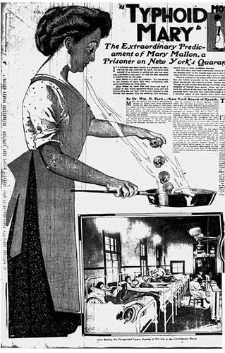
As we debate whether Windsor McCay or George Herriman was the greater genius, we might recall that it was on this date in 1938 that Mary Mallon– “Typhoid Mary”– died of a stroke on North Brother Island, where she he had been quarantined since 1915. She was the first person in the United States identified as an asymptomatic carrier of the pathogen associated with typhoid fever… before which, she inadvertently spread typhus for years while working as a cook in the New York area.
You must be logged in to post a comment.